The network for creativity
Join 1.25M professional creatives like you
Connect with clients, get discovered, and run your business 100% commission-free
Creatives on Contra have earned over $150M and we are just getting started
Back to feedPost

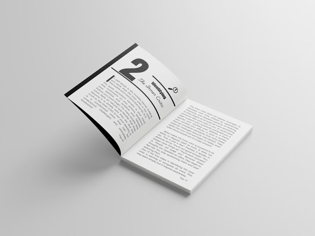
Turning rough manuscripts into clean, professional, publishing-ready books ✨📚
A good book is not just about writing.
The layout, spacing, typography, margins, and overall reading experience matter too.
I help authors, coaches, and ebook creators transform messy documents into polished interior layouts that look professional on Amazon KDP, Kindle, paperback, and ebook platforms.
The network for creativity
Join 1.25M professional creatives like you
Connect with clients, get discovered, and run your business 100% commission-free
Creatives on Contra have earned over $150M and we are just getting started





Related posts

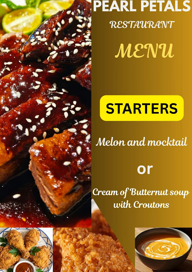
A great menu isn't just a list of items—it’s an extension of a restaurant's brand identity. I love working on layouts that balance clean typography, visual hierarchy, and an appetizing aesthetic to elevate the customer experience.


Good!

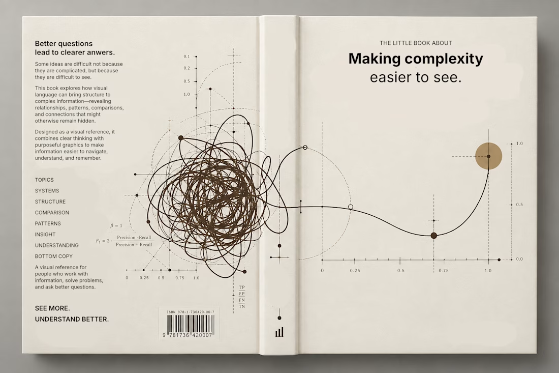
Currently exploring a book design focused on making complex information easier to understand through visual language. Playing with typography, data visualization, and graphic systems to give the subject a more editorial feel.


This is a trully elegant and impressive design concept.
I love it.

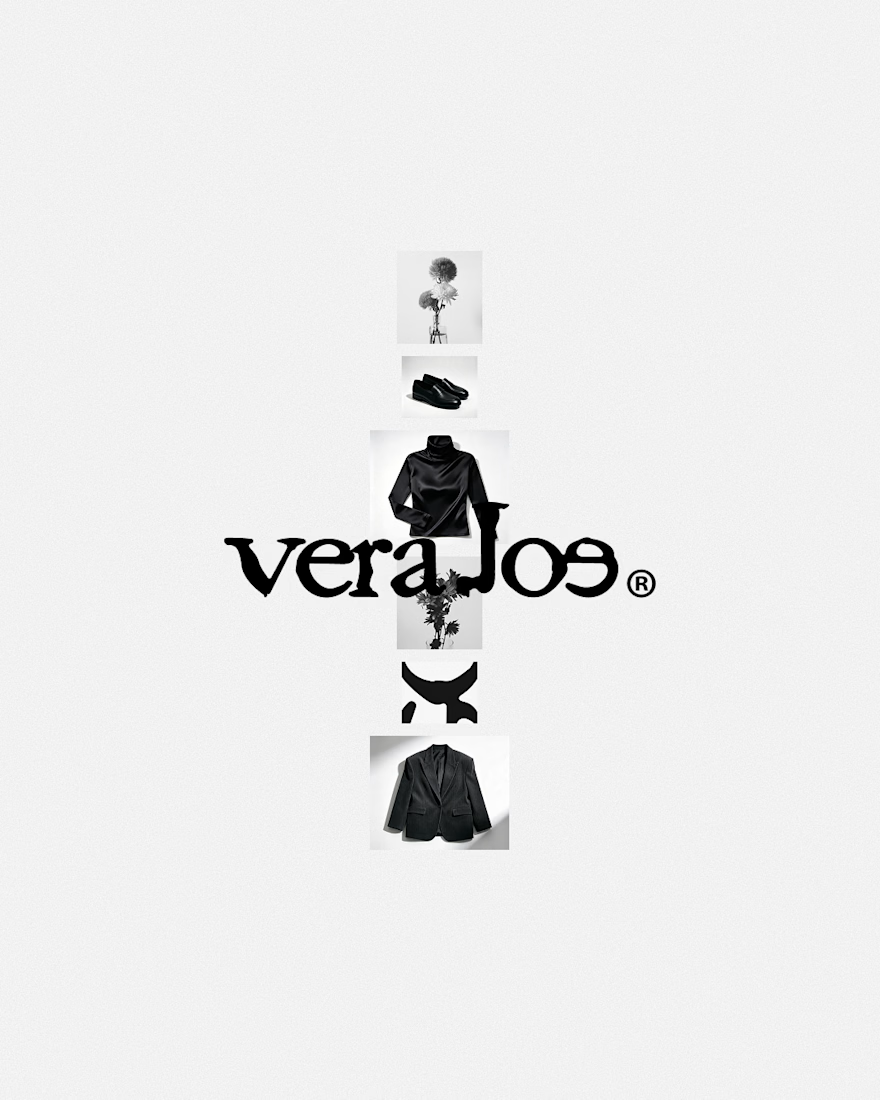
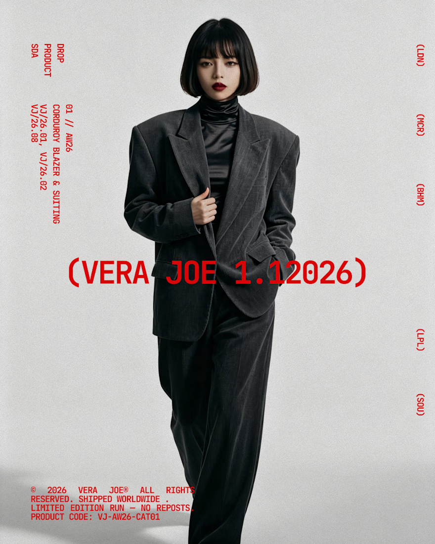
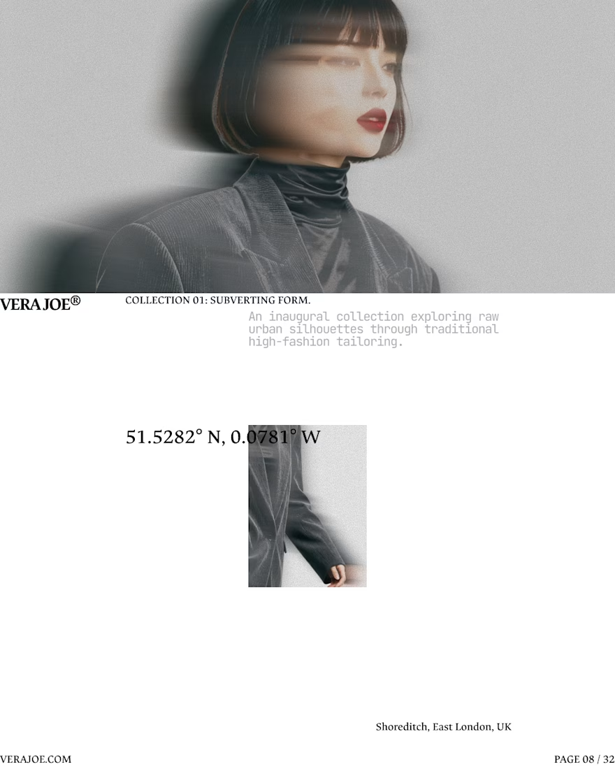
An editorial exploration for VERA JOE® Autumn/Winter 2026.
Exploratory Brand Identity & Visual Campaign.



Like the art direction