The network for creativity
Join 1.25M professional creatives like you
Connect with clients, get discovered, and run your business 100% commission-free
Creatives on Contra have earned over $150M and we are just getting started
Back to feedPost
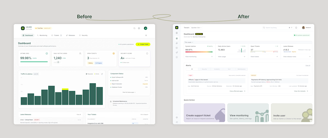
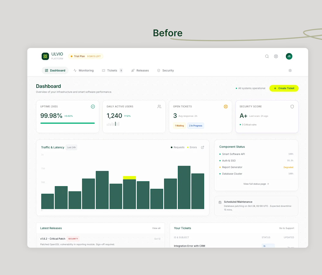
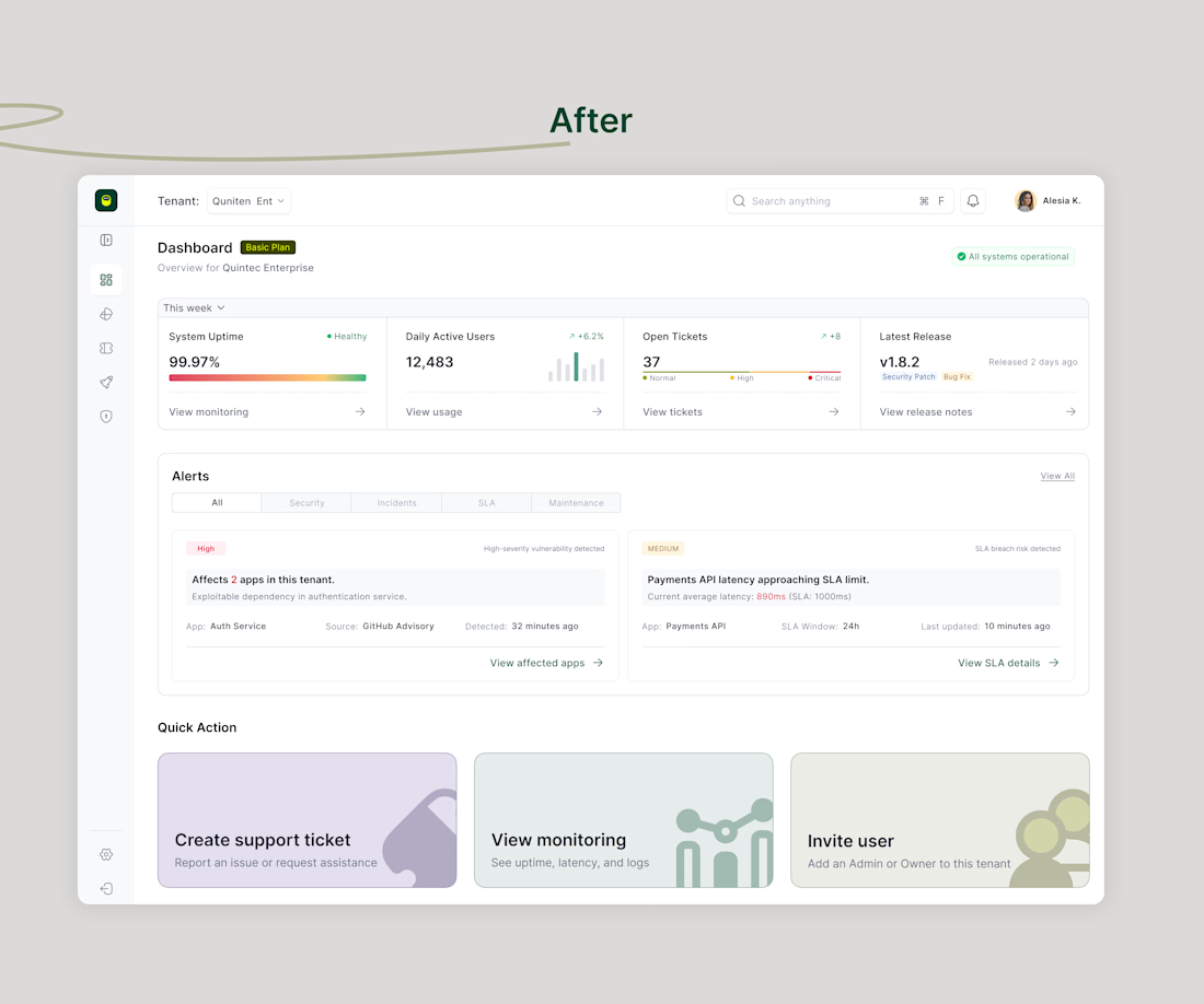
Before → After: Dashboard UX Iteration
This dashboard started as an initial concept, then went through a realignment based on one core question:
What does the user need to understand and act on in under 10 seconds?
What changed in the new version:
– Re-prioritised KPI cards to surface system health, usage, and risk first
– Simplified metrics to reduce cognitive load
– Introduced clearer alert hierarchy (severity, context, and CTA)
– Removed secondary information that distracted from primary actions
– Added quick actions to shorten time-to-resolution
The goal wasn’t to add more; it was to make the dashboard calmer, clearer, and more actionable.
Sharing the evolution because good design is rarely the first version, it’s the thinking behind the iterations.
The network for creativity
Join 1.25M professional creatives like you
Connect with clients, get discovered, and run your business 100% commission-free
Creatives on Contra have earned over $150M and we are just getting started
Challenges
View allTrending
Claude
Claude has entered the design space. How are you using Claude Design?
Contra University
Learn from expert creatives how to earn more using next-gen AI tools.
MagicPath
The canvas is infinite, and exploration is becoming the workflow. How are you using MagicPath?
creativeaiflow
Creative AI workflows are evolving. What tools do you use, and what are their strengths and weaknesses?
freelancerlife
Freelancer life is wins, pivots, and everything in between. What’s yours right now?