The network for creativity
Join 1.25M professional creatives like you
Connect with clients, get discovered, and run your business 100% commission-free
Creatives on Contra have earned over $150M and we are just getting started
Back to feedPost

I experimented with oversized typography across editorial layouts, posters, and social media covers. What do you think about the typography, layout, and color combinations? Which design catches your eye the most? I’d love to hear your thoughts! ✨


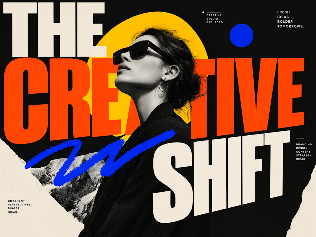
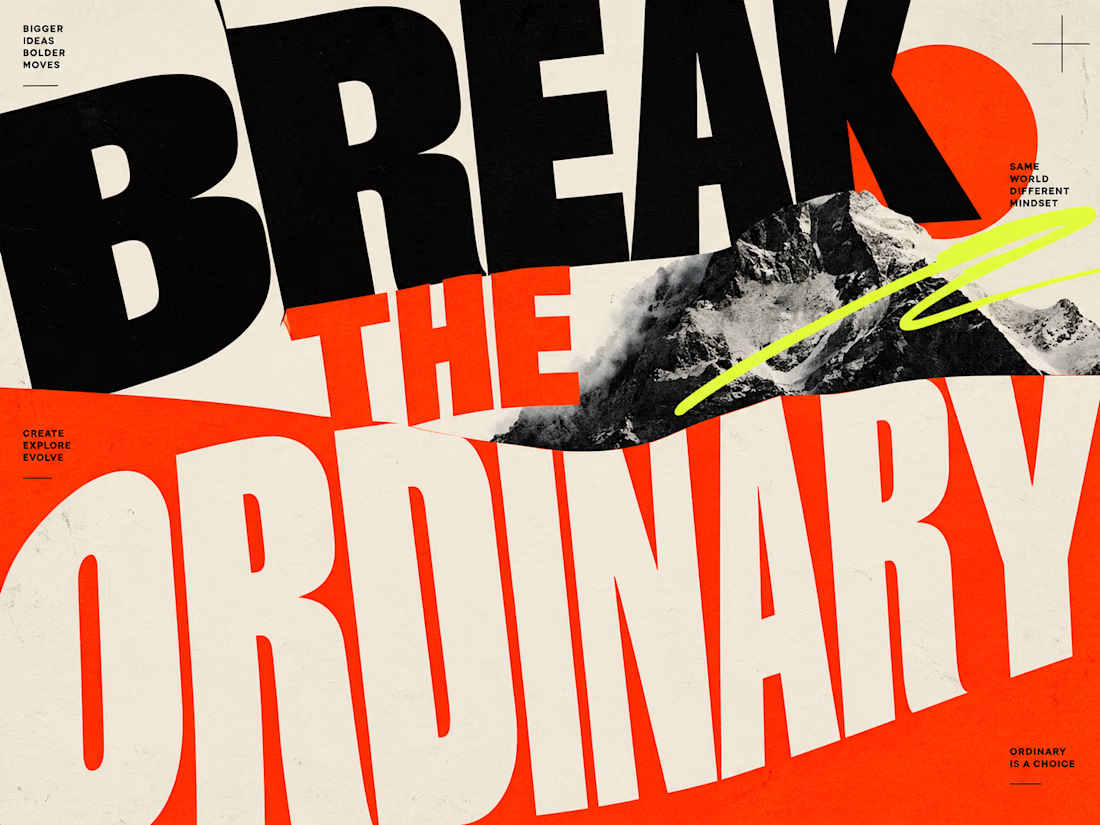
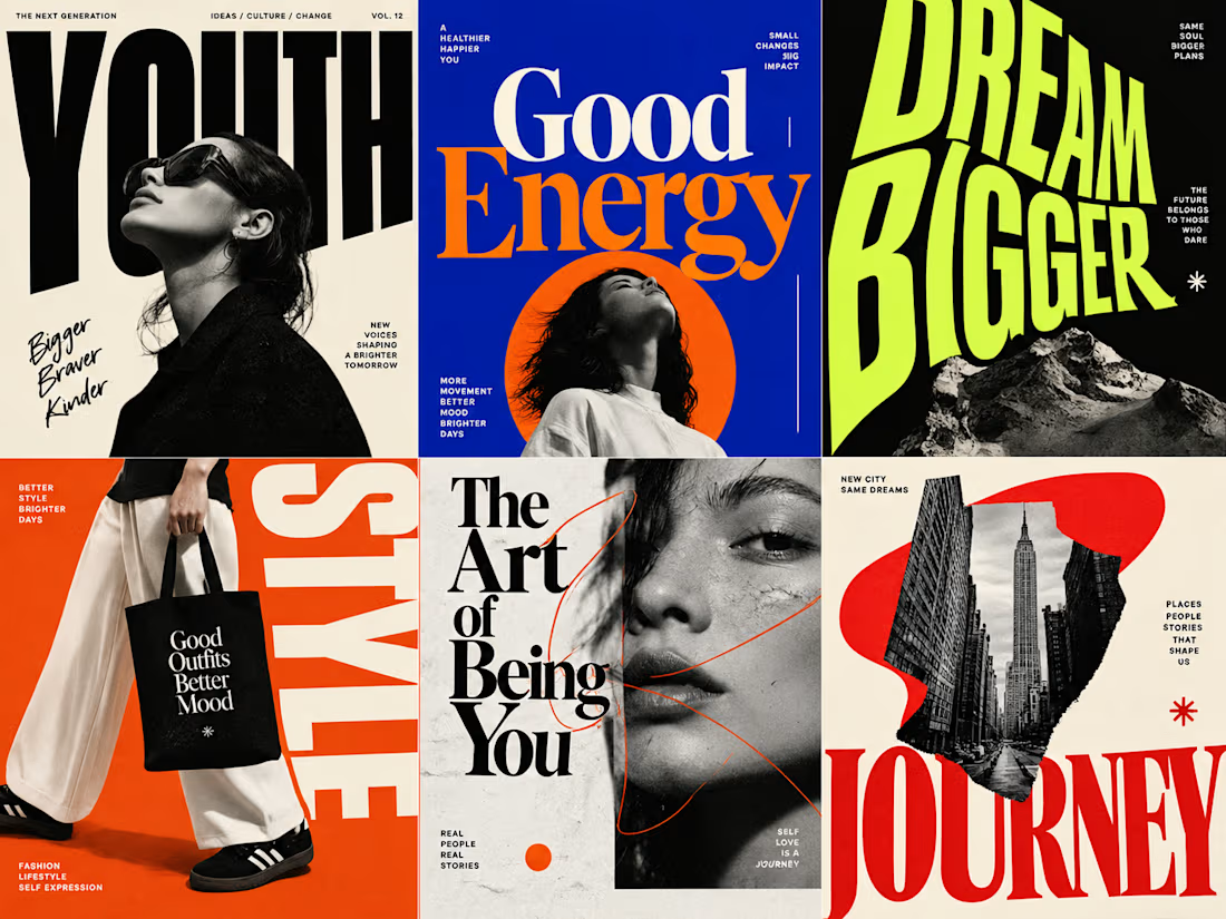
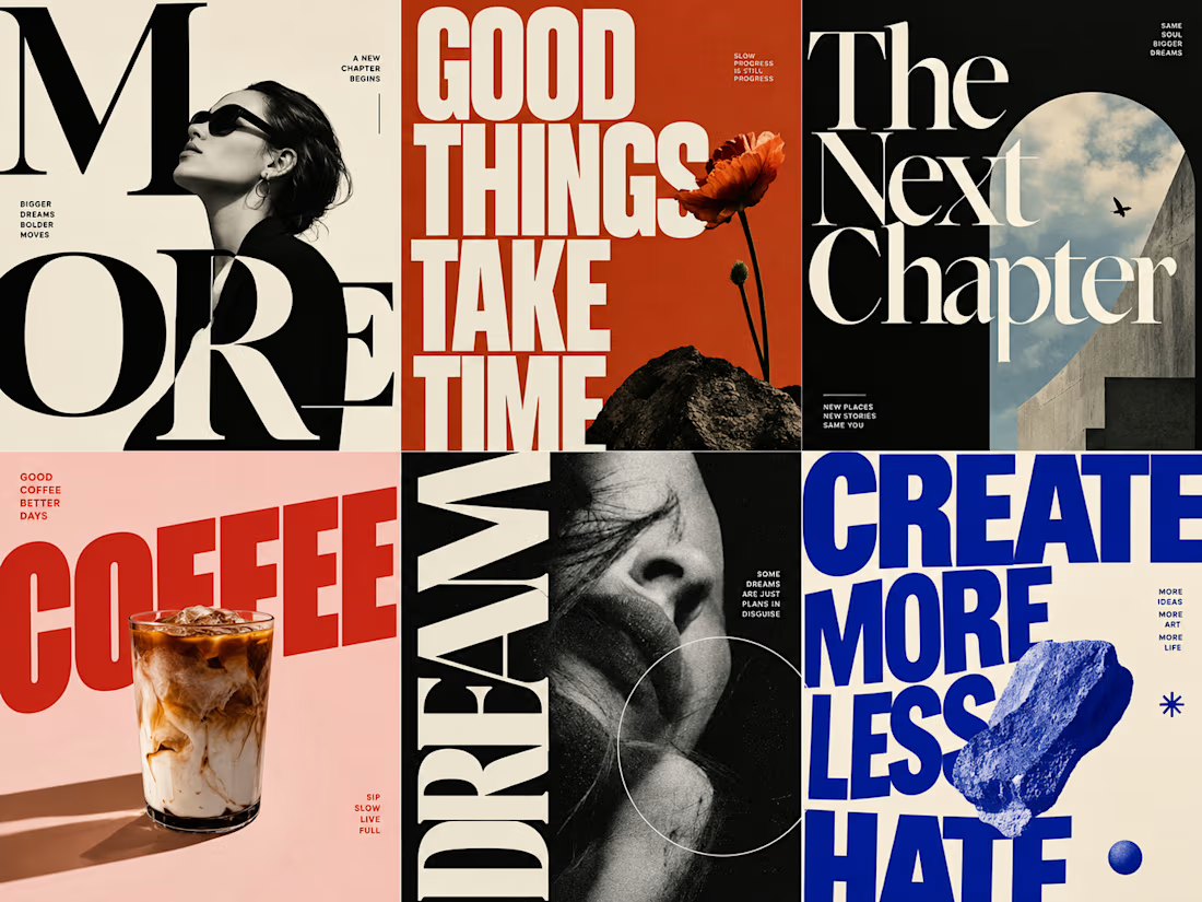

Oversized type often struggles to maintain readability on small mobile screens, which can undermine the impact of social media covers. It’s worth balancing that bold aesthetic with enough margin to keep the message clear on various devices.
The network for creativity
Join 1.25M professional creatives like you
Connect with clients, get discovered, and run your business 100% commission-free
Creatives on Contra have earned over $150M and we are just getting started
Challenges
View all


Related posts

My Top Featured Projects on @Contra Labs 🔥
⚡| NEXVOLU
⚡| HYDRUM VEIL
⚡| NOIRÉ
Each project explores a different direction, but the goal stays the same: build brands that stand out.
Which project is your favorite?
Drop the name below 👇


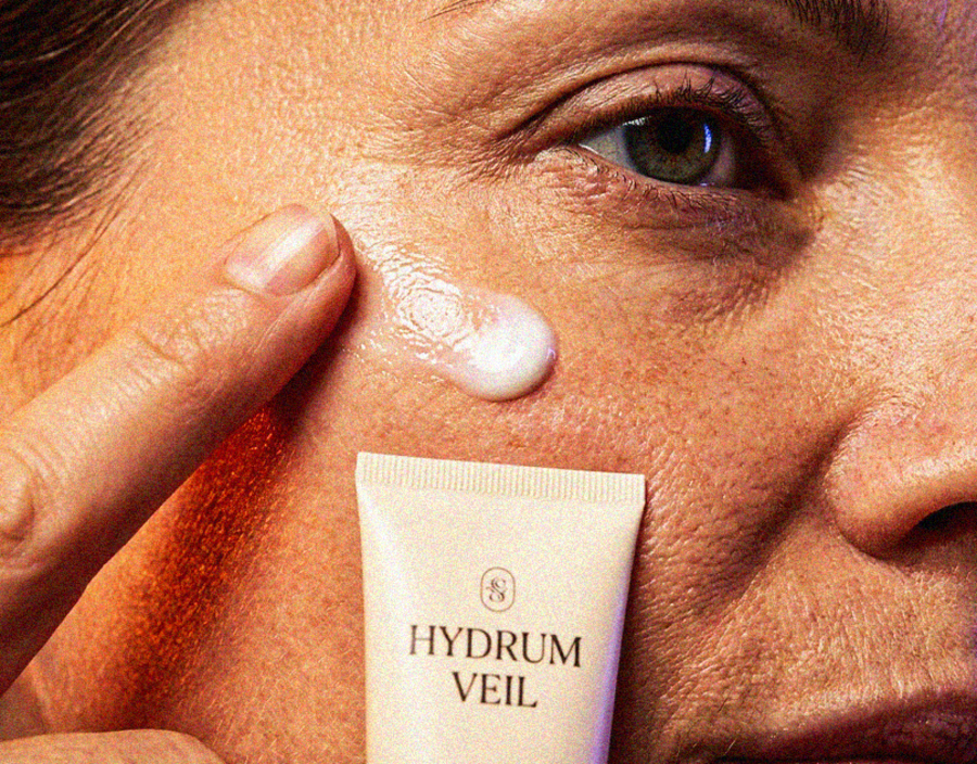

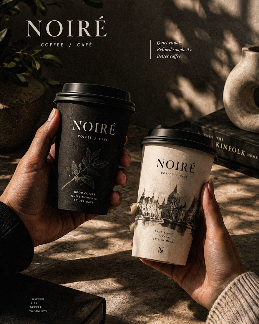

These are 🔥 Mine are all fav 🙌
Congo for Featured on @Contra HQ & @Contra Labs ... 😍

More from ARDA®, a look at the desktop experience.
A, editorial approach to presenting architecture, built around typography, grid and imagery.


When u realize, there are websites with crazy animation but simple web like this has more conversations rate

Bold coffee packaging and visual design created to give the brand a distinctive shelf presence through strong typography, modern layouts, and a cohesive visual identity.
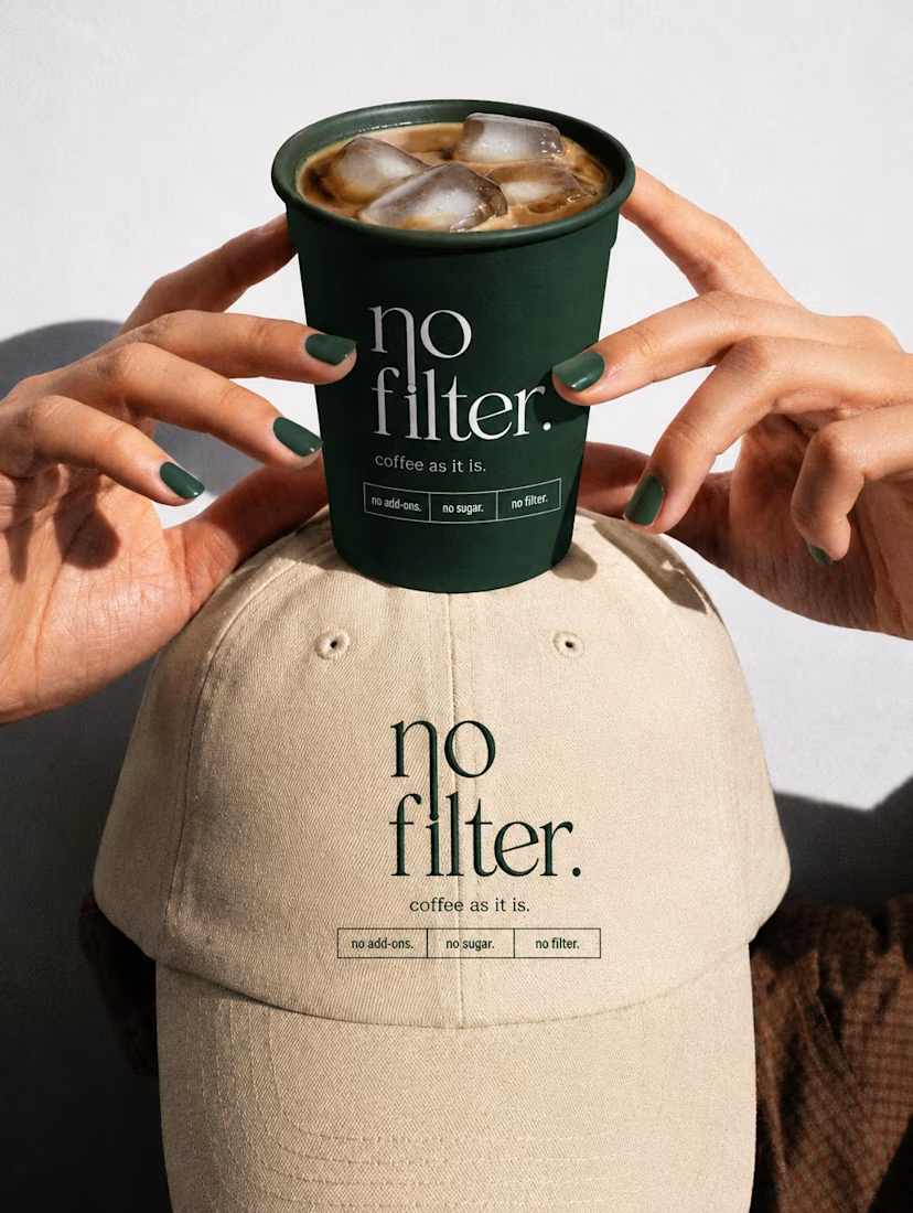

the green nails matching the cup is a fun touch. did you plan that?