The network for creativity
Join 1.25M professional creatives like you
Connect with clients, get discovered, and run your business 100% commission-free
Creatives on Contra have earned over $150M and we are just getting started
Back to feedPost

Online yoga has a retention problem. It’s easy to start and even easier to quit.
Most people don’t stop because they dislike yoga. They stop because a library of 300 videos turns into a to-do list nobody opens. That’s what I designed Yogora around.
Yogora is an online yoga studio, and the design had to do more than get someone through the door. It had to give them a reason to come back on day eight, day thirty, and day ninety.
Here’s how I approached it:
1. Lower the risk of starting.
A 7-day free trial, then $29.99/month, with “cancel anytime in two taps” stated right in the pricing section. Annual saves 33%. Nothing is hidden, so the first step feels safe.
2. Help people choose, so they don’t scroll.
Four ways in: Vinyasa, Yin & Restore, Strength, and Meditation. Every featured class shows its length, level, rating, and teacher, so a beginner can pick a 45-minute flow without second-guessing.
3. Add live sessions, so showing up has a reason.
Daily live classes with a time, a teacher, a “spots left” counter, and a Reserve button. A booked class is much harder to skip than a saved video, and a little scarcity helps. Replays last 48 hours for people who miss it.
4. Give people a path, not just a library.
Guided programs like the 21-Day Morning Ritual have a clear start, a number of sessions, and an end. Progress is easier to feel when it has a shape.
5. Prove it with people, not slogans.
Testimonials from a 52-year-old who started with zero flexibility, a lifter who was skeptical, and someone who finally sleeps through the night. Each one speaks to a different kind of visitor.
The look stays calm: warm off-white, deep forest black, and soft photography. Nothing on the page competes with the practice.
What I took from this one: for a subscription product, the homepage isn’t selling the first class. It’s selling the habit.
What’s the one thing that actually keeps you showing up to a habit: a plan, a person, or a schedule?
#BuildingInPublic #WebDesign #UXDesign #ProductDesign #WellnessBranding


The network for creativity
Join 1.25M professional creatives like you
Connect with clients, get discovered, and run your business 100% commission-free
Creatives on Contra have earned over $150M and we are just getting started







Related posts

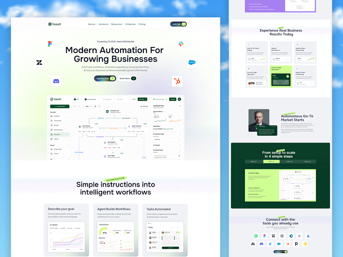
🚀 Saasti — Smart Automation for Growing Businesses
A modern SaaS website concept designed to turn complex automation into a simple, intuitive experience. With clean layouts, interactive workflow dashboards, vibrant accents, and clear messaging, every section highlights the power of smarter business operations.
✨ Modern SaaS UI/UX Design
⚡ AI-Powered Automation Experience
📊 Intuitive Workflow Dashboards
🎨 Clean, Conversion-Focused Layout
Designed by OrdainIT to bring innovation and usability together.
#SaaSDesign #UIDesign #UXDesign #AI #WebDesign #DashboardDesign #OrdainIT



Brilliant execution!

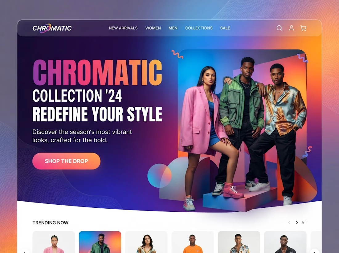
Modern Slick hero page design figma+Tailwind+Gemini ;)




Designed a clean, modern, and responsive business website concept to showcase services, build trust, and help businesses attract potential customers.

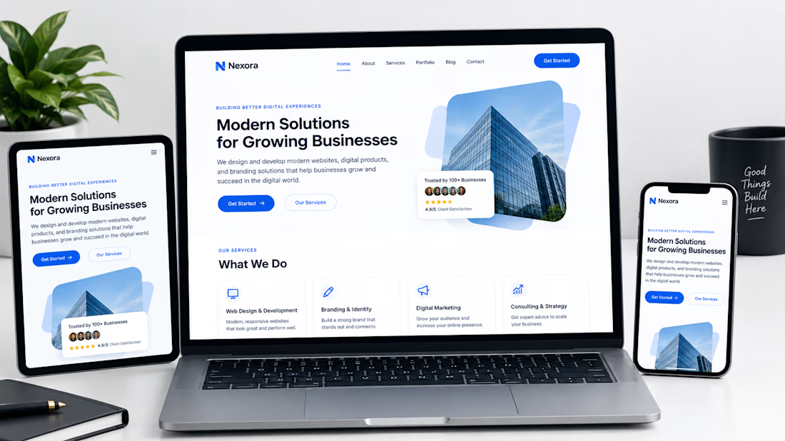

Not only is the design clean, but you also did a great job making sure it works well across different devices with a responsive design.