The network for creativity
Join 1.25M professional creatives like you
Connect with clients, get discovered, and run your business 100% commission-free
Creatives on Contra have earned over $150M and we are just getting started
Back to feedPost

Designing Wrought Steel Gate
RECOMMENDED
“Riza is a fantastic designer. We have worked together on many projects now and he is the only designer I want to work with. His accuracy, communication and attention to detail is second to none. Highly recommended!”


Joshua Simons
East Vic AccessThe network for creativity
Join 1.25M professional creatives like you
Connect with clients, get discovered, and run your business 100% commission-free
Creatives on Contra have earned over $150M and we are just getting started
Related posts

PAPER MONOLITH — Where Paper Becomes Architecture
An exploration of experimental graphic design, sculptural form, and architectural minimalism.
PAPER MONOLITH transforms the delicate nature of paper into a monumental visual statement. Inspired by origami geometry and contemporary architecture, this concept combines intricate folded structures, sophisticated typography, and refined editorial composition.
Created for 1286 CRAFT, the project explores the contrast between softness and strength through ivory-toned sculptural forms, realistic CGI aesthetics, precise geometric detailing, and a minimalist Swiss-inspired design approach.
The accompanying cinematic motion design brings the composition to life through subtle unfolding movements, atmospheric lighting, and elegant visual storytelling.
Creative Direction: Experimental Graphic Design, 3D Art Direction, Editorial Typography, Conceptual Design, Architectural Visualization, AI-Assisted Visual Design, and Cinematic Motion Design.
1286 CRAFT — Precision in Every Detail.
#1286CRAFT #GraphicDesign #ExperimentalDesign #EditorialDesign #Typography #3DArt #ArtDirection #MotionDesign #VisualIdentity #CreativePortfolio


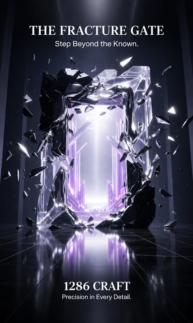
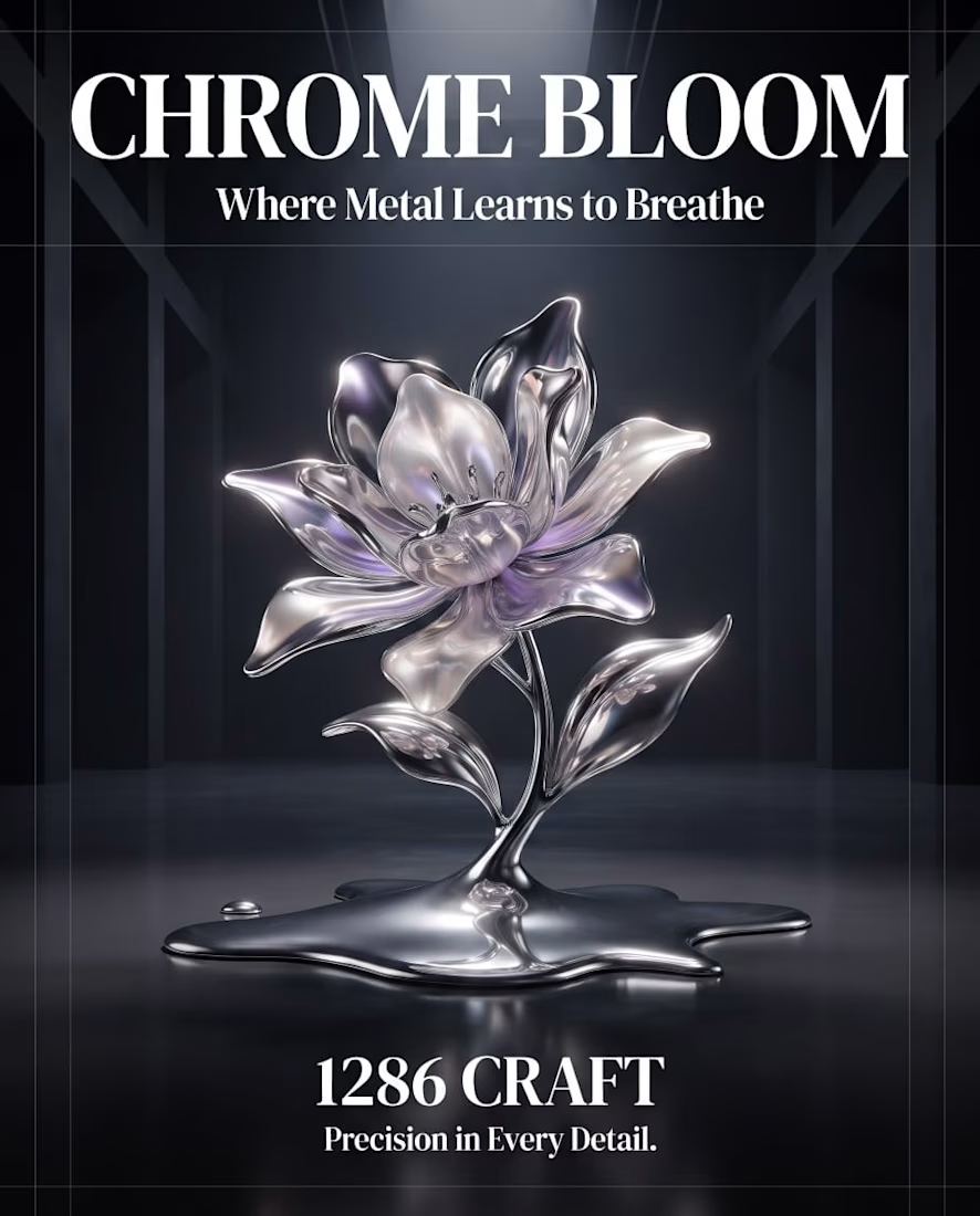
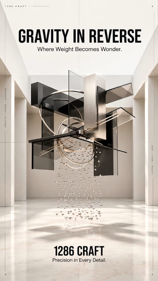
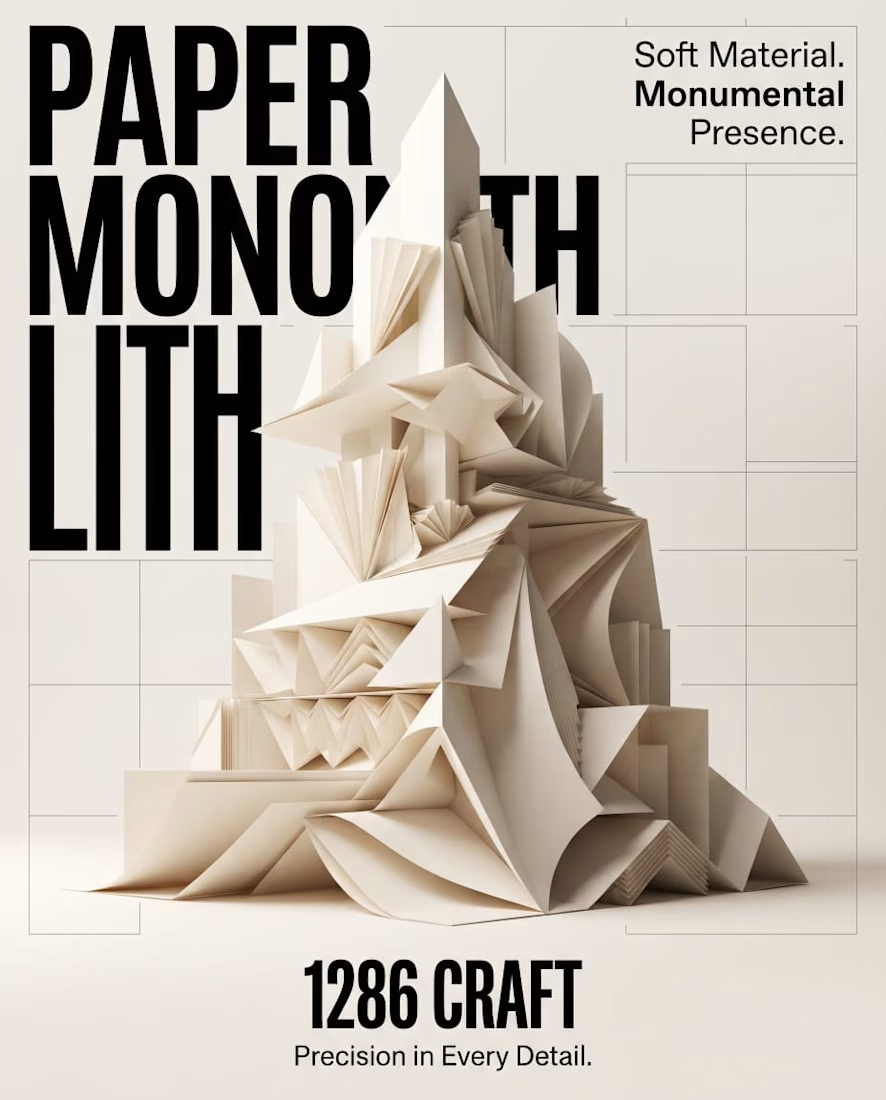

Amazing work

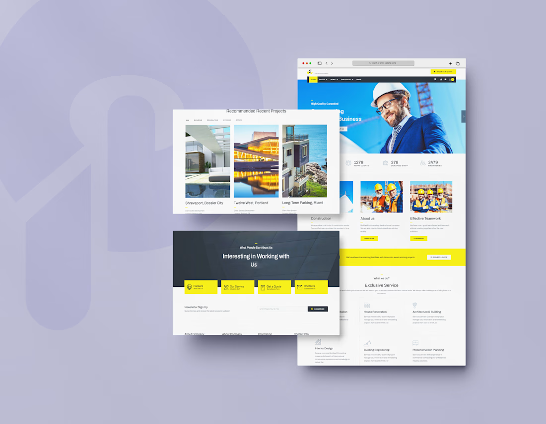
I designed the website for Buildwall, a construction company that handles building, renovation, architecture, and interior design. Contractor sites often look generic and dated. I wanted this one to feel strong, organized, and easy to trust.
The hero shows a real person. A smiling builder in a hard hat and suit sits against a bright blue background, with a "Request a Quote" button in the top bar. It signals both professionalism and approachability before anyone reads a word.
Numbers build trust fast. Right under the hero, three stats (1,278 happy clients, 378 qualified staff, 3,479 machineries) show scale at a glance.
Yellow means action. On a clean white and charcoal base, safety-yellow marks the quote buttons, the active menu tab, and the contact tiles. It nods to construction gear and tells visitors where to click.
Services are easy to scan. "Exclusive Service" lays out House Renovation, Architecture & Building, Interior Design, Building Engineering, and Preconstruction Planning as icon cards with a short line each. Visitors can tell quickly if the company does what they need.
Projects come first on a dedicated section. "Recommended Recent Projects" uses large photos with the project name, client, and location, plus filter tabs (All, Building, Consulting, Interior, Office) so visitors can find work similar to theirs.
Many paths to contact. A yellow banner repeats "Request a Quote" mid-page. Near the footer, four tiles (Careers, Our Service, Get a Quote, Contacts) and a newsletter signup catch visitors at different stages.



Login page idea design
A playful visual concept where the character literally “arms” himself depending on the strength of the password.
As the user creates a stronger password, the character progressively equips himself with more powerful protection and armor. The stronger the password, the better prepared and more protected he becomes.
The idea turns password security into a simple and engaging visual metaphor , instead of showing abstract security levels, the user can immediately see how their password makes the character stronger and safer.


