The network for creativity
Join 1.25M professional creatives like you
Connect with clients, get discovered, and run your business 100% commission-free
Creatives on Contra have earned over $150M and we are just getting started
Back to feedPost


The network for creativity
Join 1.25M professional creatives like you
Connect with clients, get discovered, and run your business 100% commission-free
Creatives on Contra have earned over $150M and we are just getting started
Related posts

An architecture studio's website should feel like walking through a quiet gallery, not a brochure.
Zabriskie is an architecture and design studio that balances sustainability, aesthetics and economy. I built them a custom WordPress theme with a calm, gallery-like layout.
What's on the site:
• About, team, and clients and partners
• Services: workplace, neighbourhood, landscape and urban design
• Sustainability and investment advisory pages
The decision I'd defend: lots of white space and very little decoration. The projects are the visuals, so the layout steps back and lets them lead.
Under the hood: editable templates so the team updates content without code, optimized images and caching, and layouts checked on desktop, tablet and mobile.
Stack: WordPress (custom theme), Figma, PHP/CSS
Live: zabriskie.rs
For a portfolio-led studio, how much should the site itself say?
🎬 A new website build every day. Follow so you catch the next one: instagram.com/sellwrightstudio · youtube.com/@sellwrightstudio

Stunning

A good-looking website is great. A website that actually brings in more leads? Even better.
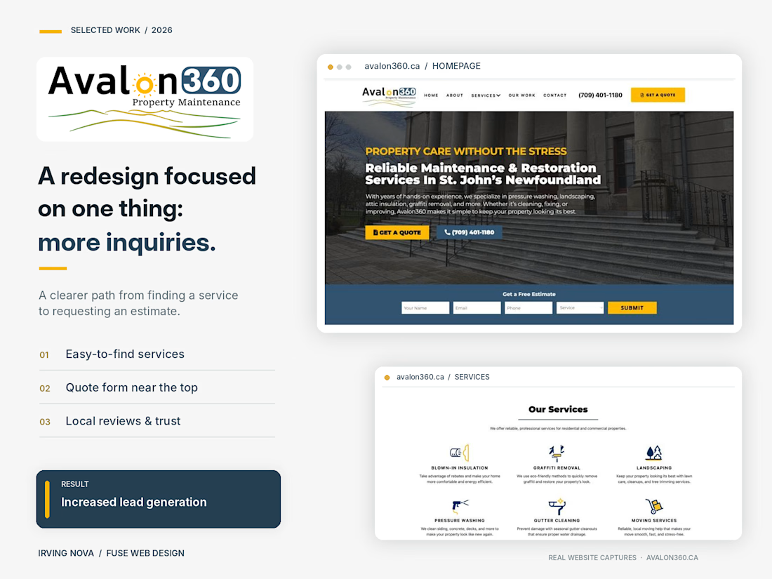
I recently redesigned the website for Avalon360, a property maintenance company based in St. John's, Newfoundland.
The goal wasn't just to modernize the design. It was to turn more website visitors into potential customers.
Here's what I focused on:
✅ A modern, professional design that builds trust
✅ Clear service pages that help customers find exactly what they need
✅ Strategically placed calls to action and easy-to-use quote forms
✅ A better mobile experience
✅ Real project photos, customer reviews, and local credibility
The result? Increased lead generation and a website that works harder for the business.
This is something I always emphasize with clients: your website shouldn't just be an online brochure. It should help grow your business.
🔗 Check out the live website: https://avalon360.ca
Designed & developed by Irving Nova | Fuse Web Design
What's the first thing you look for when deciding whether to trust a business website?
#WebDesign #WebsiteRedesign #LeadGeneration #WebDevelopment #SmallBusiness


For BrewMetrics, an analytics platform for cafés and coffee shops, handled both the design and the development.
The goal was to make data feel friendly and easy to understand for café owners. We went with a warm coffee-inspired palette, clear typography and simple visuals that explain the product at a glance.
Then built it, so the final site looks exactly like the design. No lost details between Figma and launch.
What do you think of the result?
Need someone to design and build your website? My DMs are open ✨

Looks great!