The network for creativity
Join 1.25M professional creatives like you
Connect with clients, get discovered, and run your business 100% commission-free
Creatives on Contra have earned over $150M and we are just getting started

The network for creativity
Join 1.25M professional creatives like you
Connect with clients, get discovered, and run your business 100% commission-free
Creatives on Contra have earned over $150M and we are just getting started







Related posts

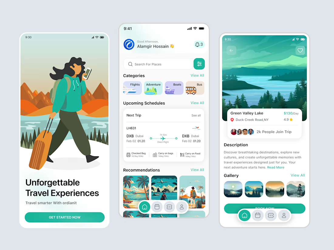
✈️ Designed for Better Travel Experiences
What if planning your next adventure felt as exciting as the journey itself?
Introducing a modern Travel App UI/UX concept by OrdainIT, designed with intuitive navigation, beautiful destination discovery, trip schedules, and personalized travel recommendations.
✨ Design highlights:
Clean, user-friendly mobile interface
Smart trip planning and schedules
Beautiful destination exploration
Travel recommendations and booking experience
Modern visuals with a refreshing color palette
The goal: make every journey easier to plan and more enjoyable to explore.
💬 What’s the one feature you’d love to see in your ideal travel app?
#UIUXDesign #MobileAppDesign #TravelApp #ProductDesign #Figma #OrdainIT