The network for creativity
Join 1.25M professional creatives like you
Connect with clients, get discovered, and run your business 100% commission-free
Creatives on Contra have earned over $150M and we are just getting started
Back to feedPost
A client came to me with a notebook product.
Already had the idea. Already had a rough layout. Wanted help making it "look good."
I said — before we touch anything visual, let me ask you something.
Who fails with this product, and why?
He didn't have an answer. That's where the work started.
Step 1: Diagnose what's actually broken
The space he was entering — decision journaling — already had players. Notebooks, planners, frameworks. People were buying them.
But buying wasn't the problem. Using was.
So I mapped the failure pattern:
Person buys journal, starts strong for 3–5 days
Format is flexible, open-ended
Entries start mixing decisions with venting, ideas, to-do lists
Pages fill up but nothing is resolved
Person abandons it — not because they lost interest, but because they lost the thread
The product wasn't failing. The behavior the product was supposed to produce — was never defined.
Nobody had asked: what does a successful user actually do with this thing, week after week?
That one question changed the entire project.
Step 2: Reverse-engineer from the behavior, not the product
Most design processes go:
Product → Features → Positioning → Hope users behave correctly
I flipped it:
Target behavior → What enables that behavior → What blocks it → Build the constraints that make the right behavior the default
The behavior I was designing for: a person who makes a clear decision, names it, logs it, and reviews it.
That's it. Nothing else.
So every design decision got filtered through one question:
Does this make that behavior easier, or does it give the user a way to avoid it?
Blank pages? Avoided it. Cut.
Open prompts? Avoided it. Cut.
Optional reflection section? Avoided it. Made mandatory.
This isn't about being rigid. It's about understanding that flexible tools create flexible behavior — which in this case meant no behavior.
Step 3: Turn constraints into the actual design
Once the behavior was defined, the constraints wrote themselves:
Constraint 1 — Input type is fixed.
Only decisions go in this product. Not thoughts. Not tasks. Not feelings. If you're not logging a decision, you're using it wrong.
This sounds obvious. But it's a hard call to make because it shrinks the audience. He pushed back. I held the line — because a product that does one thing well creates a user who does one thing well.
Constraint 2 — Every page asks a direct question.
Not "write about your week." Instead:
What are you committing to and why?
What would change your mind?
What did last week's decision cost or produce?
The page leads. The user responds. No wandering.
Constraint 3 — Bets are named before outcomes.
You log what you're backing and your reasoning before you know the result. This creates accountability that isn't social — it's structural. The page already knows what you said you'd do.
Constraint 4 — Reflection isn't optional.
It's a section on the same spread. Not a separate page, not a "monthly review." Right there, same week. Because if reflection is optional, it gets skipped. If it's skipped, the feedback loop breaks. If the feedback loop breaks, the behavior doesn't compound.
Each constraint came from understanding where behavior breaks down — not from aesthetic preference or market research.
Step 4: Position it before anything else
Here's where most product builders get this wrong.
They build first, then ask: how do we describe this?
But the name and frame aren't marketing. They're behavioral priming. The word someone uses to describe a product determines how they use it.
We tested three directions:
"Decision Journal" — accurate, forgettable. Sounds like everything else. User picks it up thinking I'll write in this when I feel like it.
"Clarity Planner" — softer, vaguer. Positions it as a self-help object. Wrong identity.
"Ledger" — this one landed.
A ledger carries weight that a journal doesn't. A ledger is a record of commitments. You don't doodle in a ledger. You don't skip entries. When someone picks this up and the word ledger is in their head — before writing a single word — they've already shifted their posture.
That's what positioning is supposed to do. Not describe the product. Prime the behavior.
The name became the first design decision, not the last.
Step 5: Design for retention without any digital hooks
This is the part most physical product designers never think about because they borrow retention logic from apps.
Apps use: streaks, notifications, social pressure, gamification.
A physical object has none of that. It just sits on a desk.
So the question became: what makes someone come back to a physical object, week after week, without being reminded?
The answer isn't habit. Habits break.
It's identity.
Here's how that was built into the product:
The language throughout the product refers to the user as a decider. Not "journaler," not "planner." Every prompt, every section header, every piece of copy is written to the person they're becoming — not the person they are right now.
After two weeks of consistent use, something shifts. The user doesn't think "I should write in my journal." They think "I haven't logged this week's decision yet."
The gap feels wrong to them — not because of external pressure, but because their self-concept has updated.
A decider logs decisions. That's what deciders do.
That's a different retention mechanism than any app can build. Because it's not about the product anymore — it's about who they are without it.
Each layer feeds the next. Design without positioning is guessing. Positioning without behavior design is branding on top of a broken product. Retention without identity is just notification spam.
They're one system. Built together from the first conversation.
This is what the work actually looks like — before a single visual is made.


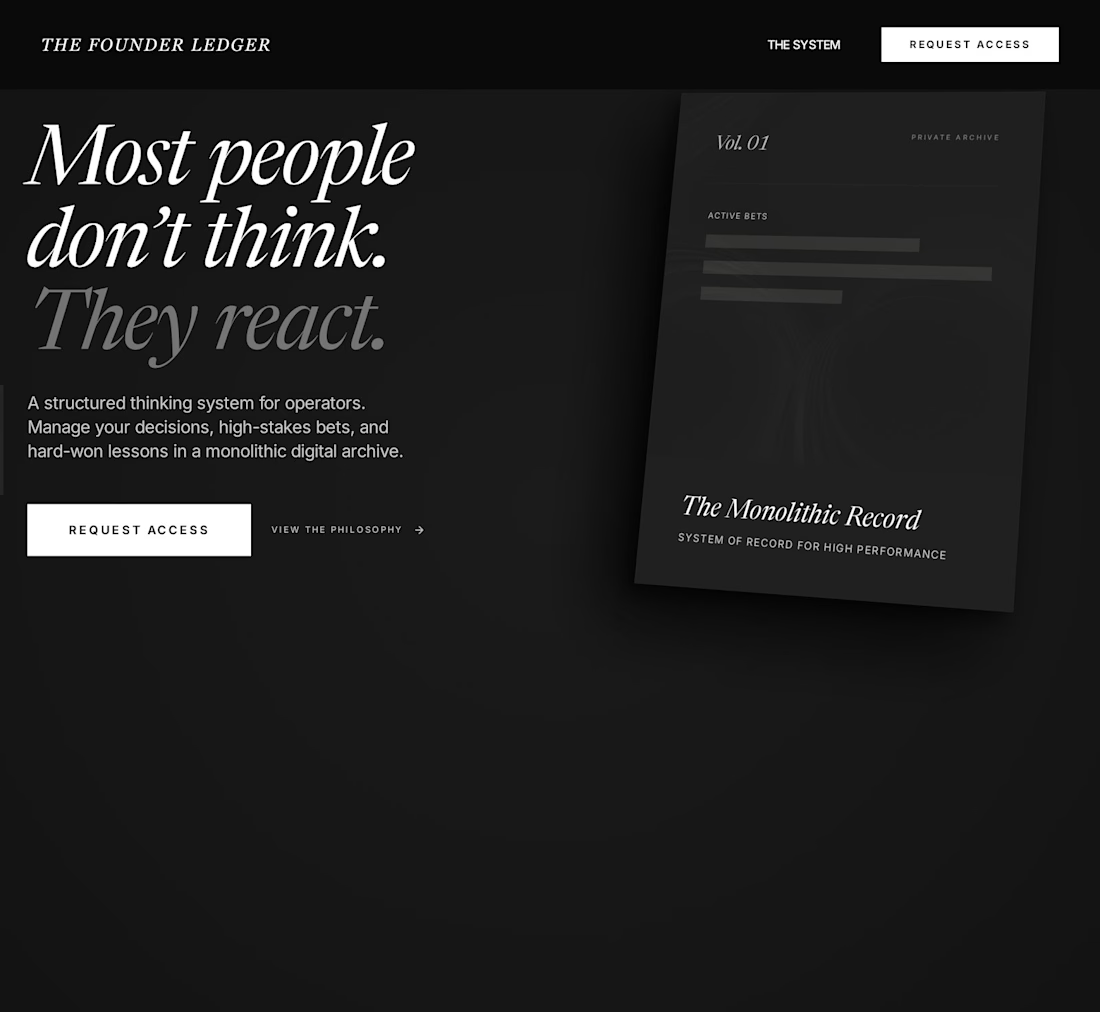
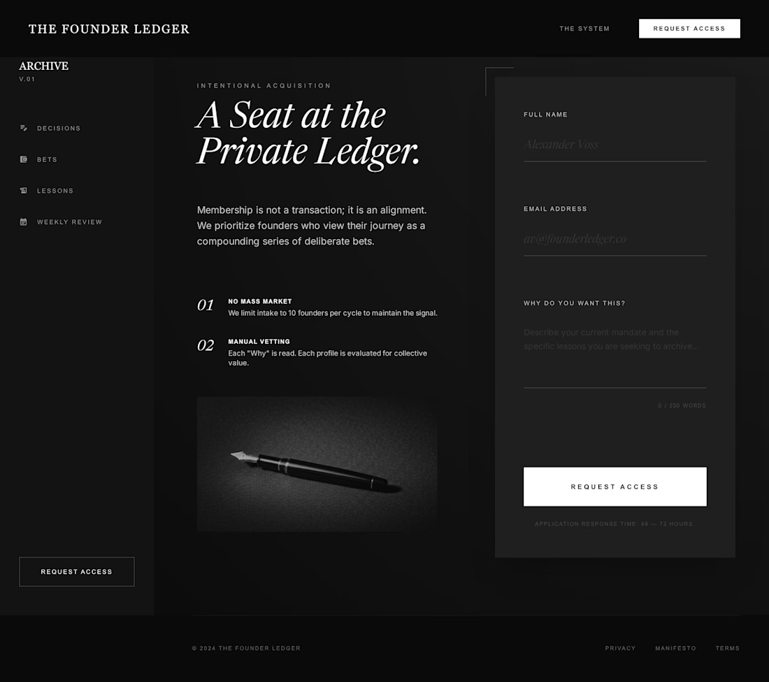
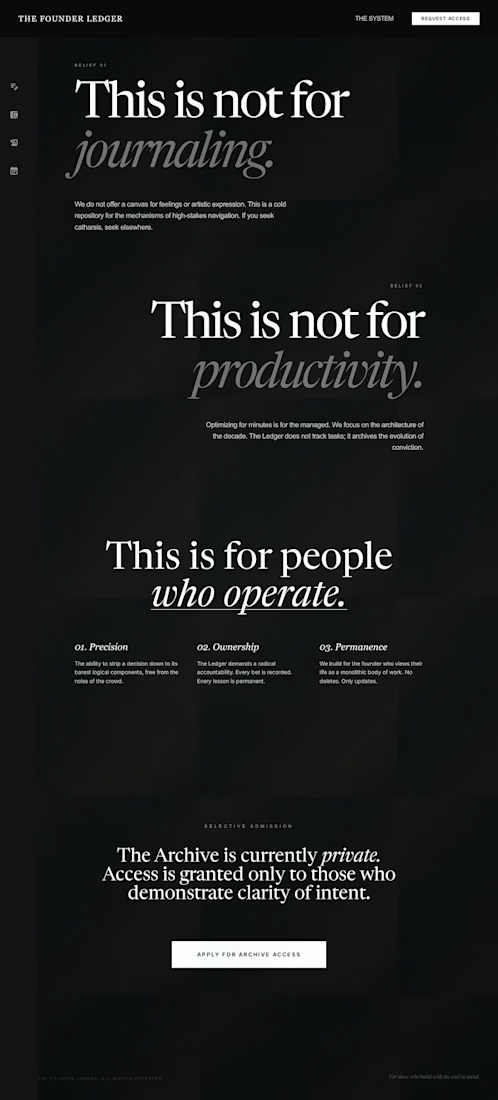
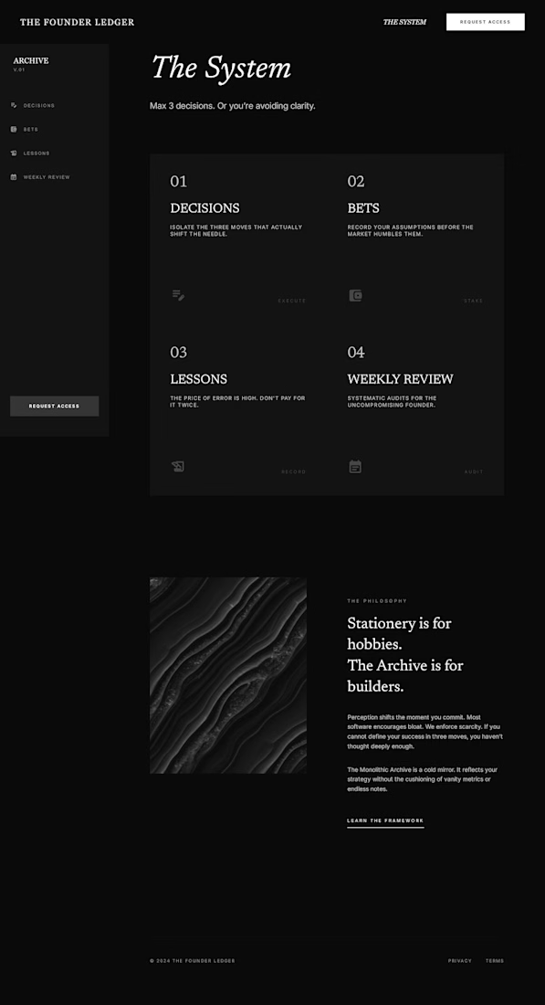

Most people hire for the deliverable — the logo, the deck, the website.
What they actually need is someone who diagnoses why the product isn't working the way it should — before touching anything visual.
That's the work that happens before the work.
Design is the last 20%. The 80%...
The network for creativity
Join 1.25M professional creatives like you
Connect with clients, get discovered, and run your business 100% commission-free
Creatives on Contra have earned over $150M and we are just getting started
Related posts


New Framer template WIP at Studio Duo
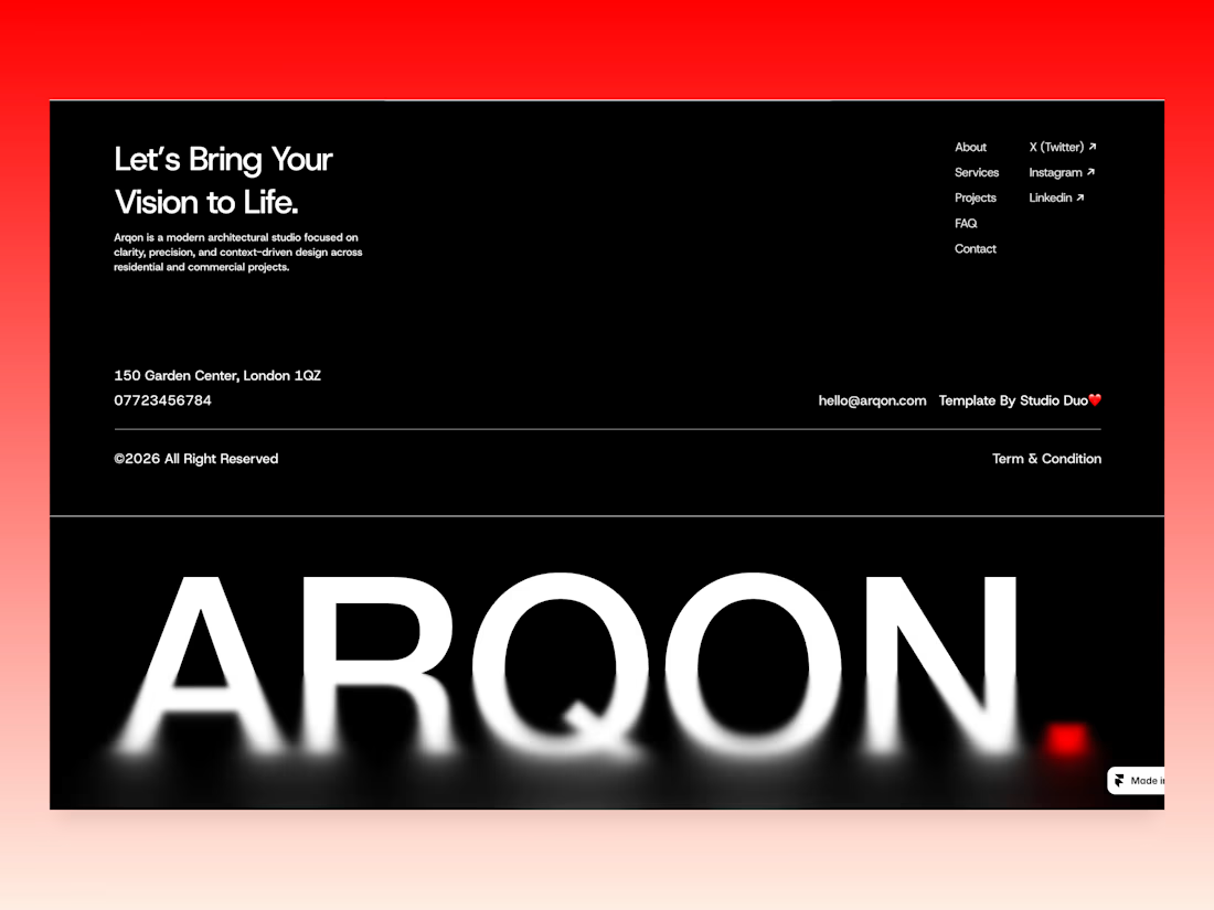
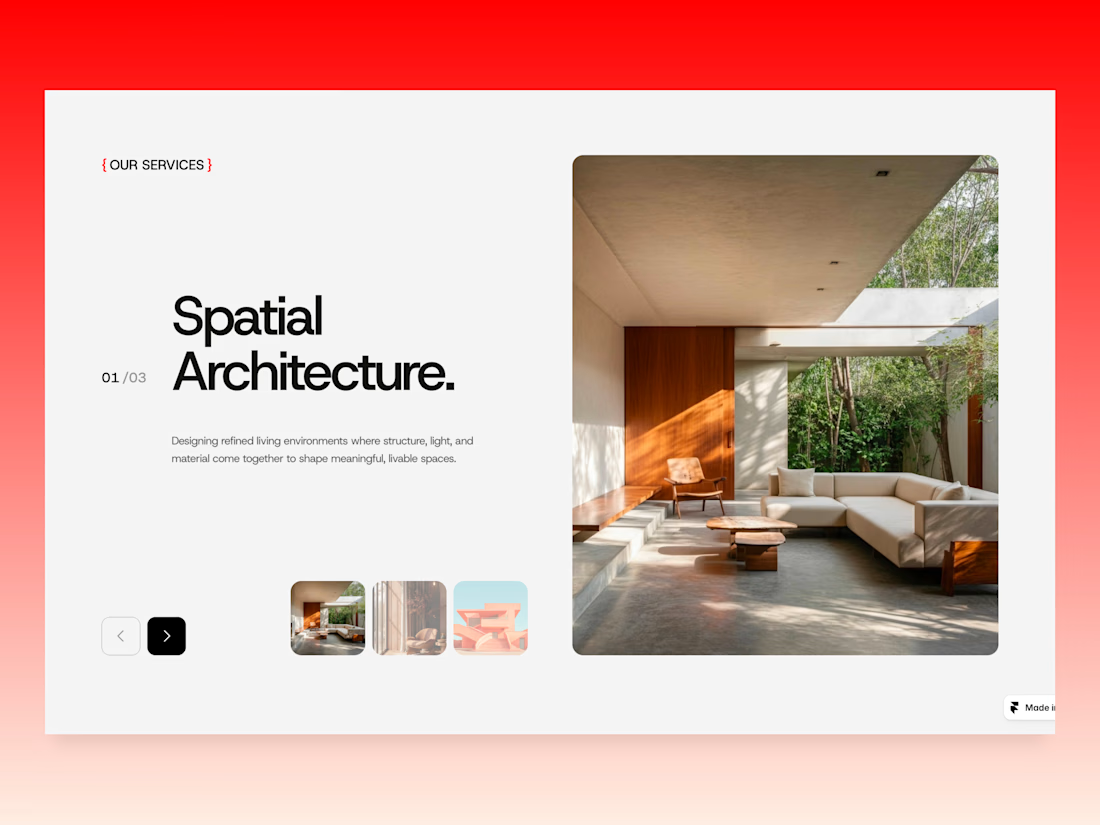
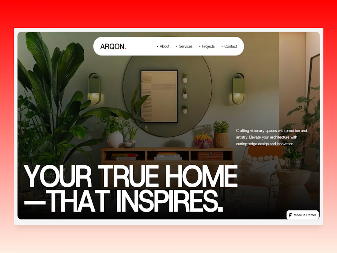
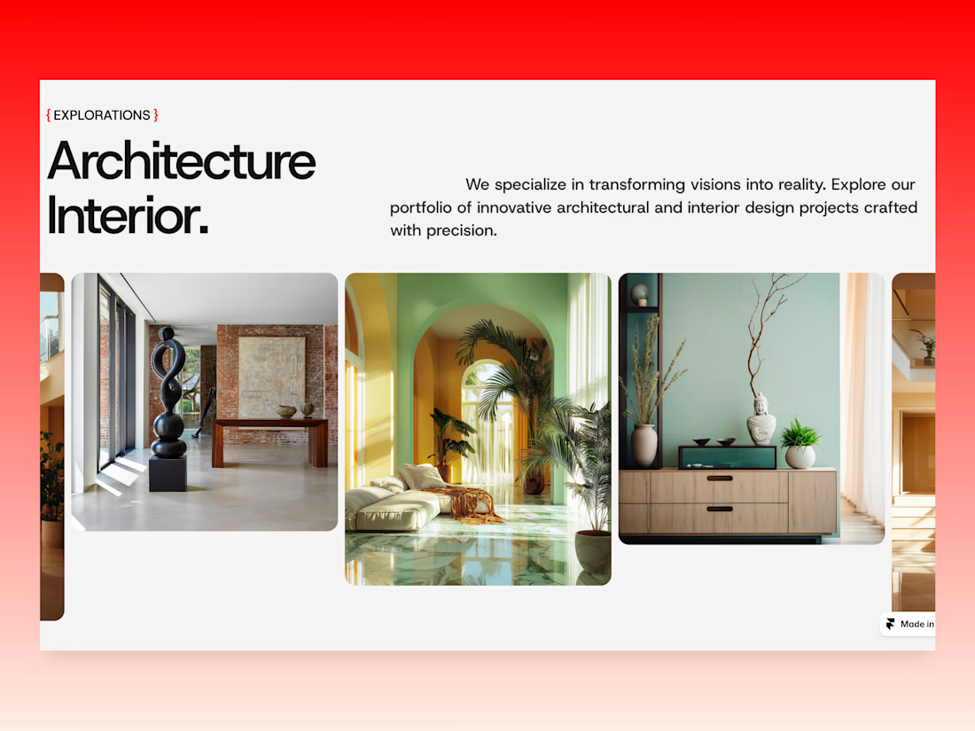
Arqon Studio approaches architecture as a dialogue between space and lifestyle.
Creating homes that inspire through thoughtful design and modern simplicity.

Wow, really nice layout

Good motion isn't just about animating every single element.
Small details, layered animations, rhythm, timing, meaningful direction, it all adds up.
That’s the goal behind this Relay motion exploration.
Sound on 🔊


The design aesthetic is top tier!

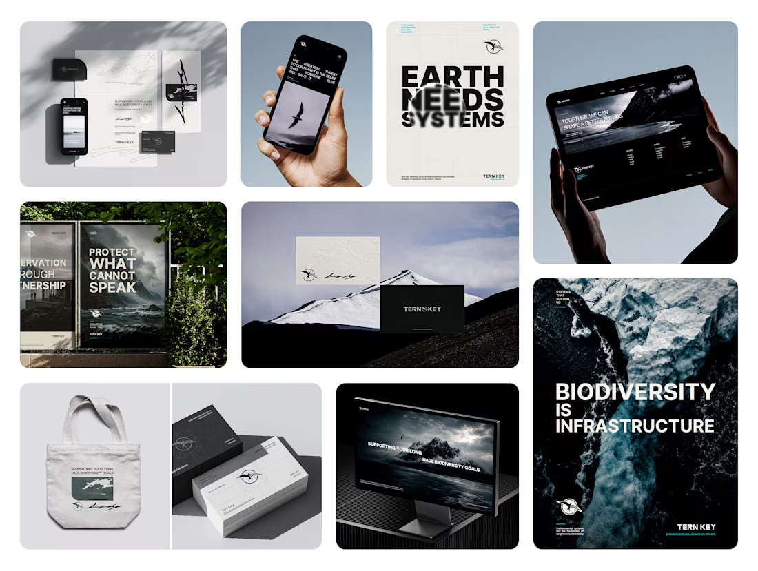
Tern Key
Tern Key is a contemporary environmental organization focused on building structured conservation partnerships through strategy, research, and visual communication.
The identity system combines cinematic environmental storytelling with a refined editorial approach, creating a visual language that feels both institutional and emotionally immersive.
From motion direction to typography, every element was designed to reflect clarity, scale, and long-term environmental impact.
Now live on @behance — Full project in my bios.
2026© AMNE Studio.
Enmanuel Jimenez V.
Jv® Studio. —
All rights reserved.










Trending

Claude
Claude has entered the design space. How are you using Claude Design?

Contra University
Learn from expert creatives how to earn more using next-gen AI tools.
creativeaiflow
Creative AI workflows are evolving. What tools do you use, and what are their strengths and weaknesses?
portfolioreview
The best portfolios tell a story, not just show a grid. Share yours for feedback.
freelancerlife
Freelancer life is wins, pivots, and everything in between. What’s yours right now?