The network for creativity
Join 1.25M professional creatives like you
Connect with clients, get discovered, and run your business 100% commission-free
Creatives on Contra have earned over $150M and we are just getting started
Back to feedPost
AI made every pixel. A human knew which ones to remove.


This one went right down to the wire. I hope everyone managed to get their entries in. I literally uploaded mine with 10 seconds left on the countdown.
Here’s the final project: Plantful - Make Room for More Life.
For this challenge, I began with a billboard exploration that...

Sharing socials: https://www.instagram.com/reel/DbSnCd0OkyX #envatochallenge
Sharing socials: https://youtu.be/p1EJ3idX2oI
Sharing socials: https://x.com/i/status/2082601145542099205
The network for creativity
Join 1.25M professional creatives like you
Connect with clients, get discovered, and run your business 100% commission-free
Creatives on Contra have earned over $150M and we are just getting started



Related posts

Behind the wall: a homepage concept for Studio Cesare
I’m testing a new landing page for my studio, made with Brik.
A pixel-brick grid covers the screen. Move through it and the bricks fall away to reveal the person behind the work, mid-coffee, slightly off balance. Then the wall closes again.
It’s a small metaphor for how I approach next-generation branding: a strong system on the surface, with a real person and a real point of view underneath.
Exploring this for the studio site launch. Open to feedback, and to new projects 🤝🏼

This is amazing!!

PREMIUM BRAND IDENTITY & MOCKUP COLLECTION


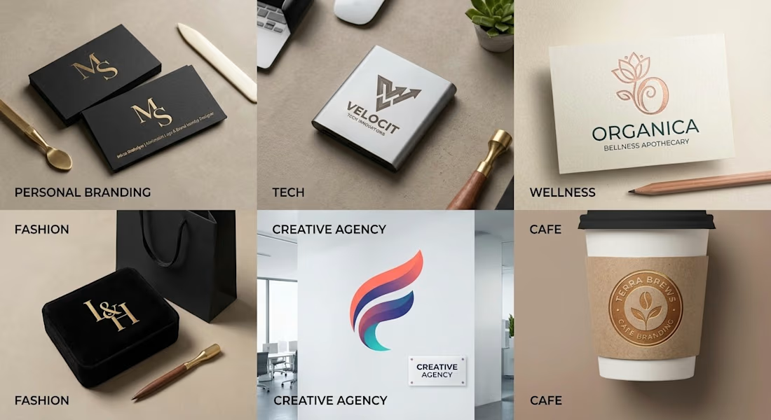

Clear Brand Identity + Clean MockUp = Premium Product

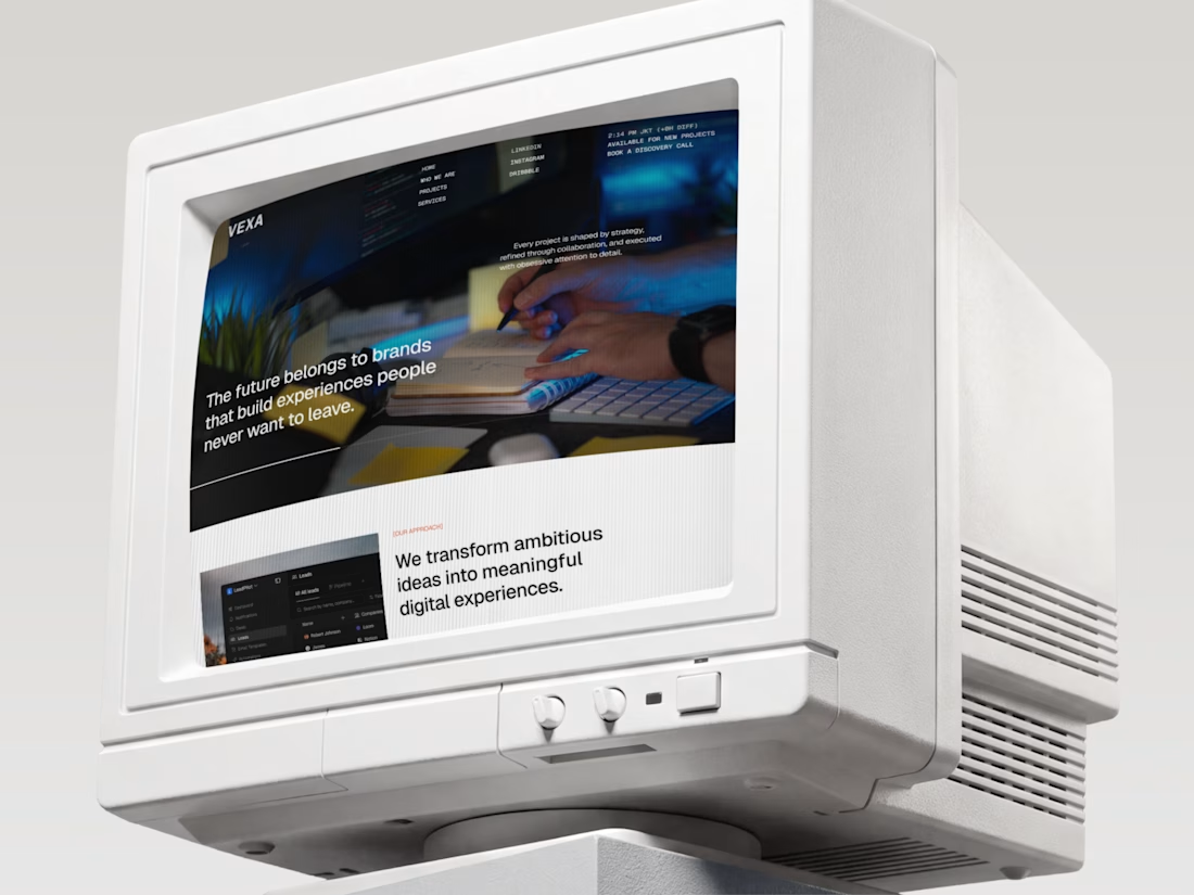
The future belongs to brands people never want to leave. 🖥️✨
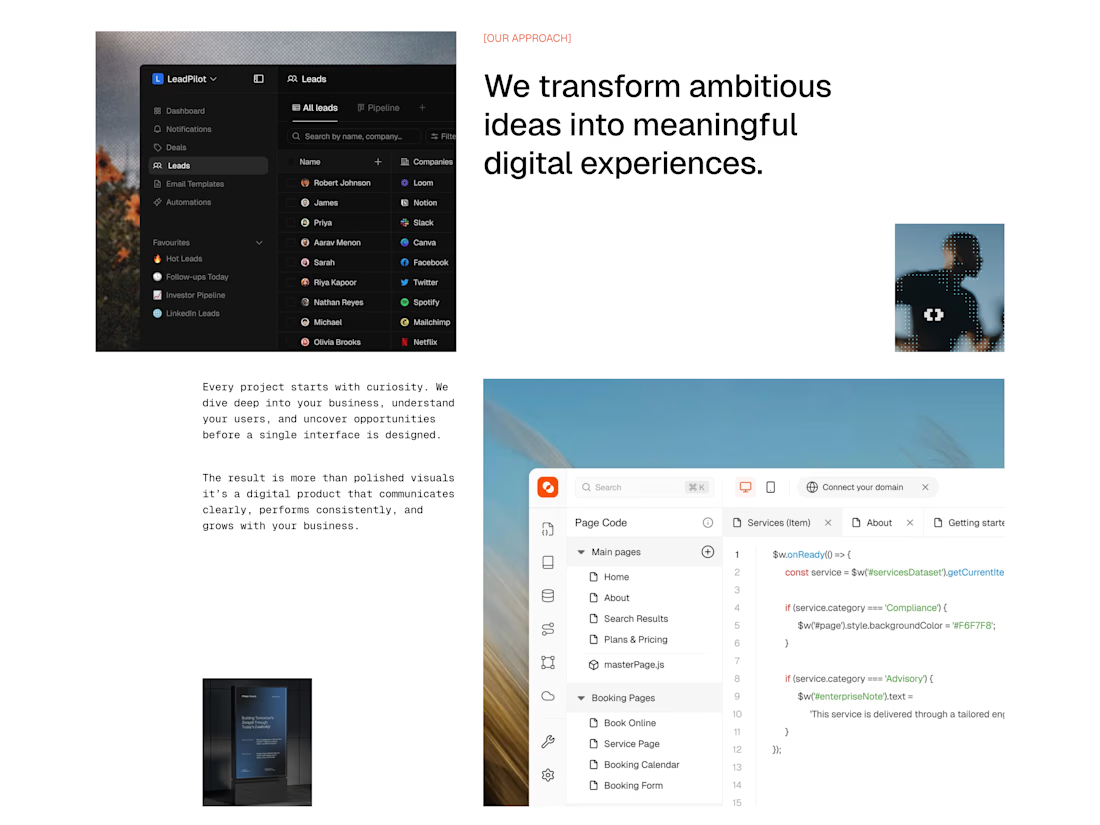
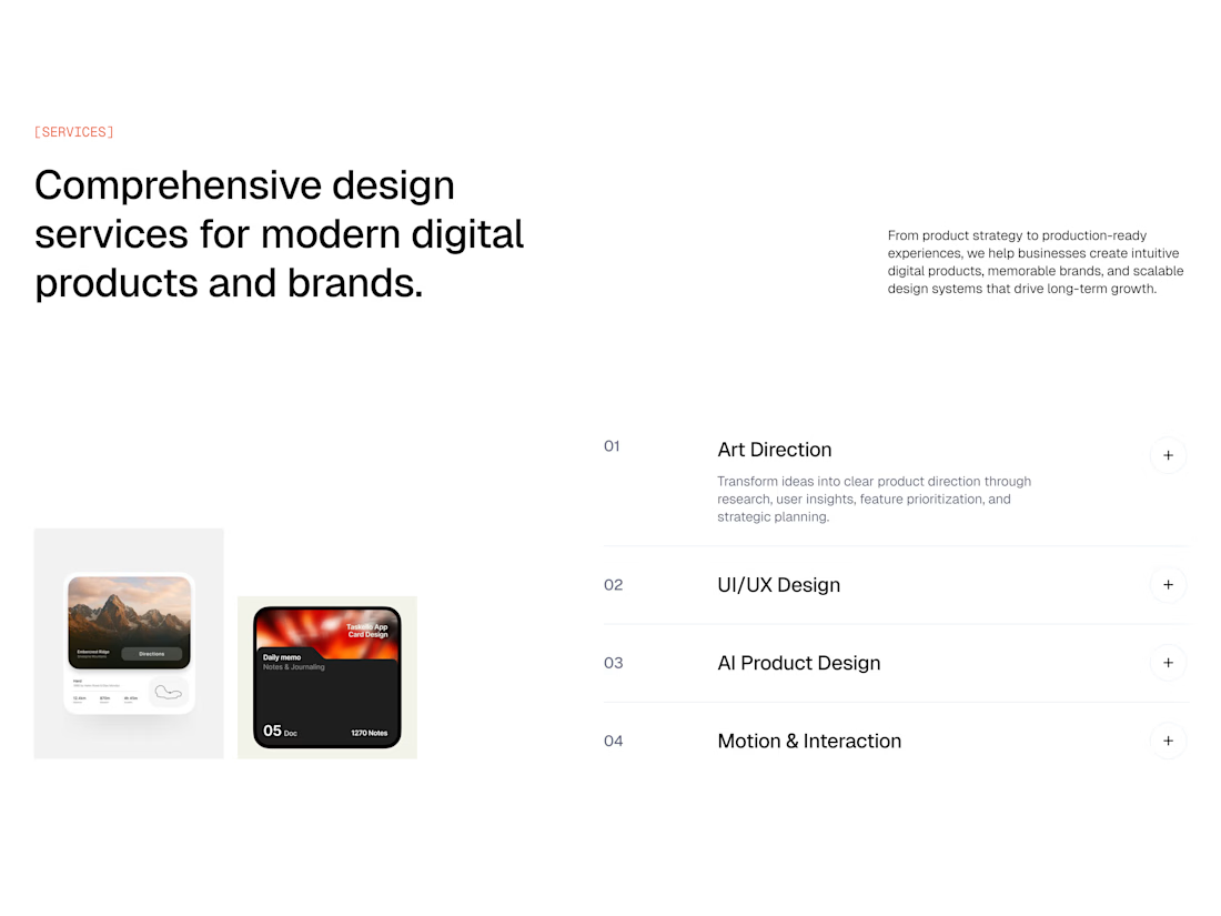
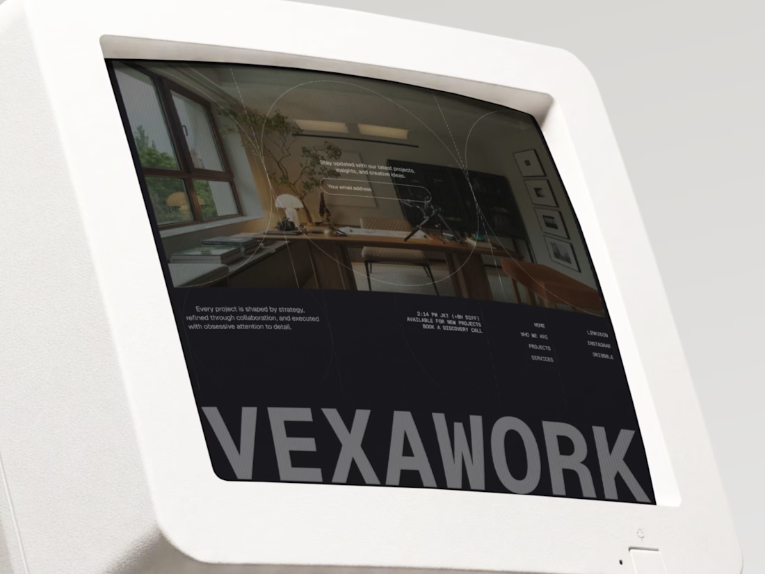
Meet Vexa, a landing page for a design studio that mixes modern UI with a nostalgic twist. Think crisp white layouts, typewriter-style details, and bold type, all shown on vintage CRT monitors that make the studio’s story feel unforgettable.
Swipe through the 4 frames to see the hero, the approach, the services, and the closing VEXAWORK screen. 👀
Retro monitors or modern devices: which would you use to show your work? Tell us in the comments! 💬👇
#UIDesign #UXDesign #WebDesign #LandingPage #DesignStudio #RetroDesign #BrandIdentity #PortfolioDesign