The network for creativity
Join 1.25M professional creatives like you
Connect with clients, get discovered, and run your business 100% commission-free
Creatives on Contra have earned over $150M and we are just getting started
Back to feedPost

What if your brand identity could move?
Working with jewelry brands teaches you that every detail carries emotion, the color, the texture, the mood.
This is a creative experiment inspired by the world of luxury jewelry I've worked with.
The network for creativity
Join 1.25M professional creatives like you
Connect with clients, get discovered, and run your business 100% commission-free
Creatives on Contra have earned over $150M and we are just getting started



Related posts

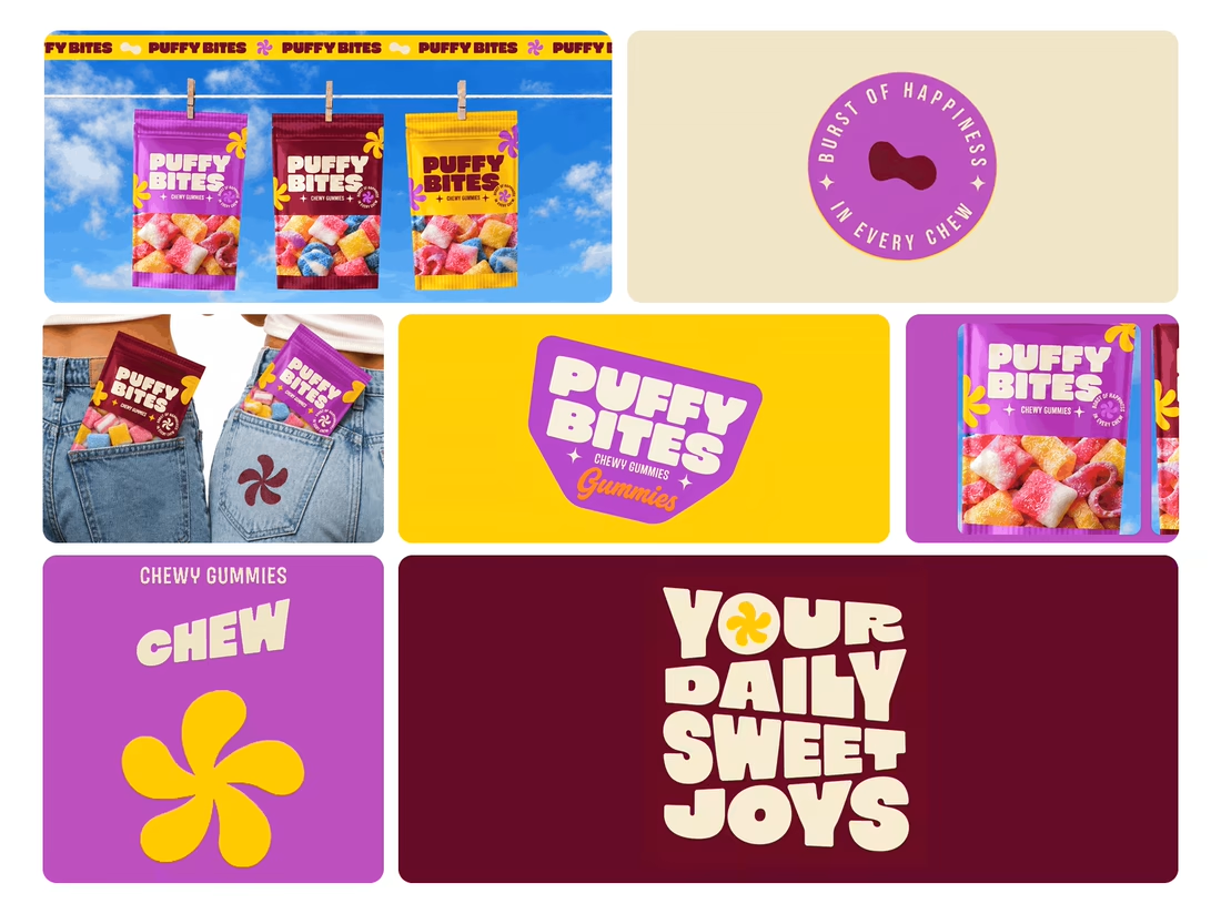
What makes a candy brand recognizable across every pack?
For Puffy Bites, I built the identity around rounded lettering, expressive symbols, and a palette of burgundy, purple, yellow, and cream.
The same visual language carries through pouch packaging, smaller wrappers, campaign imagery, and an animated brand showcase.
One design decision that ties it together: the packaging color changes, while the logo placement, product descriptor, and supporting graphics maintain a consistent structure.
I handled the full client project, from logo and visual identity to packaging and campaign applications.
Which colorway would catch your eye first—purple, burgundy, or yellow?
Explore the full Puffy Bites case study. If you’re developing a candy or snack brand, I’m available for branding and packaging projects.

Love it,
Great work

✨ New Year, on loop — literally.
This seamless sparkler-celebration character loop is built to run endlessly for New Year campaigns on TikTok, Reels and Meta — no cut, no restart, just continuous celebration.
Want a looping character video for your brand's next campaign? I create AI UGC product video ads from $50, first drafts in 48–72 hours, 2 revisions included.
https://contra.com/s/gXq6FWFe-ai-ugc-product-video-ad-for-tik-tok-reels-and-meta


If a logo had to tell what a brand does, Apple would be a fruit stand.
New on our blog: why comparing "logo + guidelines" with a branding process is comparing two different products, how to tell whether you need a new logo or a new brand, and why sometimes the professional move is to turn the work down.
A logo is the signature. The story is everything else. Read it here: https://ander.agency/blog-posts/branding-is-not-a-logo