The network for creativity
Join 1.25M professional creatives like you
Connect with clients, get discovered, and run your business 100% commission-free
Creatives on Contra have earned over $150M and we are just getting started
Back to feedPost

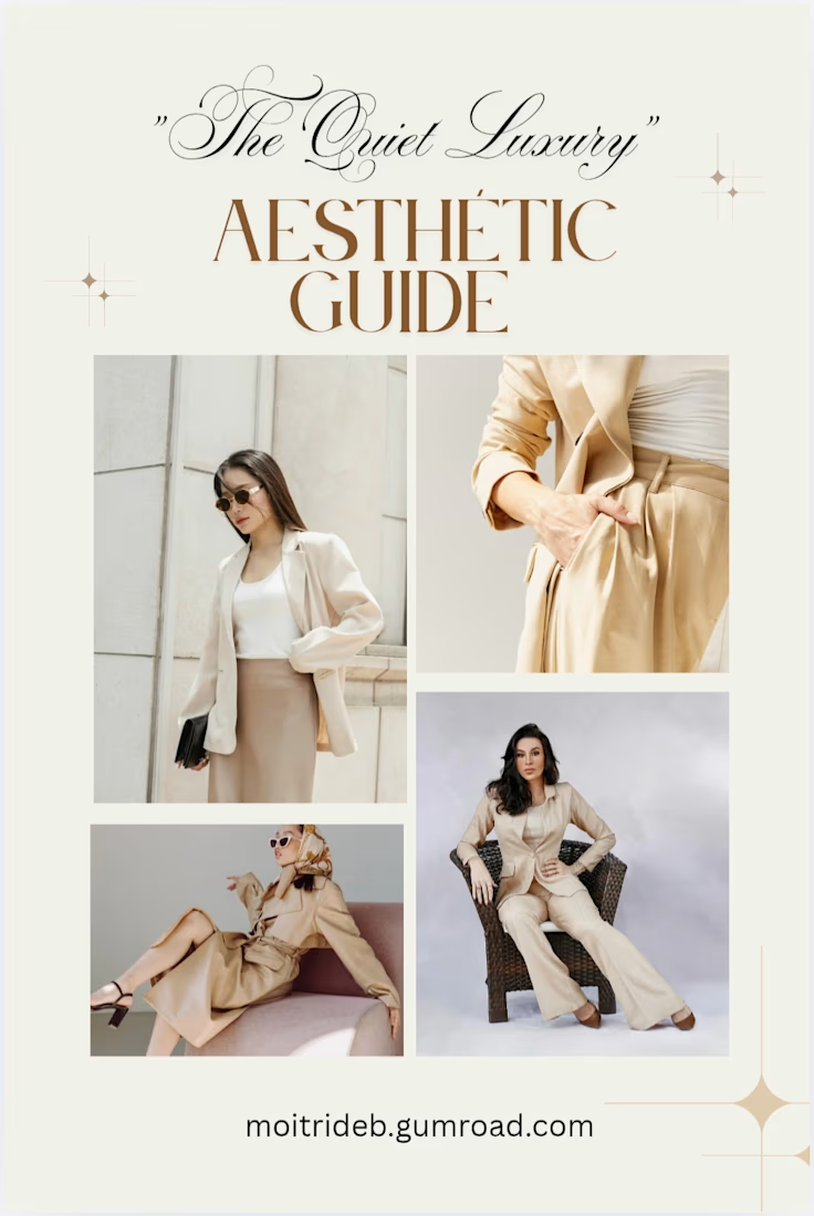
An aesthetic digital guide exploring the "Quiet Luxury" lifestyle. It covers how to live elegantly, style with a sophisticated touch, and embrace high-end minimalism without needing a massive budget.

The network for creativity
Join 1.25M professional creatives like you
Connect with clients, get discovered, and run your business 100% commission-free
Creatives on Contra have earned over $150M and we are just getting started

Challenges
View all


Related posts

Luxury Fashion E-commerce Landing Page
A premium e-commerce website concept created for a modern luxury fashion brand. The experience focuses on elegant visuals, refined typography, and an intuitive shopping journey that reflects the brand's premium identity.
Project Goal💯
The objective was to design a sophisticated online shopping experience that combines visual storytelling with seamless product discovery. Every section was crafted to highlight the brand's quality, build trust, and encourage conversions while maintaining a clean, minimal aesthetic.


Stunning work

Branding & Packaging Design for Glowy


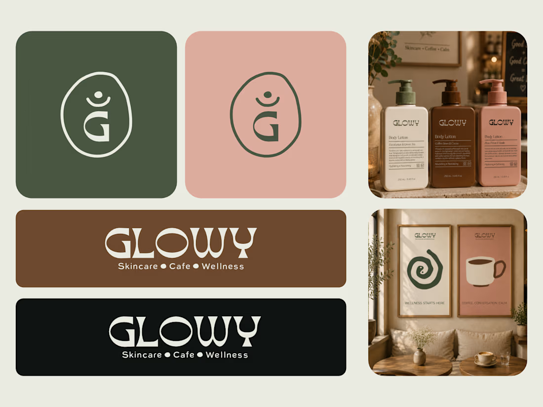

This is great! Something about it makes it have an African vibe

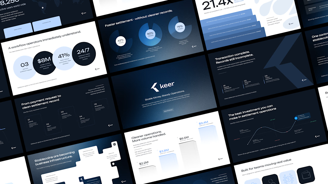
Minimalism isn't a style choice. It's a discipline.
Anyone can strip a slide down to one line and call it clean. The harder part is knowing what to keep, and why every element that stays has a reason to be there.
This deck runs on that principle. Dark base because contrast is the fastest way to direct attention. One accent color because more than one is a decision you haven't made yet. Grid-locked layouts because when the structure holds, the content doesn't have to fight for space.
I design across industries. Tech, finance, healthcare, consumer brands. But there's something about high-stakes products, the ones where a single presentation can move serious money, that pushes the design thinking further.
This is one of those.
I didn't design this to look like a fintech deck. I designed it to look like a decision has already been made, and the slides are just showing you why.
Does the vibe land for you?
Full case study Keer



minimalism is a discipline,, 100% agree