The network for creativity
Join 1.25M professional creatives like you
Connect with clients, get discovered, and run your business 100% commission-free
Creatives on Contra have earned over $150M and we are just getting started
Back to feedPost

The network for creativity
Join 1.25M professional creatives like you
Connect with clients, get discovered, and run your business 100% commission-free
Creatives on Contra have earned over $150M and we are just getting started





Related posts

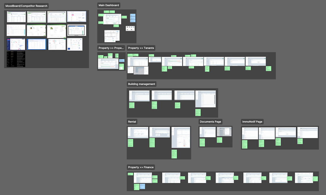
UX Audit: ImmoAdmin (Property Management SaaS)
-> UX issues mapped with improvement notes
-> Competitor research & mood board
-> 8 modules audited screen by screen
-> Wireframes with cleaner flows


Really thoughtful approach to simplifying complex SaaS flows. 👏

Share my SaaS experiment here.
Loyalty SaaS I built end to end: cashback, points and stamps on one card in Apple Wallet and Google Wallet, plus POS and CRM integrations.
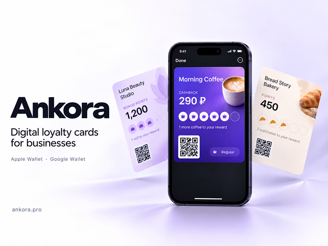

This is clean! Love how you simplified cashback + stamps into one Wallet card. The Ankora branding with the coffee mockup is super premium. Did you build the POS integration yourself? Very impressive end-to-end build!

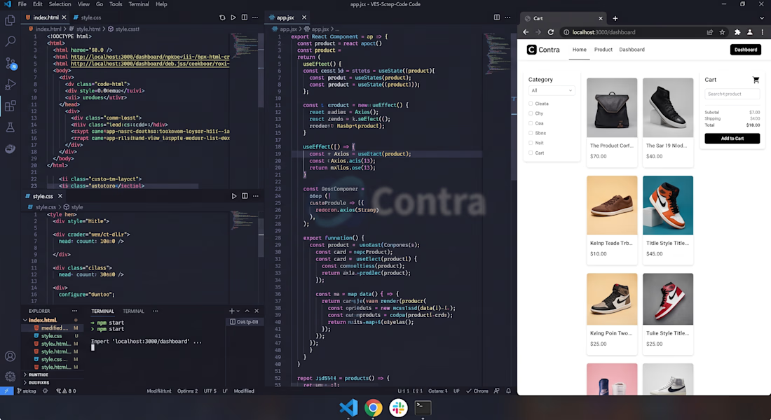
Just finished building this modern, responsive e-commerce dashboard using React, HTML, and CSS! Featuring dynamic product grids, category filters, and seamless cart management. Open for web development projects and custom UI designs! 🚀