The network for creativity
Join 1.25M professional creatives like you
Connect with clients, get discovered, and run your business 100% commission-free
Creatives on Contra have earned over $150M and we are just getting started
Back to feedPost
Taste Test

A or B? 🎾
Working on the hero section for a tennis club landing page. Trying to decide if a high-motion athlete shot or a clean, atmospheric court shot resonates more.
Which one would make you want to "Join the Club"?
12 voted
57%
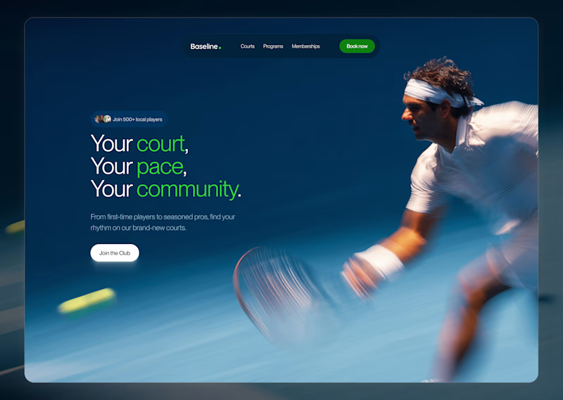
9 voted
43%
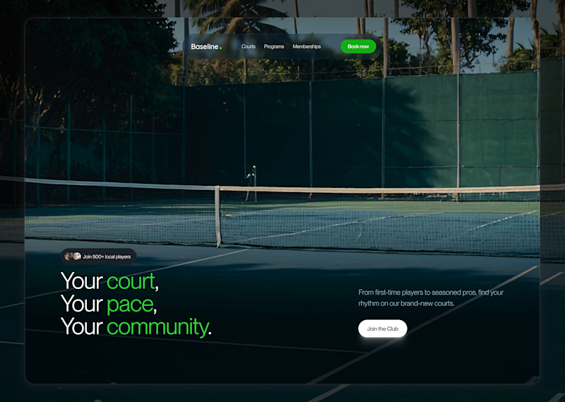
21 votes
Closed

The human element just does it for me
Thank you so much for the feedback😊
You're welcome

Definitely A
Thank you, but why tho?
Just from a glance i already understood the message before reading, B i'd say doesn't look very familiar

Thank you, but why A?

Both options are solid but I am leaning towards the atmospheric court shot. It sets the whole mood and makes you feel like you are already there. The copy works so well with both though. Nice work!
Thank you so much for this detailed thought😊

I’d go with Option A. You can immediately see what the page is selling and the goal it’s trying to achieve. The other one feels more like an empty space, the image doesn’t really add much to the message.
Oh okay, thank you so much😊

Good job on the two screens
I’m definitely going with A
Thank you so much😊
But why A?
The screen is clear , with A you get a glimpse of what the section is all about.
Alright, thank you

Definitely A for me. The motion blur looks fantastic and gives it a very high-end sports brand feel.
Thank you so much, I appreciate your thought on this😊
The network for creativity
Join 1.25M professional creatives like you
Connect with clients, get discovered, and run your business 100% commission-free
Creatives on Contra have earned over $150M and we are just getting started

Challenges
View all


Related posts

Design Exploration: Hero Section of Architecture Website. Which one do you think much better?


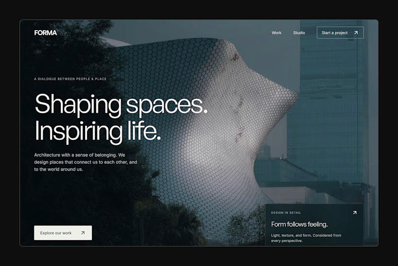
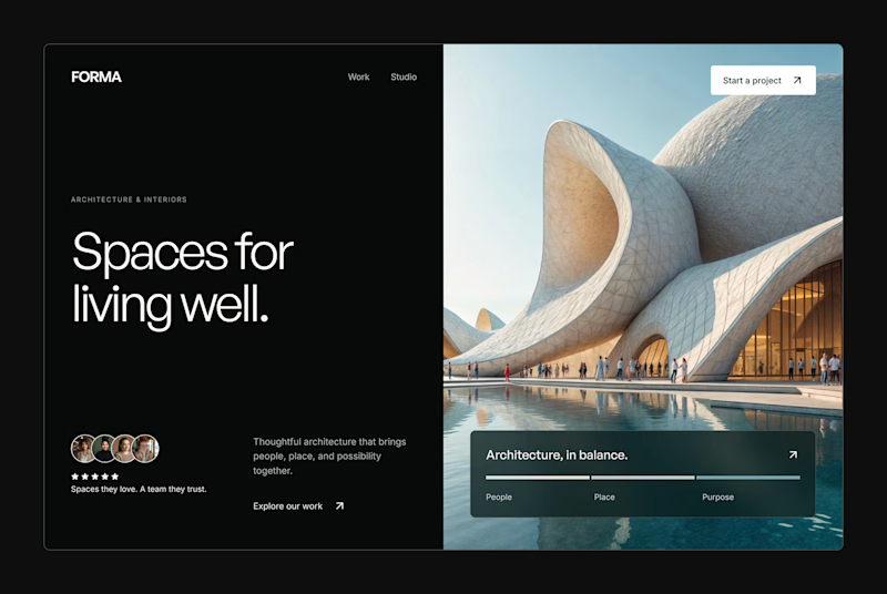
1 vote
Ends in 1d

Which shot hits hard?
GOT themed short film drooping soon!

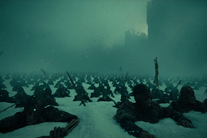
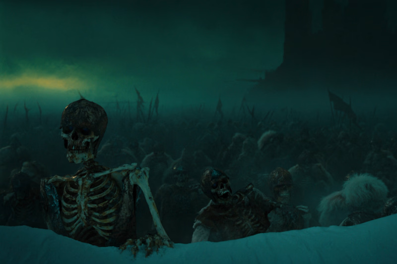
2 votes
Ends in 1d


the skeleton in the snow on shot 2 gets me. that one


Your Hero Section Has One Job: Be Clear.
You don’t need huge headlines or long explanations. You need the right image + short headline + clear offer.
For the first version, we worked on the branding, the image and the copy together, so at first glance it’s clear: this is a makeup course, and here’s what you’ll get.
The second version is still beautiful and still feels like beauty. But what are you actually getting? A makeup course? Products? A store? That’s the problem with a Hero that looks good but isn’t thought through.
Your first screen doesn’t need to say everything. It just needs to say the right thing.

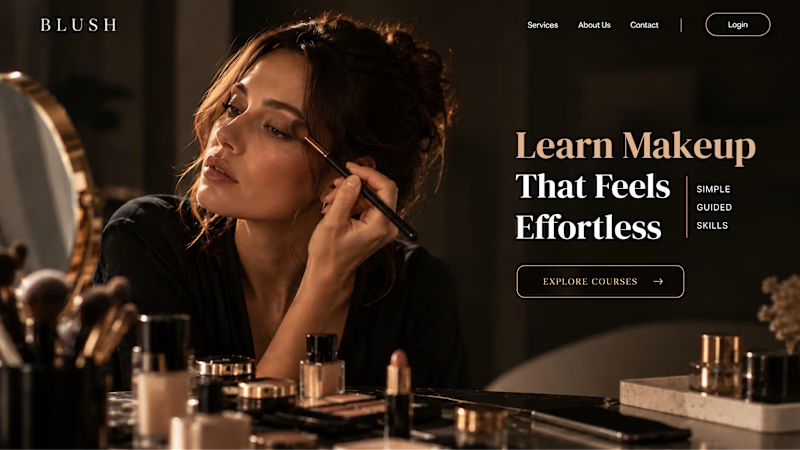
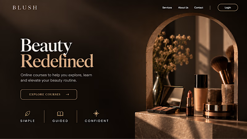
22 votes
Ends in 1d
