The network for creativity
Join 1.25M professional creatives like you
Connect with clients, get discovered, and run your business 100% commission-free
Creatives on Contra have earned over $150M and we are just getting started
Back to feedPost


The network for creativity
Join 1.25M professional creatives like you
Connect with clients, get discovered, and run your business 100% commission-free
Creatives on Contra have earned over $150M and we are just getting started
Challenges
View all


Related posts

What's your one-rule brand? Tell me.
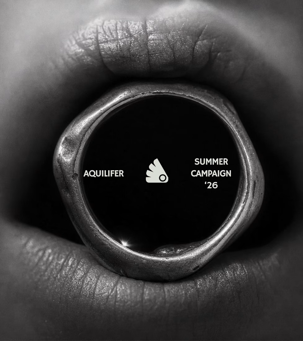
Most jewelry brands photograph the object. This one photographs the grip.
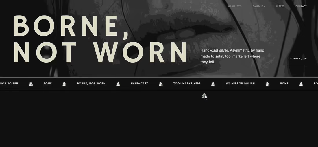
AQUILIFER — a brand I built around one idea: jewelry as something carried, not worn.
Case study + full site now live.
The name comes from Roman military rank. The aquilifer carried the standard — the one thing the legion couldn't afford to drop.
That single word killed my first direction before I'd finished it.
No polish. No faceted stones.
Hand-cast, asymmetric pieces, tool marks left visible.
Photography went extreme macro, unretouched skin, hands gripping the face instead of posing near it.
Color system: two darks instead of one dark + accent.
#1E1E1E and #27331A let the brand shift register — campaign world to product world — without ever going light.
#D9DED4 stays structural only. Never a fill.
Motion rule on the site: diagonal masks only. No rotation, anywhere.
A spinning object reads as being shown off. This brand is about weight, not display.
Same angle, same easing, top to bottom.
One idea, held all the way through — name, object, photography, palette, motion.
That's the whole pitch for how I work.

Absolutely love your works!
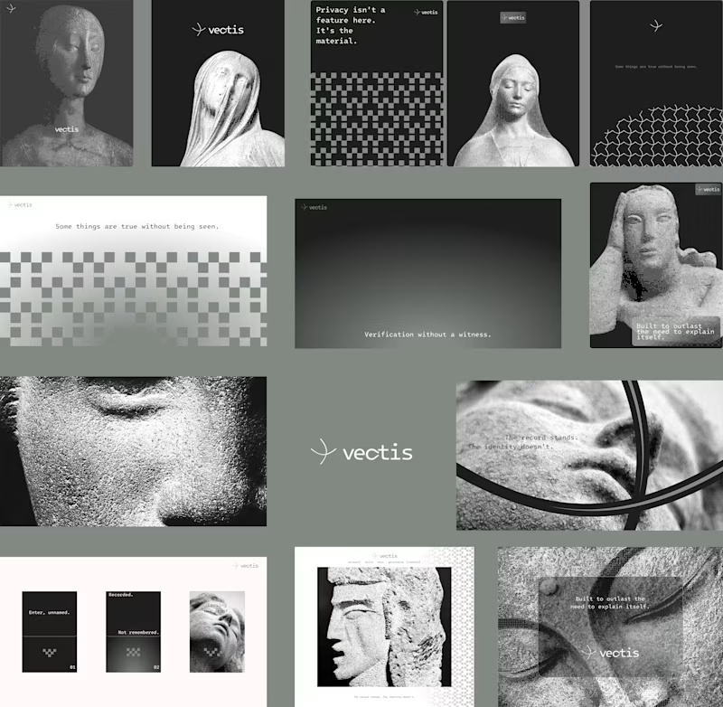
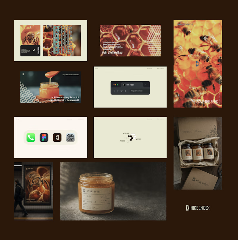
Two case studies, two totally opposite registers.
One is carved in stone and says nothing.
One drips off a spoon and won't shut up about which field it came from.
Which one do you want first?
vectis — zero-knowledge privacy, dithered like a forgotten statue
HIVE INDEX — raw honey with a paper trail. No two lots taste the same, and we don't correct for that.
45 voted
51%
43 voted
49%
88 votes
Closed

Vectis

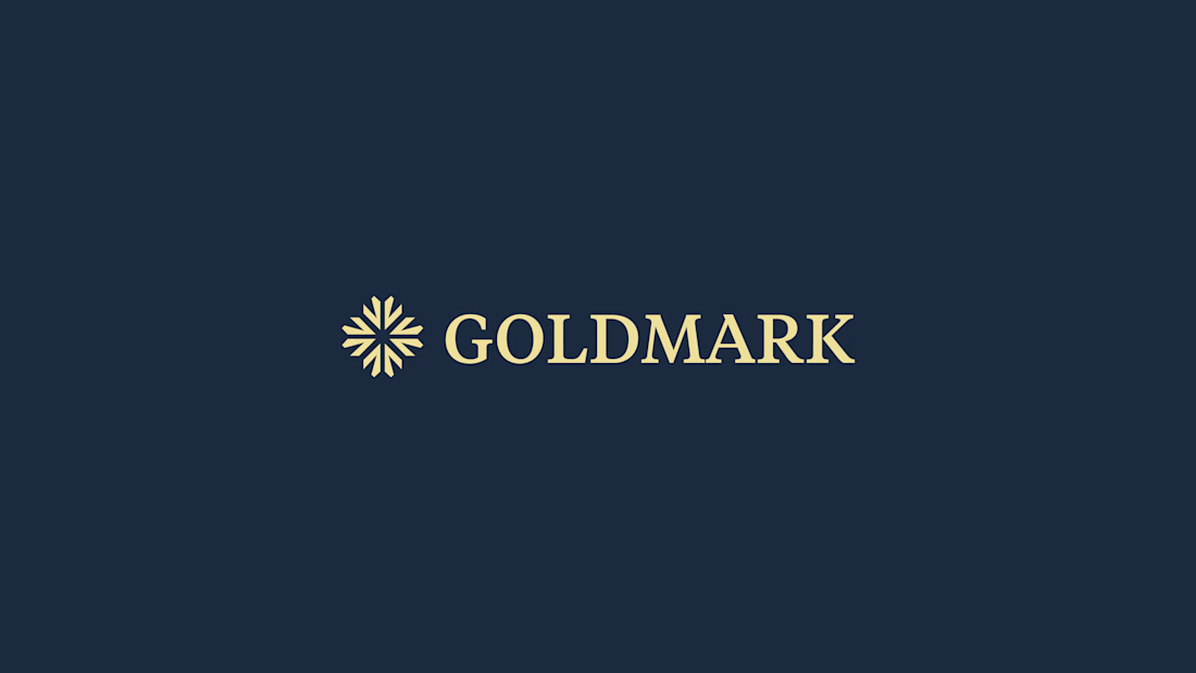
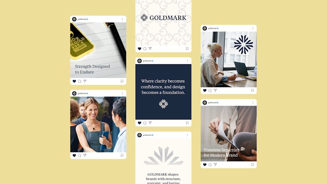
GOLDMARK - A refined identity for modern legal expertise. ✦
A complete branding exploration focused on building a visual language that feels premium, trustworthy, timeless, and confident.
The identity combines a distinctive symbol, elegant typography, and a deep navy + warm gold palette to create a sophisticated presence across digital and print applications.
Services: Brand Identity • Logo Design • Art Direction • Visual System
#BrandIdentity #BrandDesign #LogoDesign #VisualIdentity #Branding #GraphicDesign #ContraPortfolio