The network for creativity
Join 1.25M professional creatives like you
Connect with clients, get discovered, and run your business 100% commission-free
Creatives on Contra have earned over $150M and we are just getting started
Back to feedPost

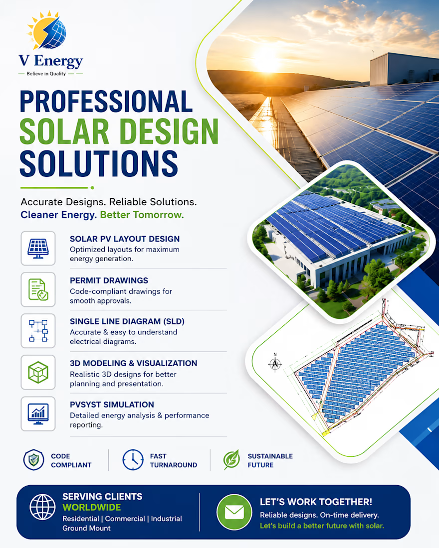
From Concept to Installation-Ready Solar Designs
A great solar project starts with a precise design.
I help solar installers, EPC companies, and renewable energy businesses transform ideas into accurate, installation-ready engineering designs.
My Services:
🔹 Solar PV Layout Design
🔹 Permit Drawings
🔹 Single Line Diagrams (SLD)
🔹 3D Solar Modeling & Visualization
🔹 PVsyst Energy Simulation
🔹 Residential, Commercial & Industrial Solar Projects
Every design is created with a focus on:
✔ Maximum energy generation
✔ Efficient roof space utilization
✔ Code-compliant engineering
✔ Fast turnaround time
✔ High-quality deliverables
🌍 Available for remote projects worldwide.
If you're looking for a reliable Solar PV Design Engineer to support your next project, I'd be happy to help.
📩 Let's connect and build smarter solar solutions together.


The network for creativity
Join 1.25M professional creatives like you
Connect with clients, get discovered, and run your business 100% commission-free
Creatives on Contra have earned over $150M and we are just getting started

Challenges
View all


Related posts


👍


this awesome


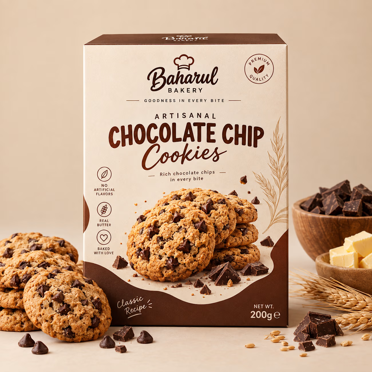
Most cookie packaging on shelf leans loud and cluttered — I wanted to see
what happens when you strip that back and let the product feel premium
instead of just sweet.
This project started as a redesign exercise on an existing cookie packaging
concept. I kept the product category and target shelf context the same,
then rebuilt the concept from scratch: new color story, new typography
system, new material direction.
What changed:
— Concept shifted from playful/busy to minimalist and premium
— Palette rebuilt around cream, charcoal, and a warm gold accent
— Custom logotype and clean geometric type system
— Matte textured finish to signal quality over sugar-rush energy
The result reads less like a snack and more like a gift — which is exactly
the shelf position a lot of artisanal food brands are chasing right now.
Open to redesign work like this for food, cosmetic, and skincare brands
looking to reposition their packaging. Let's talk about your product.
#Packaging Design, #Food Packaging, #Branding, #Product Design, #Label Design,#Package Mockup



The restraint here really works—the warm chocolate palette and generous negative space make the pack feel premium without losing the product cue. The ingredient callouts are a nice touch for quick shelf scanning.