The network for creativity
Join 1.25M professional creatives like you
Connect with clients, get discovered, and run your business 100% commission-free
Creatives on Contra have earned over $150M and we are just getting started
Back to feedPost

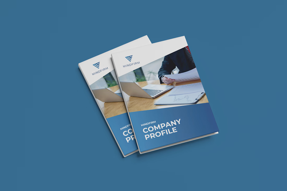
MindFirm — Corporate Company Profile & Capability Brochure Design
Subtitle / One-Line Summary
A modern, multi-page corporate company profile and capability brochure designed for MindFirm, establishing an authoritative corporate identity through clean editorial typography and structured data visualization.
Project Overview
MindFirm is a corporate consulting and advisory firm based in Saudi Arabia. The objective was to design a comprehensive company profile and capability deck to present to enterprise clients, prospective partners, and stakeholders.
The design challenge was to translate corporate messaging—including company values, service frameworks, and value propositions—into an executive-level publication that balances regional business standards with contemporary international layout aesthetics.
Role & Scope of Work
Role: Lead Publication & Layout Designer
Services:
Multi-page Editorial Layout Design
Information Architecture & Section Hierarchy
Custom Infographics & Process Diagramming
Imagery Curation & Framing Systems
Print-Ready Prepress & Interactive Digital Delivery
Design Approach & Execution
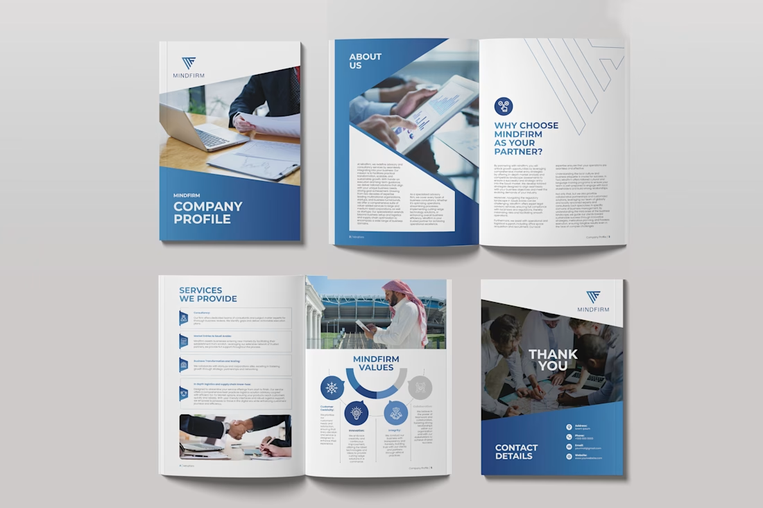
Geometric Brand Integration: Derived dynamic angular framing from the MindFirm logo icon, using sharp diagonal divisions across covers and inner spreads to create visual energy and brand cohesion.
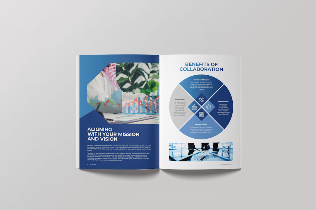
Corporate Hierarchy & Spacing: Built on a systematic grid system with clear typographic hierarchy, ample whitespace, and bold corporate blue tones balanced against neutral gray and white backgrounds.
Service Architecture & Infographics: Designed scannable service matrices with dedicated iconography and created a customized concentric "MindFirm Values" circular diagram to make organizational principles visually digestable.
High-Impact Corporate Imagery: Paired modern corporate photography with regional business imagery, reinforcing regional authenticity while maintaining an executive tone.
Technical Production: Developed complete Parent Pages, Paragraph/Character Styles, and color profiles in Adobe InDesign, ensuring smooth print preflight (CMYK with bleeds) and web-optimized interactive distribution.
Deliverables
Print-Ready Multi-Page PDF (CMYK, 300 DPI, Bleeds & Crop Marks)
Interactive Screen PDF (Clickable Navigation & Hyperlinks)
Master InDesign (.INDD) Source Template & Style Assets
Tools Used
Adobe InDesign (Grid Systems, Style Sheets & Multi-Page Layout)
Adobe Illustrator (Vector Diagramming, Values Wheel & Iconography)
Adobe Photoshop (Image Retouching & Composition)


The network for creativity
Join 1.25M professional creatives like you
Connect with clients, get discovered, and run your business 100% commission-free
Creatives on Contra have earned over $150M and we are just getting started











Related posts


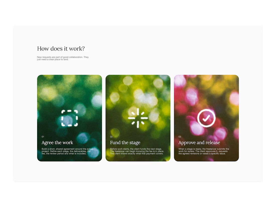

Your web sections always have such strong art direction. Great to see the brand carried right into the layout.

I created a brand identity concept for Velora, an AI productivity platform. I explored the logo, colors, typography, and how the brand could look across a website, mobile app, and everyday products. I wanted everything to feel consistent, modern, and easy to recognize.

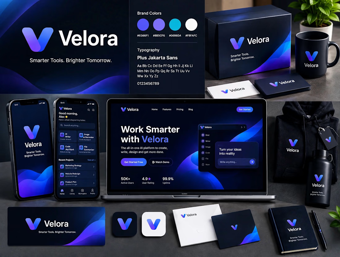

The blue is perfect for this. I’ve seen so many AI brands do boring black/white but this gradient gives it energy. And Plus Jakarta Sans was a great choice, keeps it friendly.

POLIDO — Brand Identity & Visual System
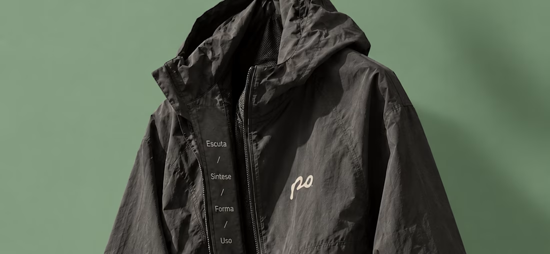
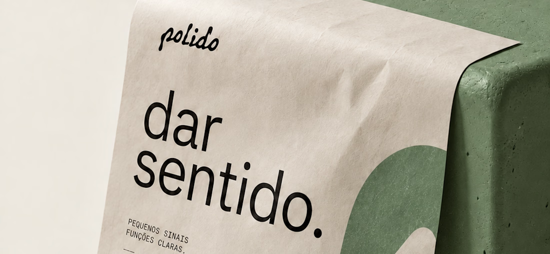
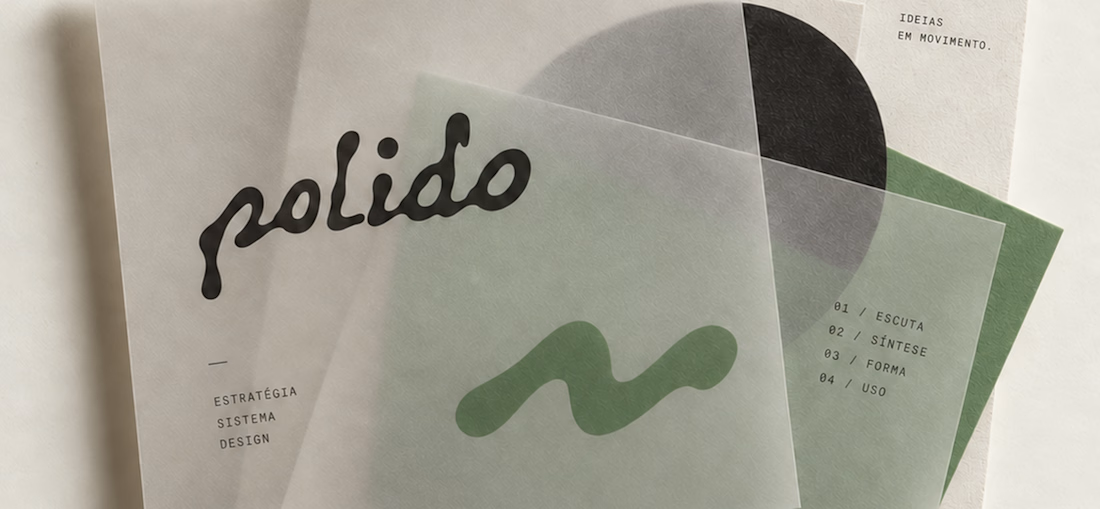
POLIDO is the visual identity of my independent brand design practice, shaped by a process of listening, synthesis, form, and use.
The identity brings together a hand-drawn signature, restrained typography, tactile materials, and a palette of warm paper, graphite, and Basil green.
From printed matter to apparel and physical applications, the project explores how a consistent visual language can adapt to different materials and contexts while maintaining its character.
Scope: Brand Strategy, Visual Identity, Art Direction, and Mockup Design.


High end branding