The network for creativity
Join 1.25M professional creatives like you
Connect with clients, get discovered, and run your business 100% commission-free
Creatives on Contra have earned over $150M and we are just getting started
Back to feedPost

I took an early-stage idea with no business model and defined the product: the competitive positioning against Bolt and Uber, a hotel-partnership booking model, trust and anti-cancellation strategy, and an EV layer designed for real adoption. Designed and prototyped end to end in code.
Built for complex, multi-party products in mobility, logistics, and fleet operations.


Starting with zero business model and working out the competitive positioning against Bolt and Uber is the real lift here. The hotel-partnership angle is a smart differentiation move. Would love to see how the EV layer was designed for driver adoption specifically.


Cool!
Don't forget to post your live link
The network for creativity
Join 1.25M professional creatives like you
Connect with clients, get discovered, and run your business 100% commission-free
Creatives on Contra have earned over $150M and we are just getting started











Related posts

A little peek at the brand work we did for Elio Mortgage.
A warm, approachable identity full of warm vibrant colors paired with soft sun rising inspired gradients, inner glows and custom illustrations & more. Loved this direction!
Full case study coming soon, from process to final identity.
Plenty of logo explorations to share too!


That color palette takes the whole identity to a different level!! I loove it.

Brand Expressions -- Olivir



Thats so crazy!!!!!! Seeing this I feel we humans are still far better than AI

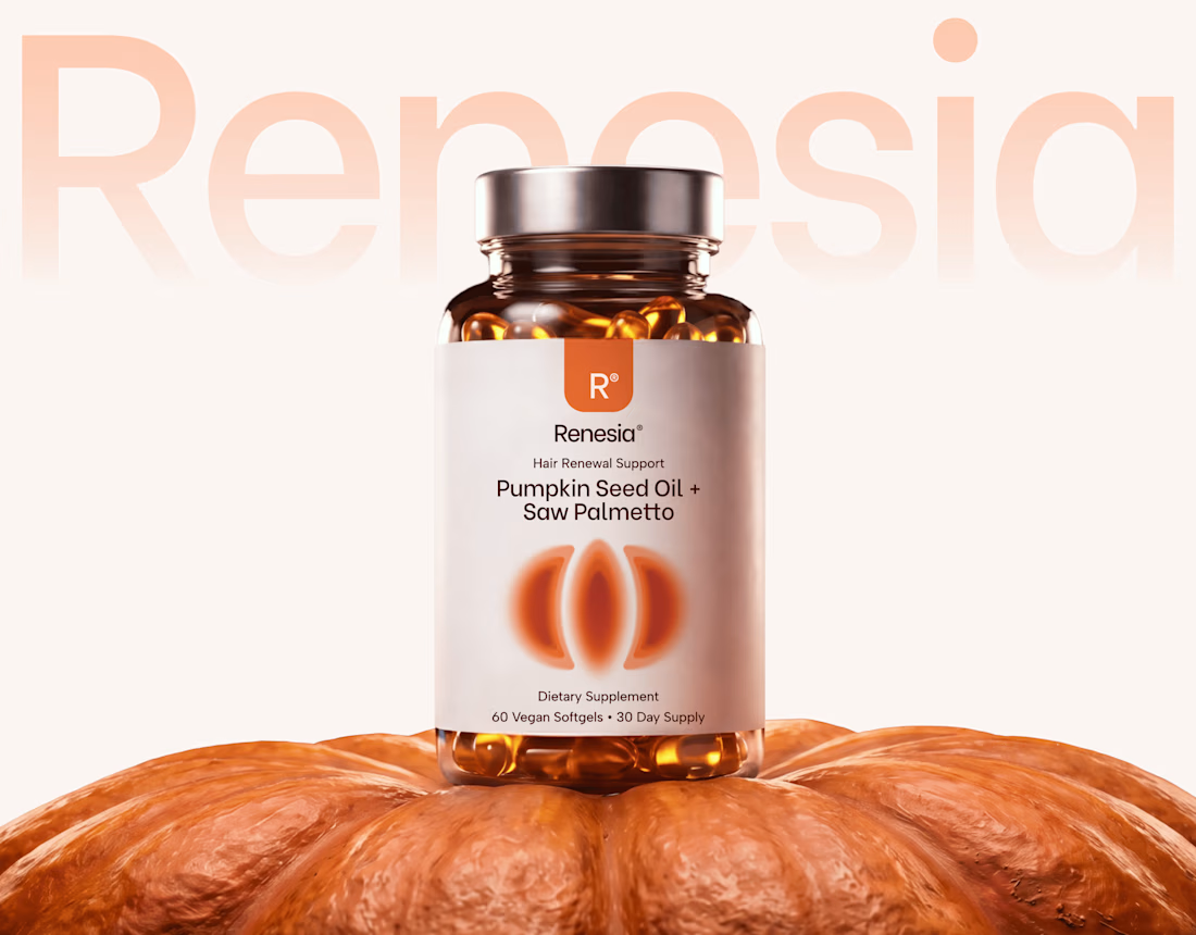
Here we go, check the full case study, I think you will love it! 🎃


Love this! 🎃 The pumpkin concept for Renesia is super creative - perfectly matches the Pumpkin Seed Oil story. Clean work in Illustrator & Figma!