The network for creativity
Join 1.25M professional creatives like you
Connect with clients, get discovered, and run your business 100% commission-free
Creatives on Contra have earned over $150M and we are just getting started
Back to feedPost

Designed and structured the digital web presence for Island International Realty, a boutique luxury real estate agency based in Antigua. The platform connects international investors and high-net-worth buyers with prime Caribbean properties, beachfront estates, and lifestyle investments through an elegant, modern browsing experience.
Key Highlights:
Boutique Luxury Aesthetic: Clean, minimalist visual design highlighting high-end Caribbean lifestyles, luxury real estate, and investment opportunities.
Direct Lead Capture & Inquiries: Prominent direct-contact headers and inquiry forms tailored for foreign investors and buyers seeking custom property advisory.
Property & Investment Showcase: Streamlined UI for exploring residential listings, vacation estates, and investment-grade real estate across Antigua.
Mobile-First Responsive Layout: High-speed, mobile-optimized experience ensuring fast image rendering and smooth navigation for global clients on all devices.
Local SEO & Global Investor Reach: Structured metadata and search optimization targeted at international Caribbean real estate and luxury lifestyle searches.
Tools & Technologies:
Figma, Next.js, React, Tailwind CSS, JavaScript, Responsive UI/UX, Local & International SEO, Custom Lead Forms.


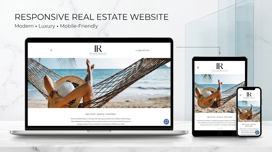

Elegant, responsive real estate website with a clean luxury aesthetic and strong focus on global investors.
The network for creativity
Join 1.25M professional creatives like you
Connect with clients, get discovered, and run your business 100% commission-free
Creatives on Contra have earned over $150M and we are just getting started

Challenges
View all


Related posts


Engaging website for a New York–based architecture and construction studio, balancing bold typography, immersive imagery and a minimal editorial layout.


Orion GT — Luxury Automotive Landing Page 🏎️🔥
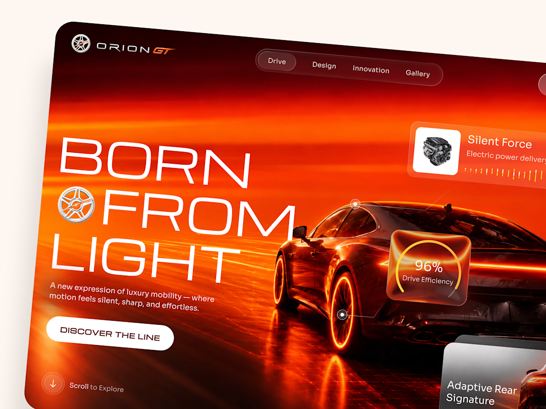
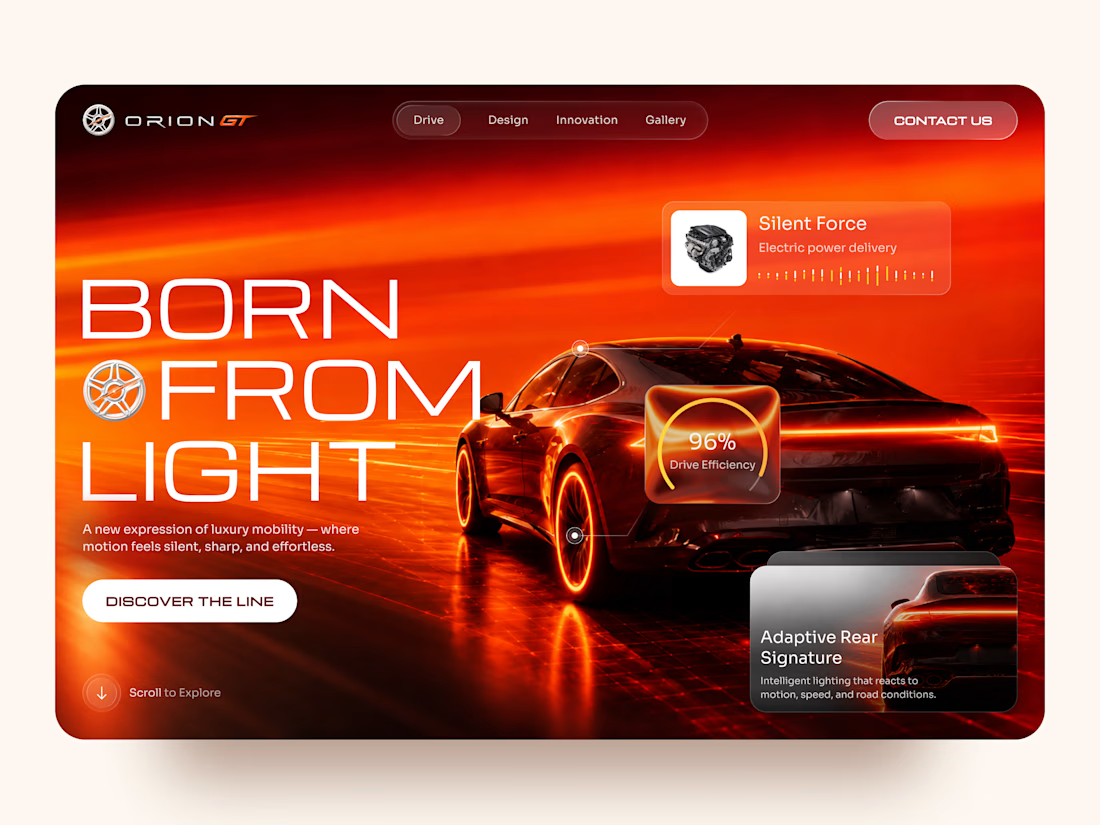
Orion GT is a landing page concept for a premium performance car brand, built around speed, innovation, and a cinematic digital experience.
The goal was to make the vehicle feel like more than a product — creating an immersive introduction where lighting, motion, typography, and interface details reinforce the feeling of performance and exclusivity.
Special attention was given to:
• a cinematic hero composition that makes the vehicle the main visual focus;
• a high-energy red and orange palette inspired by speed, heat, and light 🔥;
• oversized typography that strengthens the premium, futuristic character;
• floating performance UI elements that communicate features without interrupting the visual experience;
• glass-style interface cards for drive efficiency, electric power delivery, and adaptive lighting;
• a clear “Discover the Line” CTA integrated into the storytelling;
• responsive mobile layouts that preserve the atmosphere while simplifying the composition 📱;
• a minimal mobile navigation designed to keep the experience focused and immersive.
The result is a bold automotive experience that combines luxury presentation with a technology-driven interface — turning the landing page into part of the product experience itself.
Looking to create a premium website for your automotive, mobility, or technology brand? Let’s build something that feels as powerful as the product. ⚡




How did you choose this color direction? 🔥

The 404 was treated as a proper page rather than a fallback state.
The number is constructed as an architectural drawing. The 4 and the 0 are formed from walls at true thickness, with furniture laid out inside the resulting rooms and dimension strings running along both edges. It sits inside the same drafting system as the rest of the site rather than borrowing a display typeface.
The error message then repeats. Instead of a single dialog, identical windows cascade back across the canvas, each one carrying the same 404 notice. It reads as a system throwing an unresolved warning over and over, which is the exact behaviour Heron is built to prevent inside a model.
Error pages are never in the brief. They're a good measure of whether a team understood the product or just styled it.


Treating a 404 as an actual page instead of a dead end is such a good instinct, where did the architectural drawing idea come from, personal interest bleeding into the work?


