The network for creativity
Join 1.25M professional creatives like you
Connect with clients, get discovered, and run your business 100% commission-free
Creatives on Contra have earned over $150M and we are just getting started
Back to feedPost

seen so many matcha cafes lately that I wanted to see the anatomy of one 💚
so I'm building one. this is the first prototype.
it's a matcha bar, where the drawing is your order tracker. your cup moves through the bar, station by station, as the barista makes it: sift, pour, whisk, milk or ice, the window. I wanted the wait to be the best part.
what you're seeing is just the design. the full submission will be a whole website for a matcha cafe, built on Base44: you order your matcha online, your order lands straight on the barista's screen, every tap there moves your cup along, and an email tells you when it's ready at the window.
coming later these days.


can't wait to see the finished submission for this!
The network for creativity
Join 1.25M professional creatives like you
Connect with clients, get discovered, and run your business 100% commission-free
Creatives on Contra have earned over $150M and we are just getting started











Related posts


Gorgeous 😍


Your Hero Section Has One Job: Be Clear.
You don’t need huge headlines or long explanations. You need the right image + short headline + clear offer.
For the first version, we worked on the branding, the image and the copy together, so at first glance it’s clear: this is a makeup course, and here’s what you’ll get.
The second version is still beautiful and still feels like beauty. But what are you actually getting? A makeup course? Products? A store? That’s the problem with a Hero that looks good but isn’t thought through.
Your first screen doesn’t need to say everything. It just needs to say the right thing.

22 voted
61%
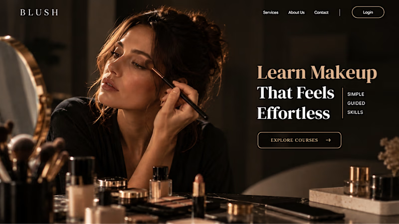
14 voted
39%
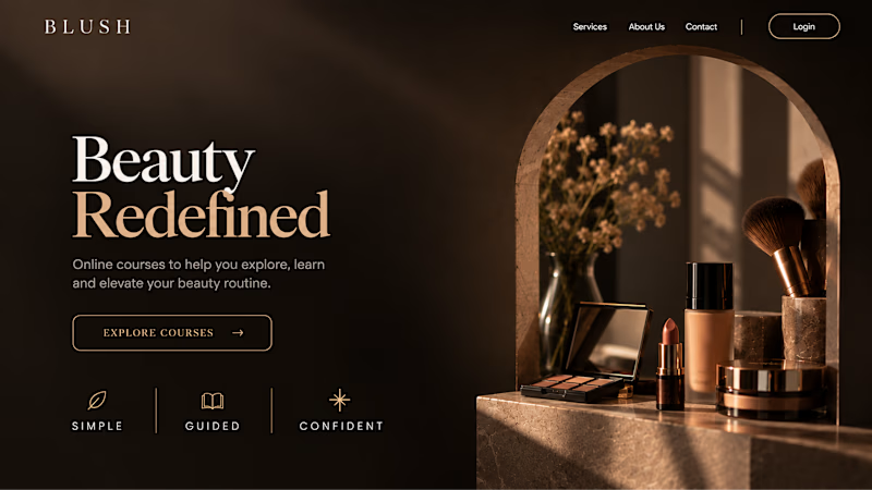
36 votes
Closed


A few updates to the project and demo video! 🔦
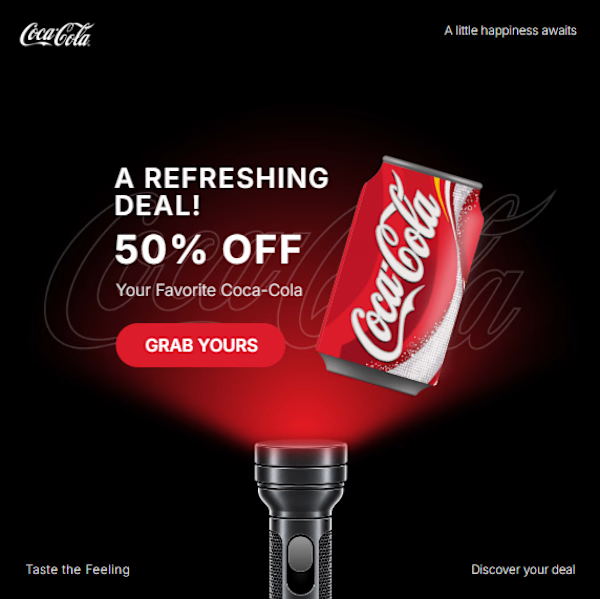
Added Coca-Cola as another brand variation, along with some improvements to the animation and presentation. For this version, I used masking and Trim Path animations to reveal the Coca-Cola background lines, combined with lighting effects to bring the product into focus.
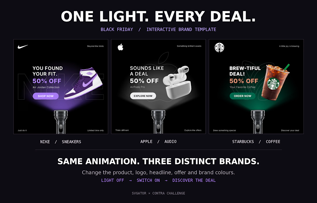
Same template, now showcased with four different brands!
Project: link



Love that you kept polishing it, and the new version is even better 🤟 Rooting for you all the way, Sirojiddin!