The network for creativity
Join 1.25M professional creatives like you
Connect with clients, get discovered, and run your business 100% commission-free
Creatives on Contra have earned over $150M and we are just getting started
Back to feedPost

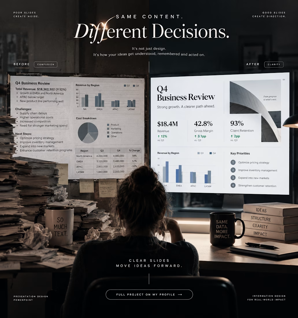
Same Content. Different Decisions.
Design the decision, not just the slide.
A bad slide doesn’t just look bad.
It changes what people notice.
The same numbers can create confusion or clarity.
The same message can feel forgettable or obvious.
The same meeting can end with more questions or a clear direction.
That’s what I wanted to explore with this redesign.
I kept the underlying business information intact and changed the way the audience experiences it:
less visual noise
stronger hierarchy
faster scanning
clearer priorities
more deliberate data storytelling
The content didn’t change.
The decision environment did.
Full presentation project is on my profile.

The network for creativity
Join 1.25M professional creatives like you
Connect with clients, get discovered, and run your business 100% commission-free
Creatives on Contra have earned over $150M and we are just getting started

Challenges
View all


Related posts

An experiment exploring how to visually communicate design impact through a draggable before/after slider. Built to test the interaction and motion feel of scrubbing between two states of a design, it uses a small format to show transformation at a glance 😊


The compact format is doing a lot of work—the draggable reveal makes the improvement immediately legible, while the consistent card rhythm keeps the comparison easy to scan.


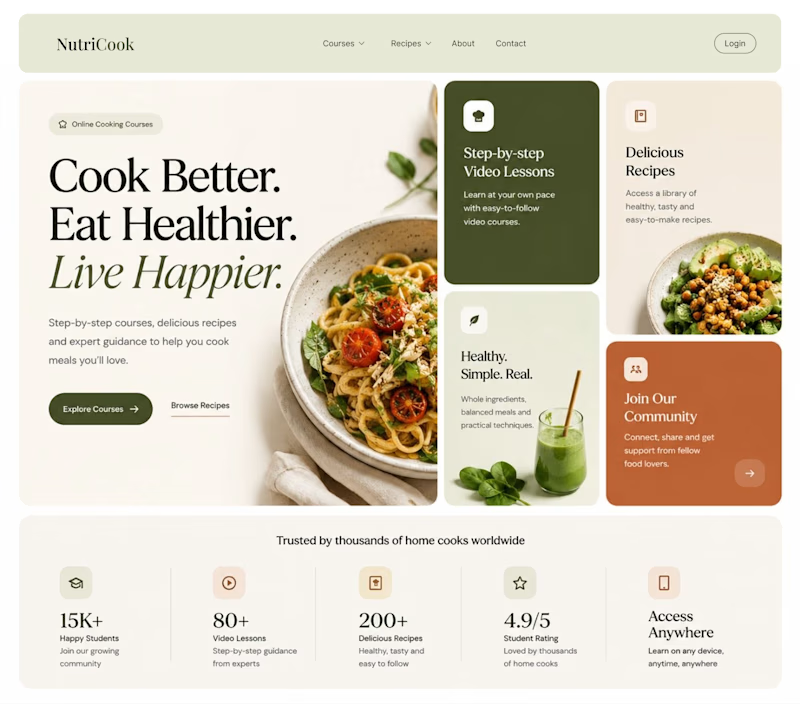
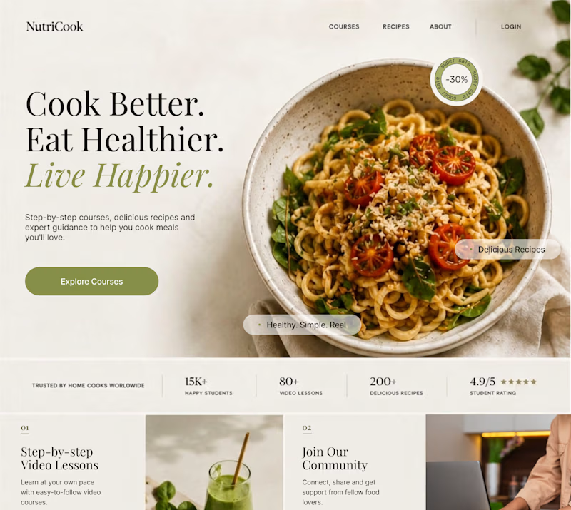
Same content. Two completely different vibes.
What happens when you keep the course content the same, but change the structure, typography, and color palette?
Two hero sections. One course. Two different visual experiences.
Which one would you choose? 1 or 2?
29 voted
41%
42 voted
59%
71 votes
Closed

Option 1 works well , the heirarchy and card layout on the hero is very smart

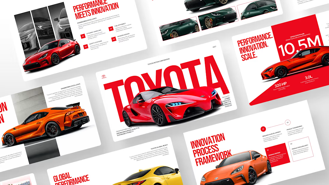
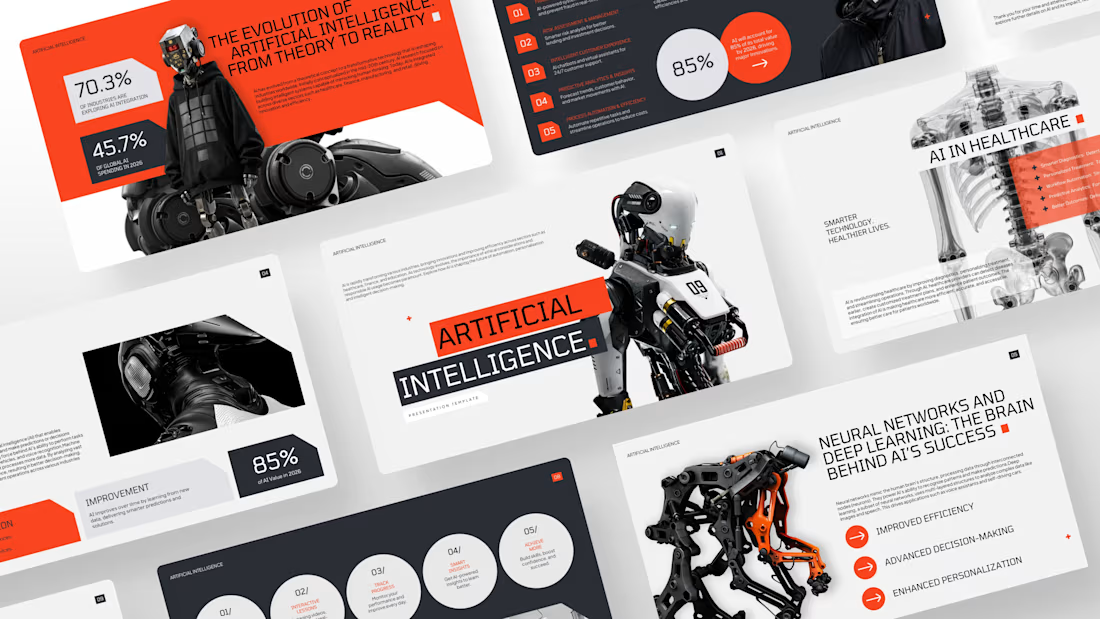
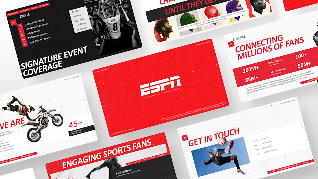
A collection of custom presentation designs showcasing my creativity across the automotive, sports, retail, and technology industries.



So beautiful