The network for creativity
Join 1.25M professional creatives like you
Connect with clients, get discovered, and run your business 100% commission-free
Creatives on Contra have earned over $150M and we are just getting started
Back to feedPost

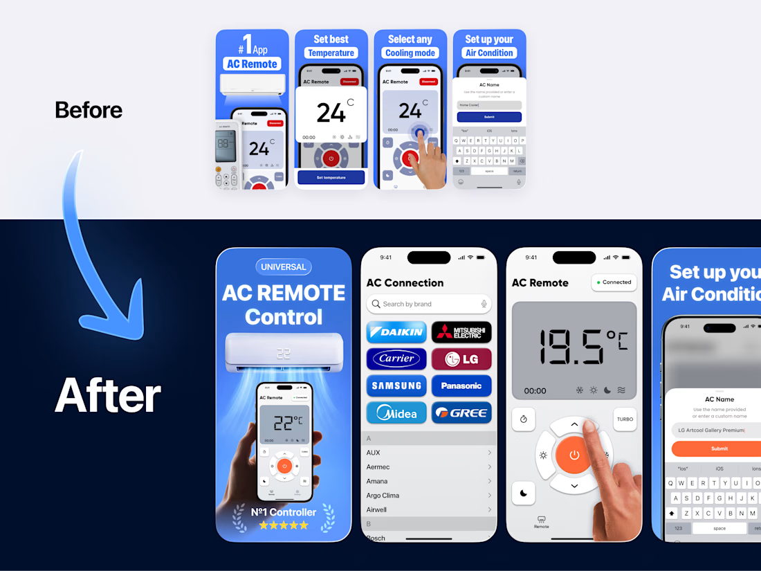
The new version increased installs by +27%.
I redesigned the App Store screenshots and updated the remote control color palette.
During A/B testing, some more visually attractive options were explored - but the winning version was the one without titles, showing full UI screens, especially the device selection flow.
Available for App Store optimization, screenshot design, and product UX.
More A/B insights coming soon.
The network for creativity
Join 1.25M professional creatives like you
Connect with clients, get discovered, and run your business 100% commission-free
Creatives on Contra have earned over $150M and we are just getting started




Related posts


I already submitted my Lovable challenge but I decided to update the landing page and make it look a little bit better by introducing more images to make the page a little bit more interactive especially on the services section, which one do you like: the old one or the new one?
You can test it here: https://carmobifix.lovable.app/
submitted project: https://contra.com/community/KUoCqygQ-i-built-mobi-fix-nairobi-a
43 voted
74%
15 voted
26%
58 votes
Closed

you had credit left ? mine finished...like 4, 5 credits left..😂

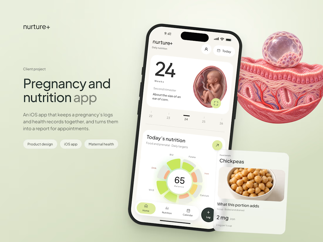
A very elaborate app study is out, I share my entire process and a lot of fun UI details along the way! Done this for https://nurtureplus.app/