The network for creativity
Join 1.25M professional creatives like you
Connect with clients, get discovered, and run your business 100% commission-free
Creatives on Contra have earned over $150M and we are just getting started
Back to feedPost
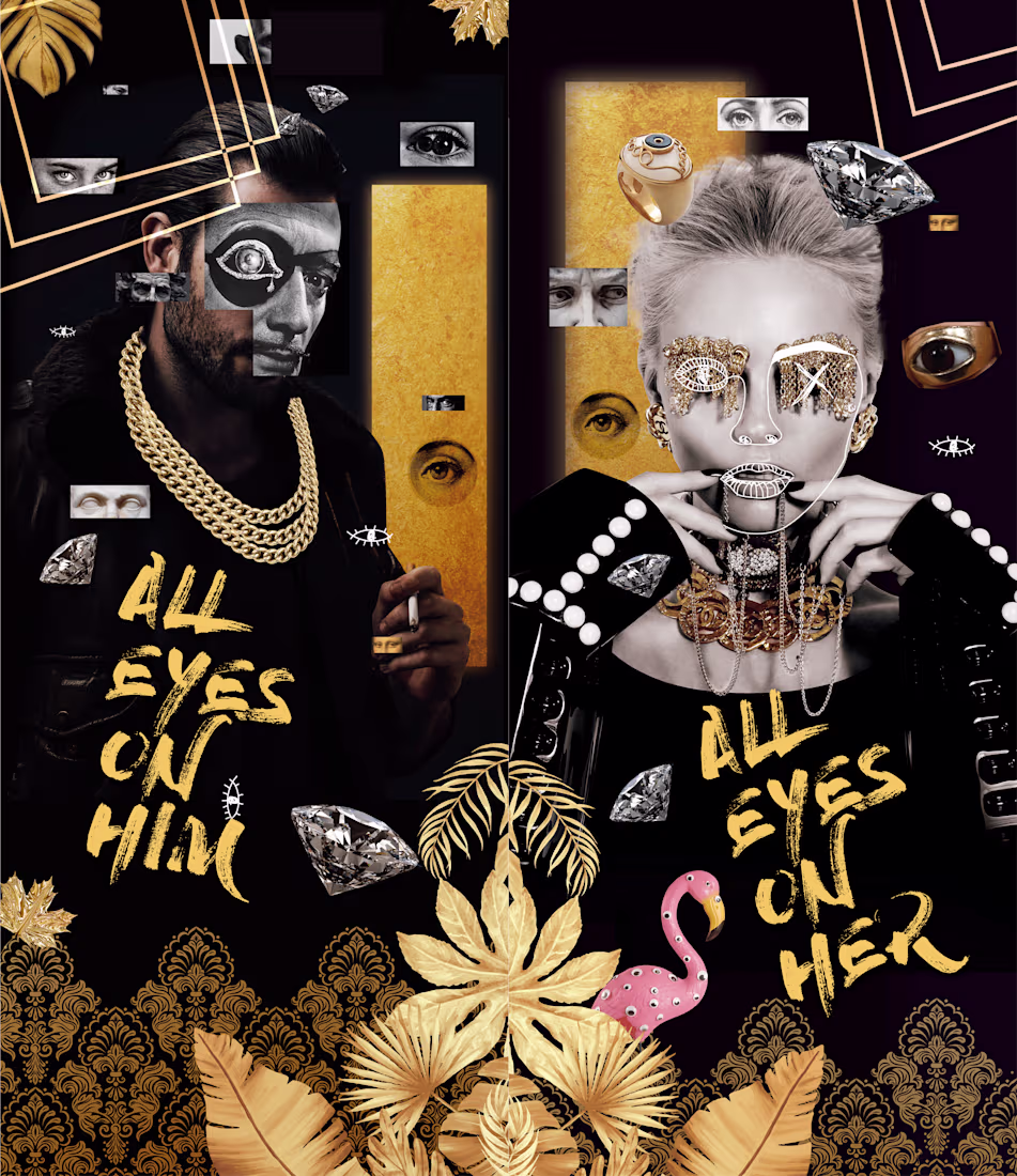
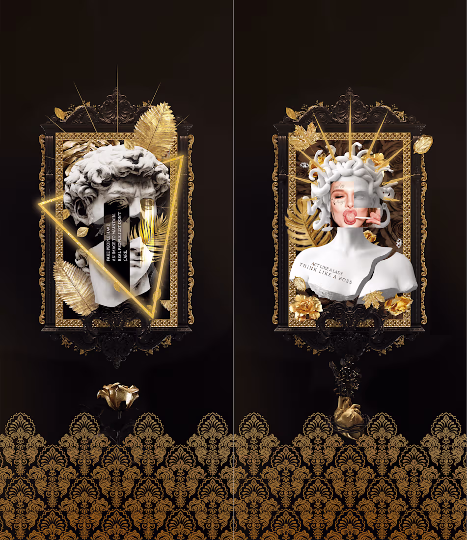
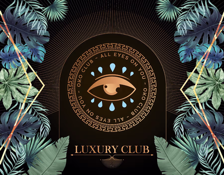
OKO Club was Toulon's most selective nightclub — hip-hop chic meets electronic house, curated crowd, premium experience. The brief wasn't just a logo. It was building a world from scratch: a brand architecture with a core identity and a full ecosystem of event sub-brands, each with its own visual personality.
The core concept was built around a single tension: street credibility versus old-money opulence. The OKO eye — drawn from Egyptian symbolism, set inside a Greek meander seal, rendered in bronze — became the anchor. Not decorative. A statement: all eyes on you is both a promise to the guest and a warning to the competition.
From there, we built four distinct event identities under the same roof. La Bringue — vintage, dark, Art Deco, a gramophone at the center of the night. Illegal Bourgeoisie — gold-glittered middle finger, dollar bills flying, aristocratic frames with zero apologies. Downtown — neon-soaked, cyberpunk, female energy raw and confrontational. All Eyes On Him / Her — collage-based, maximalist, diamonds and chains, baroque and street collapsed into one frame.
Every visual was designed to live in two places simultaneously: the Instagram feed and the club's physical walls — including bathroom doors engineered specifically for the selfie moment.
The brand manual covered color system, typography (ScalaJewel Crystal + TheSerif family), logo usage, and the full content architecture across social.
The network for creativity
Join 1.25M professional creatives like you
Connect with clients, get discovered, and run your business 100% commission-free
Creatives on Contra have earned over $150M and we are just getting started
Related posts
Working on a new website for bem, would you like to see the brand identity behind it?
Yeah sure I will love to
Proud to share my submission for the #configMakeathon 🦋
Design has one job — make people feel something before they think something.
For the #ConfigMakeathon, I built a complete digital campaign experience for Butterfly Conservation's "Britain's Favourite Butterfly" — taking a public vote and transforming it into something people actually want to be part of.
The challenge wasn't technical. It was human. How do you make someone genuinely care about a species they've never noticed? How do you turn conservation data into something personal? How do you design an experience that moves people from passive viewers to active participants?
The answer was architecture — three distinct experiences working as one:
🗳️ Results Explorer — A fully filterable species discovery system built around personality vibes, wing colours, and rarity. Not a leaderboard. A world worth exploring.
🧬 Personality Quiz — A matching experience that gives every user a butterfly identity rooted in real behavioural traits. Flashy. Feisty. Adventurous. Rare. When someone sees themselves in a species, the relationship changes entirely.
🌿 Conservation Narrative — A story-first approach to ecological data that earns its urgency rather than demanding it. The stakes land harder when you already have a favourite.
This is the kind of work I find most meaningful — where design isn't decoration, it's the strategy itself.
🔗 Prototype:Prototype
Built with Figma · Figma Make · MCP
#ConfigMakeathon #Figma #UXDesign #ProductDesign #DesignForGood #ButterflyConservation @Figma @Contra @Contra HQ
Pretty Good!
🎨 Design Challenge
Which version catches your attention first?
Now I need your opinion 👇
✅ Left
✅ Right
23 voted
23%
78 voted
77%
101 votes
Closed
This is a great reminder that design isn't just about functionality—it's also about creating a feeling.
Trending
Claude
Claude has entered the design space. How are you using Claude Design?
Contra University
Learn from expert creatives how to earn more using next-gen AI tools.
MagicPath
The canvas is infinite, and exploration is becoming the workflow. How are you using MagicPath?
creativeaiflow
Creative AI workflows are evolving. What tools do you use, and what are their strengths and weaknesses?
freelancerlife
Freelancer life is wins, pivots, and everything in between. What’s yours right now?