The network for creativity
Join 1.25M professional creatives like you
Connect with clients, get discovered, and run your business 100% commission-free
Creatives on Contra have earned over $150M and we are just getting started
Back to feedPost
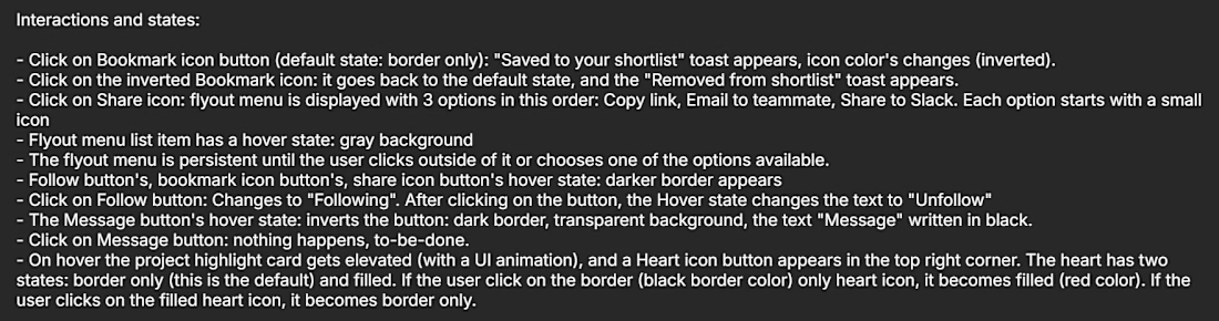
My solution is about closing the gap between design and code with designing real, fully working components.
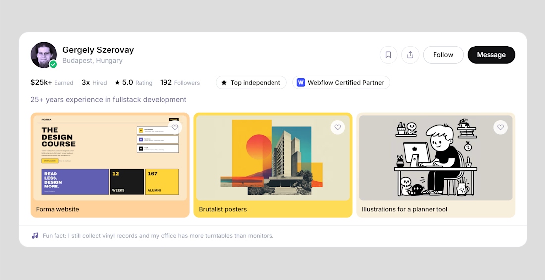
I designed a Contra-inspired profile card in Paper, then built a workflow that turns it into real, working React components.
The workflow in 3 steps:
→ Creating a contra.com style guide inside Paper, then asking it to create a copy of the profile card. Then making some refinement using the canvas and the design tools (I even added some new functionalities to the card, e.g. the fun fact section)
→ Paper design → component spec. My Claude skill reads the Paper file, including component states and the written explanations you might attached to your design, and writes a structured markdown specification with a component tree and these specs: appearance, user interactions, states, required input data.
→ Spec → working components. A second Claude skill generates real React components in Storybook and verifies each one against the Paper design until it matches: typography, colors, spacing, states.
(Btw. Storybook is a living catalog of your product's UI components, where each one runs in the browser as a real, interactive preview, so designers can click through every state and variation exactly as users will experience it, without waiting for the full app to be built around it.)
If you don’t design something, someone else (an AI, a developer) will. (It’s not necessarily a bad thing, but you need to be deliberate about what parts you want to outsource.)
With this workflow, you get to review and complete your design at two points:
→ first, when you get the detailed specification: you can take a quick look at it and fill in the gaps if needed
→ second, when you can play around with the live, fully coded components inside Storybook. You can also run tests to check e.g. whether the component is accessible or not.
With these two review steps built in, you can be sure that your design intent truly gets translated to code.
You can modify the spec, tweak the design in Paper, regenerate the components, and iterate until the result matches what you actually had in mind. No more redlining screenshots or re-explaining hover states in Slack.
Tools: Paper, Claude Code, Storybook, React.
MCP Servers: Paper, Storybook, Chrome DevTools
(Btw. I also created the slide deck inside Paper using Claude from VS Code)
I'll be open-sourcing both Claude skills and the full workflow in the coming days, so you can use it in your own projects and start closing the gap between design and code the same way. Stay tuned!
Thanks for the challenge @Stephen Haney @Contra HQ
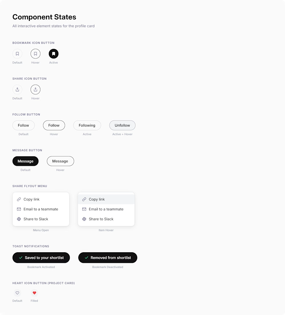
2. Then, I added some notes on Paper's canvas to specify how the components behave, what their states are.

Here is the GitHub repo of the two Claude Code skills, feel free to use them in your own work, and let me know if you have some feedback: https://github.com/gergelyszerovay/skills/blob/main/paper-to-react-workflow.md
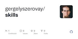
github.com
skills/paper-to-react-workflow.md at main · gergelyszerovay/skills
Contribute to gergelyszerovay/skills development by creating an account on GitHub.
Here are some screenshots from Paper:
1. This is the Contra profile card - I created it by generating a Contra style guide inside Paper, then made some tweaks using Paper's design tools, and I also added some new parts just for fun
3. Claude generated the Component States on a separate artboard inside Paper based on the written notes I added on the canvas in the previous step.
4. The first Claude skill generated the component tree and a detailed component specification as a markdown file. I asked Claude to render this file inside Paper. (This is the first review step: you can check if something is missing or needs modification).

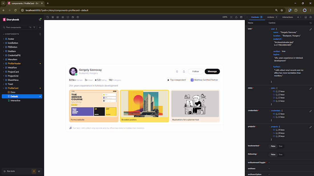
5. The second skill generates React components based on the design inside Paper and based on the specification markdown file (previous step), then showcases them in Storybook. These are fully working React components: you can check out the user interactions, change the data displayed and run tests.
Finally, I did not cover this in the video, but after all these steps, you can start a new iteration: you modify the design inside Paper or you modify the specification (the md file), and then you can ask Claude to modify the React components accordingly (or regenerate them using the second skill).
The network for creativity
Join 1.25M professional creatives like you
Connect with clients, get discovered, and run your business 100% commission-free
Creatives on Contra have earned over $150M and we are just getting started
Related posts
Built Vibe Studio with Paper MCP + Antigravity
I define a warm minimal vibe → Agent generates polished UI screens on the canvas.
Then I manually refine it: changed the greeting to “Hey Rohit” and switched the accent color to a beautiful muted teal.
The agent instantly understood my visual changes and updated the entire design system + generated clean React + Tailwind code.
This is what a true bidirectional design workflow feels like — human taste on canvas + AI intelligence.
Vibe Studio: Turning personal vibe into production code.
I’ve been experimenting with how AI agents can collaborate instead of working in isolation.
For this project, I set up two agents on a shared canvas using @paperdesign:
→ One agent focuses on UI/UX design
→ The other turns that design into a working website
The interesting part isn’t just the output — it’s the interaction.
The design agent creates the system and layout for both desktop and mobile, and the build agent reads directly from the canvas and keeps the live site in sync.
There’s no traditional handoff. Everything evolves together in real time.
This felt less like using tools, and more like watching a system collaborate.
Curious to explore where this goes next.
The Paper Challenge is officially LIVE and we can't wait to see what you create 🎨
Check out the guidelines here to get started on your build!
cool
Trending
Runway
AI video generation is exploding. What are you dreaming up in Runway?
Contra University
Learn from expert creatives how to earn more using next-gen AI tools.
creativeaiflow
Creative AI workflows are evolving. What tools do you use, and what are their strengths and weaknesses?
portfolioreview
The best portfolios tell a story, not just show a grid. Share yours for feedback.
freelancerlife
Freelancer life is wins, pivots, and everything in between. What’s yours right now?