The network for creativity
Join 1.25M professional creatives like you
Connect with clients, get discovered, and run your business 100% commission-free
Creatives on Contra have earned over $150M and we are just getting started
Back to feedPost

Every project starts with a list of things that could be built.
The useful work is deciding what should be built first.
A clear version one gives a business something real to launch, learn from, and improve. Trying to include every idea at once usually just makes the first step harder.
Simple doesn’t mean limited. It means focused.
The network for creativity
Join 1.25M professional creatives like you
Connect with clients, get discovered, and run your business 100% commission-free
Creatives on Contra have earned over $150M and we are just getting started



Related posts


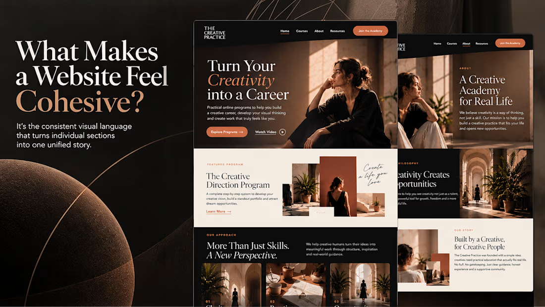
What makes a website feel cohesive?
It’s not just the colors.
It’s not just the typography.
And it’s definitely not about making every section look the same.
A cohesive website is built when every visual decision feels like part of the same story, from typography and imagery to spacing, buttons, cards, and even the smallest details.
The goal isn’t repetition.
It’s creating a visual language that people recognize and remember.
That’s when a website starts to feel like a brand, not just a collection of sections.


I do my best work when I'm excited about it. This took me under 2h from start to finish. Might have to get more selective about the projects I take on from now on.


Looks so cool🔥I really wonder how you make all the characters and animations.

Designed a new website in Shopify for ES Beauty Lab.
The menu is built around skin concerns, so shoppers get from the homepage to the right range in one tap, and the free-shipping threshold sits in the header.
Do you organise your Shopify menu by product type or by problem solved?
esbeautylabshop.com


To your question: by problem solved. Shoppers know their skin concern before they know product names, and the close-up face circles make the choice instant. I'd add a small product type filter inside each concern page.