The network for creativity
Join 1.25M professional creatives like you
Connect with clients, get discovered, and run your business 100% commission-free
Creatives on Contra have earned over $150M and we are just getting started
Back to feedPost

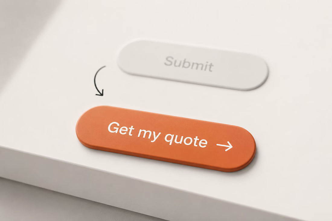
Most landing pages I review have the same problem: the main CTA is designed to "look good," not to drive action.
A button that says "Submit" or "Learn More" tells the user nothing. They have to guess what happens if they click. What actually works: CTAs that preview the outcome.
"Get my quote," "See available plans," "Start my project." It's a 5-minute change that can move conversion more than a full redesign. If you're building a landing page and aren't sure how to word your CTA, tell me what you sell and I'll give you 3 options.
The network for creativity
Join 1.25M professional creatives like you
Connect with clients, get discovered, and run your business 100% commission-free
Creatives on Contra have earned over $150M and we are just getting started






Related posts

Rare UI new landing page WIP 😉

About us Page for linegrade website
You can check the full site here: https://linegrade.framer.website/
Need a landing page in Framer? send a DM or Let's create together here: https://calendly.com/book-a-15mins-call/theframerdude


Designed a modern AI Customer Support Platform Landing Page.
Clean and professional UI with clear value proposition, smart AI chatbot highlights, feature sections, and strong CTAs focused on delivering faster, smarter customer service.


Trending

Claude
Claude has entered the design space. How are you using it?

Contra University
Learn from expert creatives how to earn more using next-gen AI tools.
Brand Design
The best brand designers are on Contra. Scroll to see what's trending in brand design. What are you building?
creativeaiflow
Creative AI workflows are evolving. What tools do you use, and what are their strengths and weaknesses?
freelancerlife
Freelancer life is wins, pivots, and everything in between. What’s yours right now?