The network for creativity
Join 1.25M professional creatives like you
Connect with clients, get discovered, and run your business 100% commission-free
Creatives on Contra have earned over $150M and we are just getting started
Back to feedPost

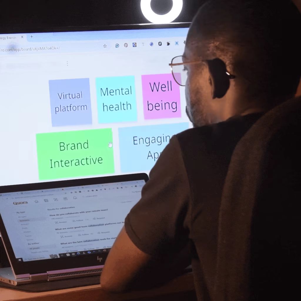
Over the years, I have seen many startup founders, and even some established brands, make the same costly mistake.
They invest heavily in building a strong brand identity… but stop there.
The visuals are polished. The logo is solid. The colours are refined.
But the experience? Inconsistent.
Branding doesn’t end at design.
It lives in how your brand is experienced across every touchpoint, interaction, and moment.
The network for creativity
Join 1.25M professional creatives like you
Connect with clients, get discovered, and run your business 100% commission-free
Creatives on Contra have earned over $150M and we are just getting started





Related posts

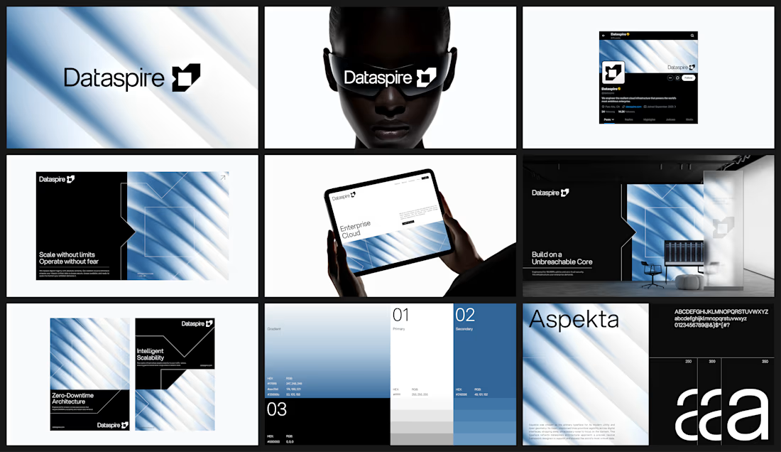


feels very sure of itself. i can picture this blown up on a conference stage

The Rebranding Challenge - Season Investments
One of the key challenges was deciding what to change and what was worth preserving.
Rather than starting from scratch, the new identity retains a visual connection to Season Investments’ heritage, but reframes it for a more contemporary and flexible brand system.
A major improvement was creating a symbol that can work independently from the wordmark. This gives the brand a stronger presence across investment platforms, digital interfaces, profile images, and other compact applications where the previous identity was difficult to use.
The result is a more adaptable system that moves the brand forward without losing its familiarity.


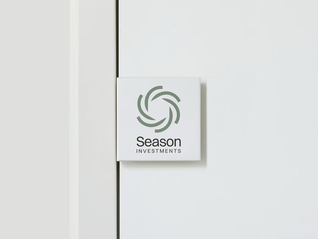
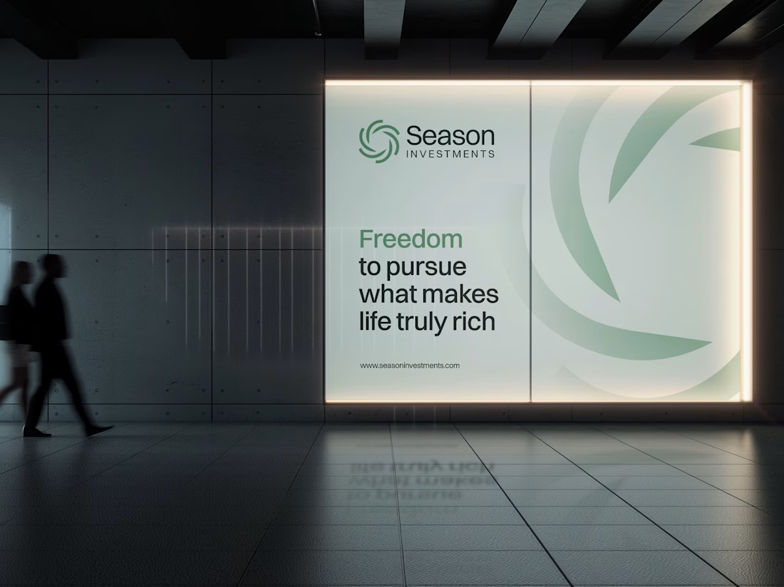



A standalone symbol that works without the wordmark is a smart fix. The swirl feels like it fits investing.

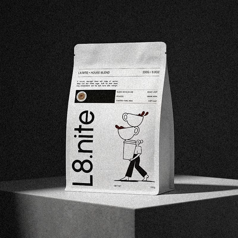
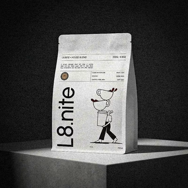
Nailing down the final grid for L8.nite coffee bags.
Left or Right?
Look closely at the central spacing and let me know which arrangement feels more balanced.
6 voted
33%
12 voted
67%
18 votes
Closed