The network for creativity
Join 1.25M professional creatives like you
Connect with clients, get discovered, and run your business 100% commission-free
Creatives on Contra have earned over $150M and we are just getting started
Back to feedPost

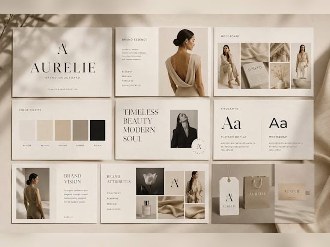
THE ART OF LUXURY BRANDING
Where visual identity meets the power of words.
The network for creativity
Join 1.25M professional creatives like you
Connect with clients, get discovered, and run your business 100% commission-free
Creatives on Contra have earned over $150M and we are just getting started


Related posts

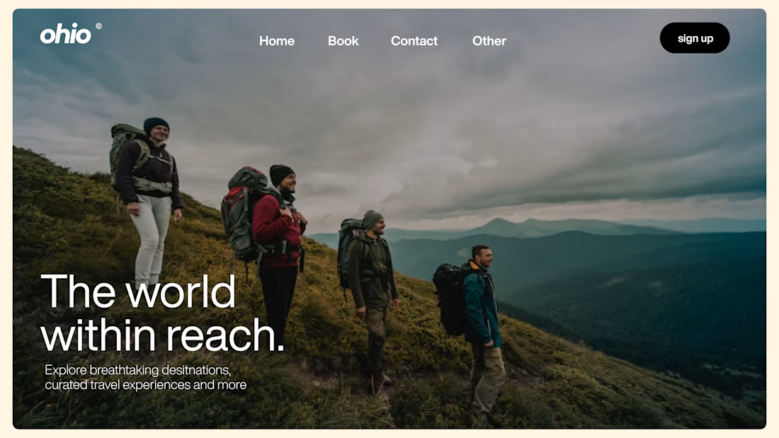
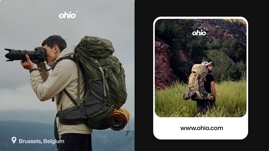
OHIO — Travel Brand Visual Identity.
Exploring the world of travel through thoughtful visual storytelling.
Ohio is a travel brand, and this project focused on building a cohesive visual identity that reflects the excitement of exploration, discovery, and meaningful experiences.
From the logo and typography to the colour palette, marketing visuals, and brand applications, every element was designed to create a consistent and recognisable brand presence.
A personal exploration of brand strategy, visual direction, and identity design.

T O P!!

BUNSOY Building a Brand Identity with Precision.
A strong brand identity isn't just about how a logo looks. It's about how every detail works together.
For Bunsoy Freight & Logistics, I explored a refined visual identity built around structure, clarity, and consistency.
From the custom B monogram to its geometric construction, proportions, and spacing rules, every element is designed to create a recognizable and scalable identity.
The goal: Create a visual language that communicates professionalism, reliability, and movement.
A closer look at the thinking behind the design.


One of the hardest things in branding is knowing what not to change.
Nubank recently worked with Koto to evolve its visual identity as the company expands internationally.
They kept the recognizable logo but rebuilt the wider system around typography, colour, illustration, photography, and motion.
The interesting part for me is how much of this work happens inside the actual product.
Animations built in Rive, a more consistent interface language, and an identity that needs to work across different markets without losing its personality.
I think that's where branding is heading, especially for digital-first companies.
A good identity shouldn't just look great in a presentation. It needs to work just as well inside the product people use every day.

Top-notch branding/rebranding