The network for creativity
Join 1.25M professional creatives like you
Connect with clients, get discovered, and run your business 100% commission-free
Creatives on Contra have earned over $150M and we are just getting started
Back to feedPost
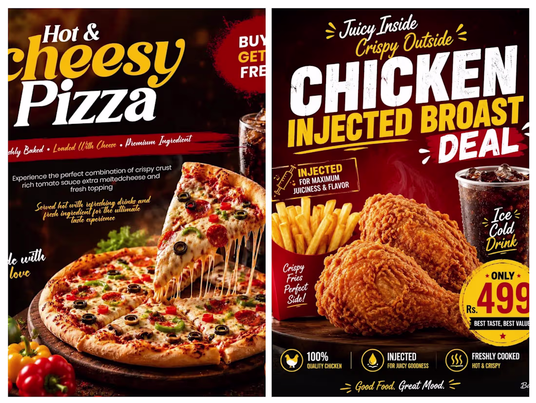
Two posts present a sharp contrast in culinary appeal, typography, and marketing focus. The left advertisement emphasizes an indulgent, premium experience with its "Hot & Cheesy Pizza," utilizing elegant, flowing script fonts and warm lighting to highlight the gooey, melt-in-your-mouth texture of the cheese. Conversely, the right advertisement focuses on a high-energy, value-driven "Chicken Injected Broast Deal," shifting to bold, rugged block typography and a prominent price tag to highlight crunchiness and a complete combo meal. While the pizza graphic relies on a traditional, sophisticated aesthetic to sell taste, the fried chicken graphic leverages a bold, punchy layout to sell a satisfying, actionable deal
The network for creativity
Join 1.25M professional creatives like you
Connect with clients, get discovered, and run your business 100% commission-free
Creatives on Contra have earned over $150M and we are just getting started
Related posts
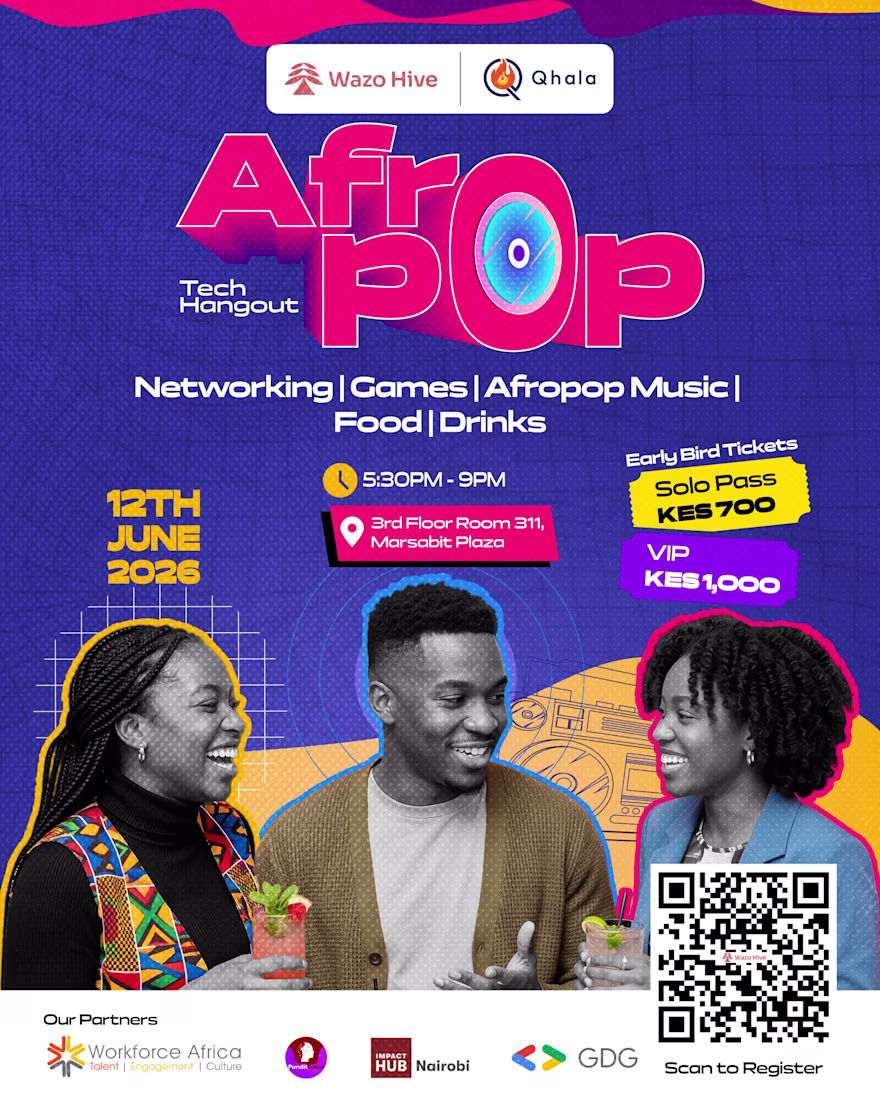
Designed a vibrant, high-energy event flyer for the AfroPop Tech Hangout, an exclusive networking event bridging technology professionals with culture, music, and gaming. The objective was to create a visually compelling asset that captures the energetic spirit of the AfroPop theme while clearly communicating essential event logistics and driving ticket registrations
Creative poster 😍
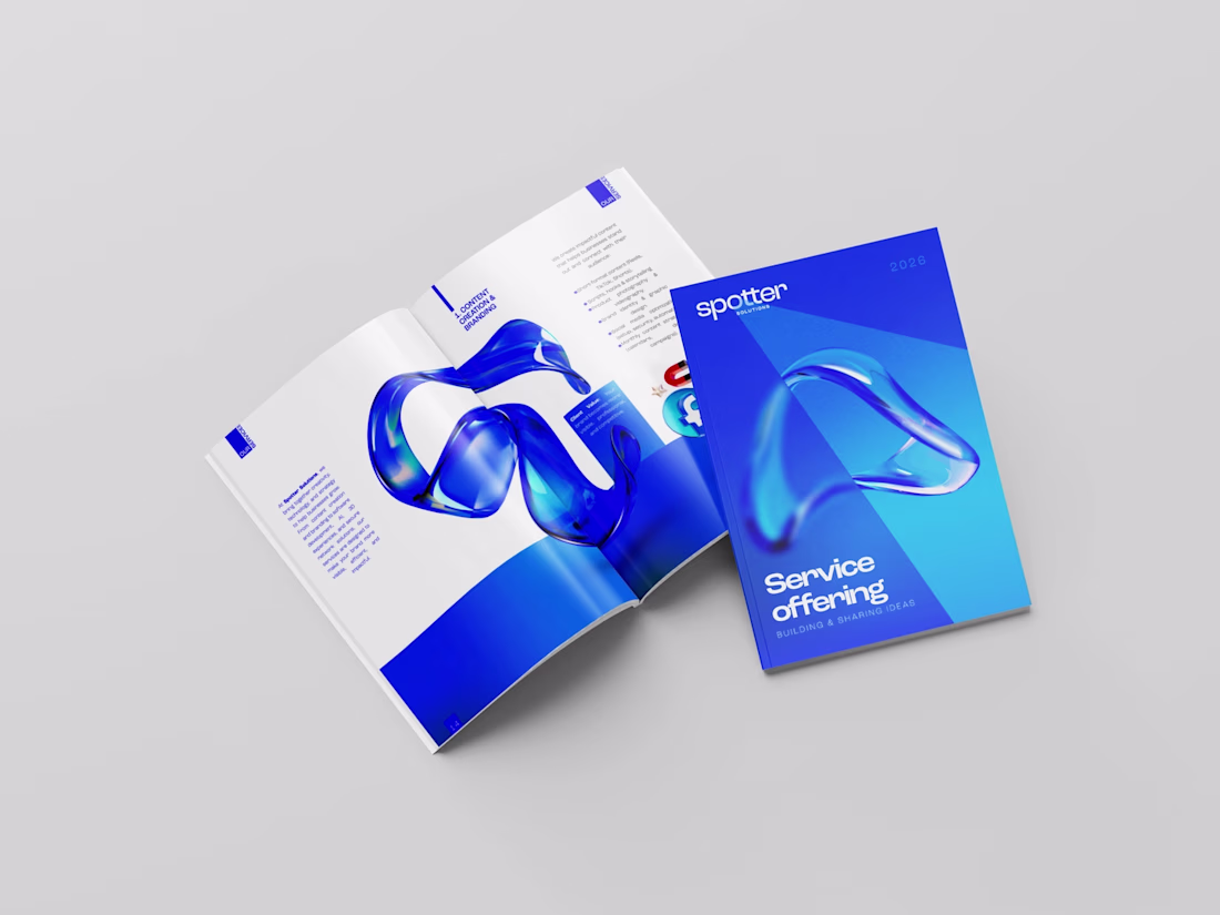
Spotter Solutions, a multi-service marketing, branding agency based in Algeria, needed a service offering document that could present 10+ distinct service lines.
Amazing clarity.
The Wisdom Cloud is a cinematic AI-powered experience that captures and preserves human wisdom before it's lost. It transforms retirement into a legacy by turning stories, lessons, failures, and life experiences into a living knowledge ecosystem for future generations.
.
.
.
Every day, decades of knowledge, lessons, and life experiences disappear forever. The Wisdom Cloud captures, preserves, and shares this wisdom, turning individual journeys into a timeless resource for future generations. A place where legacies live on and continue making an impact.
HERE IS MY SUBMISSION URL:
https://clear-pogo-61081600.figma.site
.
.
Sharing a short glimpse as well..
The framing of 'what happens when the conversation never happens' is doing a lot of work here. It reframes this from a nostalgia product to something with real urgency. Curious how you're thinking about the capture experience itself, whether it's structured interviews or something more open-ended.
Trending
Claude
Claude has entered the design space. How are you using Claude Design?
Contra University
Learn from expert creatives how to earn more using next-gen AI tools.
MagicPath
The canvas is infinite, and exploration is becoming the workflow. How are you using MagicPath?
creativeaiflow
Creative AI workflows are evolving. What tools do you use, and what are their strengths and weaknesses?
freelancerlife
Freelancer life is wins, pivots, and everything in between. What’s yours right now?