The network for creativity
Join 1.25M professional creatives like you
Connect with clients, get discovered, and run your business 100% commission-free
Creatives on Contra have earned over $150M and we are just getting started
Back to feedPost

Just launched ✨
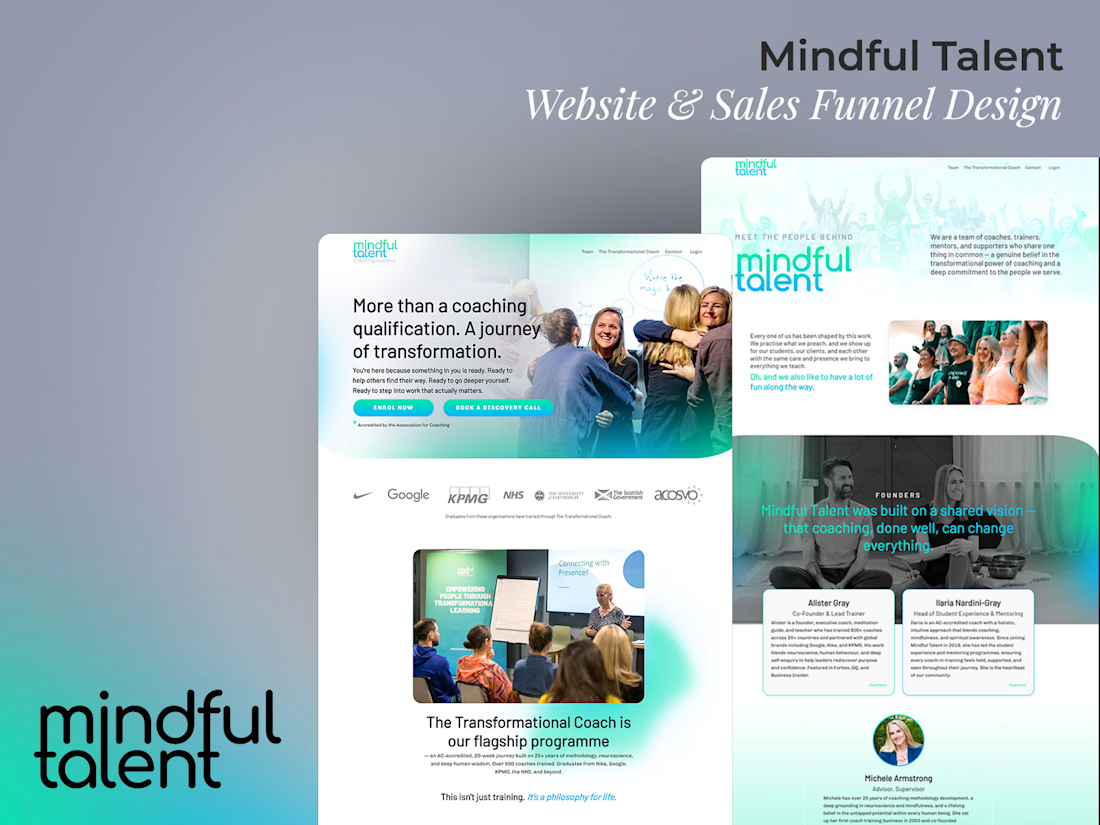
A clean, modern Kajabi website and sales page for Mindful Talent designed to communicate their message with clarity and intention.
The goal was to create a calm, professional space that guides visitors effortlessly from understanding the brand to exploring services and taking action. Every section was thoughtfully structured to keep the experience simple, engaging, and easy to navigate.
Minimal visuals, refined typography, and clear calls-to-action all work together to support both user experience and conversion.
Grateful to bring this vision to life 🔥
Explore the site: https://www.mindfultalent.co.uk/
Partnered with Alister Gray and Kajabi Legend, Chris Moore


This is solid, it feels both clean and engaging. If someone wanted to create something at this level, what would you say matters most in your process?

Colour Scheme 🙌
The network for creativity
Join 1.25M professional creatives like you
Connect with clients, get discovered, and run your business 100% commission-free
Creatives on Contra have earned over $150M and we are just getting started









Related posts

AI & Automation Academy Website Design
Designed a modern Kajabi, responsive website for an AI & Automation Academy focused on helping engineers, founders, and professionals develop practical AI skills. The goal was to create a structured learning experience that makes it easy for visitors to explore courses, understand learning pathways, and find the right training programs.
The website features a bold hero section, clear calls to action, featured course cards, structured learning tracks, and dedicated sections highlighting hands on projects, certifications, quizzes, and learning resources. A dark interface, vibrant purple and cyan accents, and AI-inspired visuals establish a technology-focused identity while maintaining readability and visual consistency.
The layout prioritizes intuitive navigation, clear content hierarchy, and responsive design to help users move from discovering the academy to exploring courses and considering enrollment.
Key features:
AI and automation education website design
Course catalog and featured course sections
Beginner, Builder, and Advanced learning pathways
Student dashboard and certification feature presentation
Resource library, quizzes, and project-based learning sections
Strategic CTAs for course exploration and enrollment
Responsive layout and modern UI/UX design
Dark theme with purple and cyan visual accents


A luxury property deserves a presentation that does it justice.
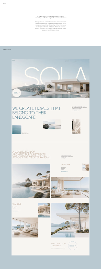
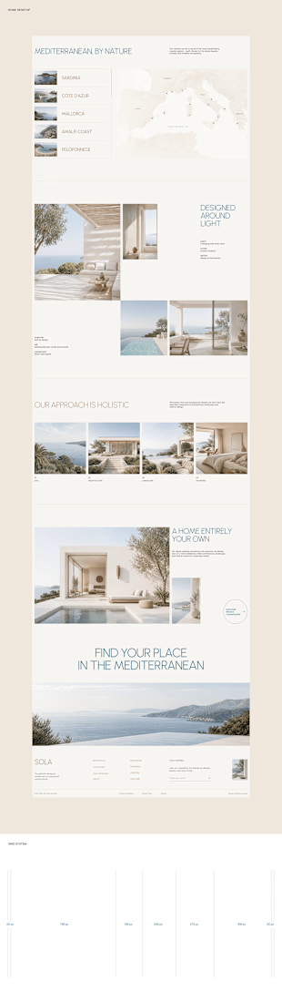
With SOLA – Architecture Studio & Luxury Real Estate, I wanted to bring the beauty of modern coastal architecture into the website itself.
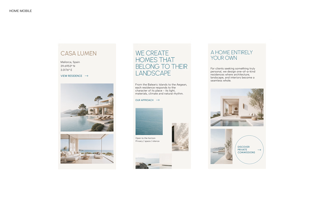
From the large property images and soft blue tones to the clean layout across desktop and mobile, every part of the design helps create a calm, premium feel while making the homes the centre of attention.
I like how the website brings architecture and digital design together, giving visitors a chance to explore the properties before making an enquiry.
If you were looking for a luxury home, would a website like this make you more interested in the property?
#WebDesign #Architecture #LuxuryRealEstate


Incredible work, you transformed SOLA into a premium property brand.

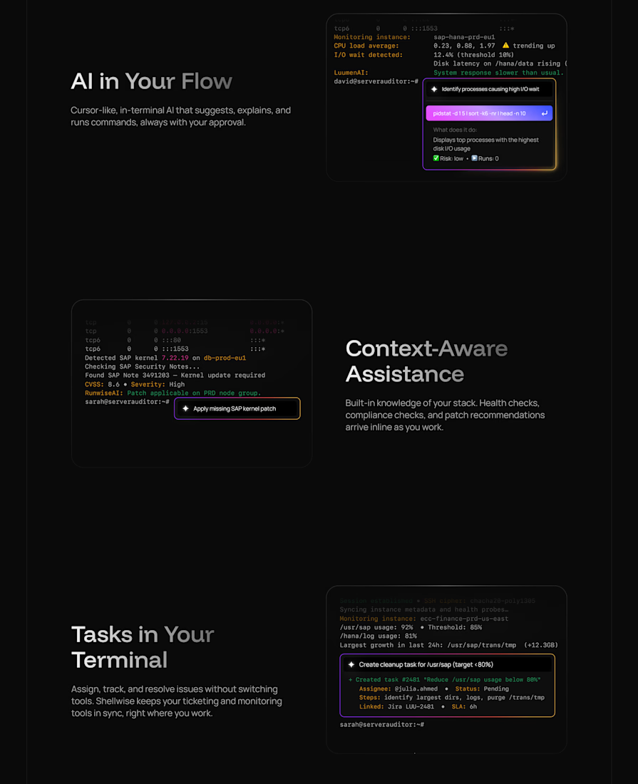
Landing page for an AI-native terminal platform