The network for creativity
Join 1.25M professional creatives like you
Connect with clients, get discovered, and run your business 100% commission-free
Creatives on Contra have earned over $150M and we are just getting started
Back to feedPost


The best interface design is invisible.
Microinteractions are those tiny moments - a button press, a smooth transition, feedback when you complete an action.
Most users won't notice them consciously. But they'll absolutely feel the difference.


That portfolio value chart transition is such a good example, the number tween and line draw make it feel alive without being flashy. Did you prototype the easing curves in Jitter first before handing off specs, or is Claude helping generate the interaction code directly now?
That's a good sign for how fast this workflow is moving, going straight from prompt to usable interaction code. Are you still spot checking the easing values by eye, or does it nail the feel on the first pass most of the time?
The network for creativity
Join 1.25M professional creatives like you
Connect with clients, get discovered, and run your business 100% commission-free
Creatives on Contra have earned over $150M and we are just getting started






Related posts


would you let people record a little voice intro before each track?


The color palette works so well here 🪙


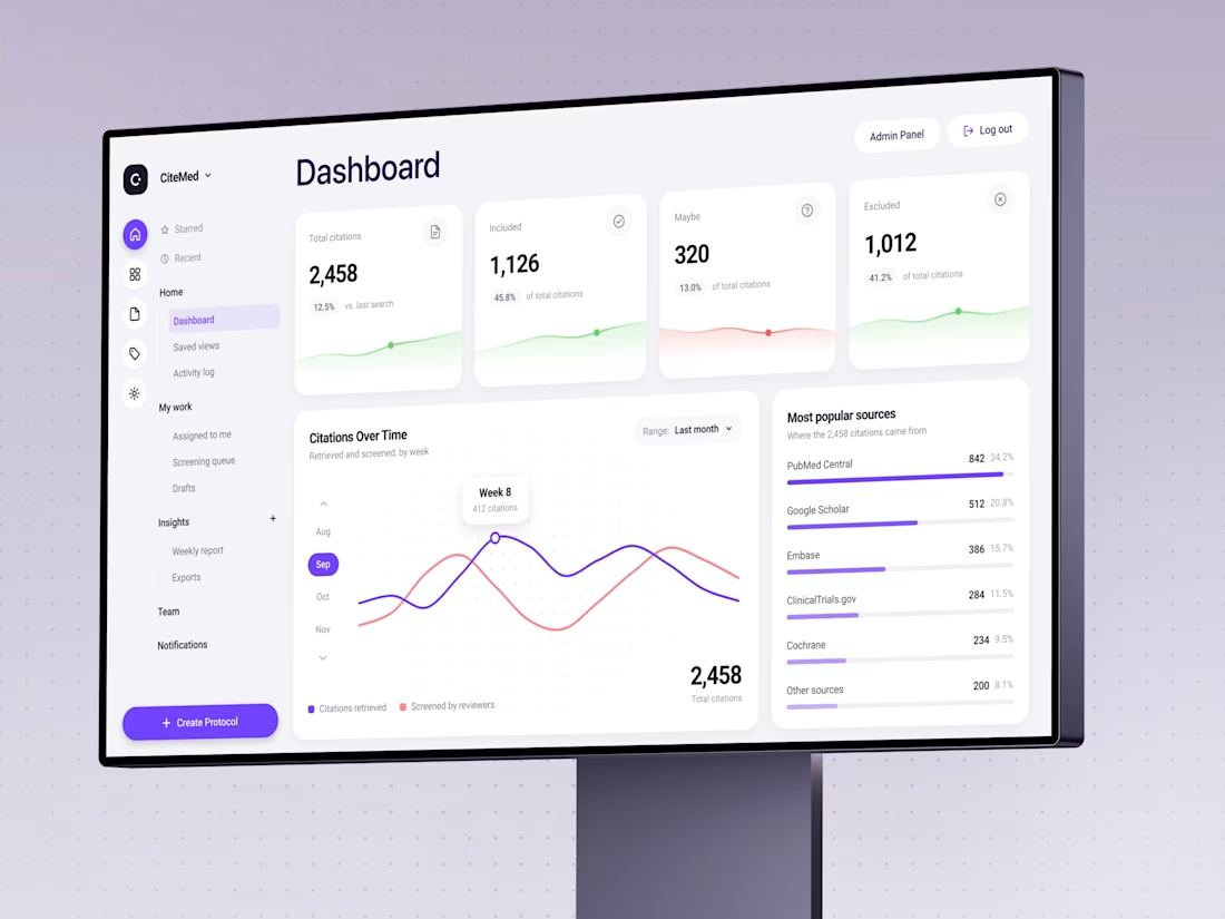
Trust me, nobody has ever said: “I can’t wait to screen 2,458 citations today.”
We designed CiteMed so the immense data to scan doesn't feel like a punishment. Clinical evidence, minus the headache.
Check the case
What’s the most boring task a good interface ever made you enjoy?