The network for creativity
Join 1.25M professional creatives like you
Connect with clients, get discovered, and run your business 100% commission-free
Creatives on Contra have earned over $150M and we are just getting started
Back to feedPost
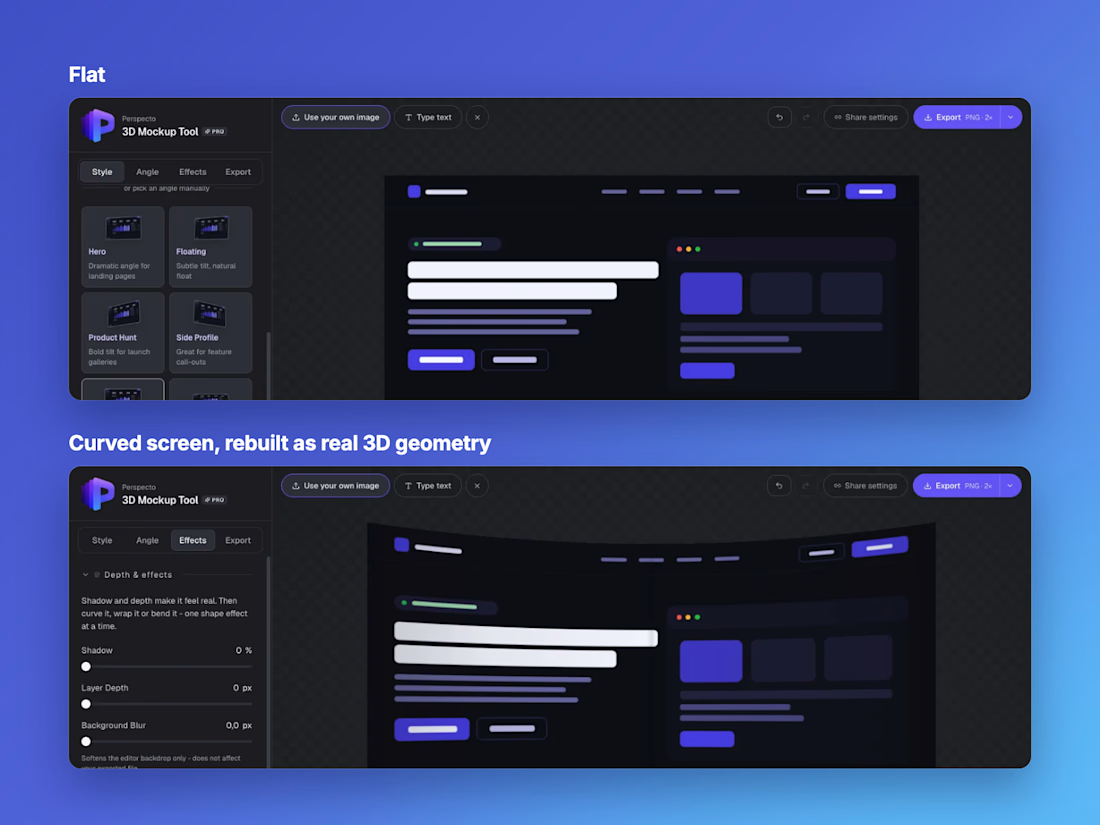
Someone trying Perspecto asked for curved monitor mockups.
The first version was a CSS trick: squeeze the image, darken the edges, add a soft highlight. It shipped in under a day and looked right straight on. Turn the mockup and it fell apart.
So I rebuilt it as real geometry. The image now wraps onto a slice of a cylinder, and the edges bow correctly from any angle, in the editor and in every export.
Quick first version, then go back and do it properly. perspecto.io

Quick first version, then go back and do it properly is a whole philosophy in one line. The cylinder slice approach is clearly the right call, the flat version falling apart at any other angle is exactly the kind of thing that erodes trust in a mockup tool. Was the rebuild...

Mostly the math. The UI barely changed, it’s still one slider. The hard part was keeping it the same everywhere: in the editor the screen is about 48 thin strips placed in 3D, and the PNG, SVG and video exports all use that same curve so nothing drifts.
The surprise was the back....

Side by side, the curved version is clearly better. Good call going back to redo it.
Thanks Rafee! Do you do much mockup work for your own projects? Always curious what people still find missing in these tools.
The network for creativity
Join 1.25M professional creatives like you
Connect with clients, get discovered, and run your business 100% commission-free
Creatives on Contra have earned over $150M and we are just getting started









Related posts

Accidentally made app navigation look more satisfying than the actual music!😍
16 seconds of spatial audio, smooth transitions, and tactile UI motion. Testing how far you can stretch digital minimalism✨
Feedback and love from the design community are always appreciated🙌
UI DesignmotiongraphicsmobileappdesignuiuxdesignMotion DesignUX DesignAdobe After EffectsCinema 4DFigma


This is so satisfying Raheel! 🔥 You nailed that tactile UI motion - 16 seconds but it feels so premium! The spatial audio card with that depth + smooth transition from Home to Made for Spatial Audio is chef's kiss. Minimalism stretched perfectly without losing the Apple Music...

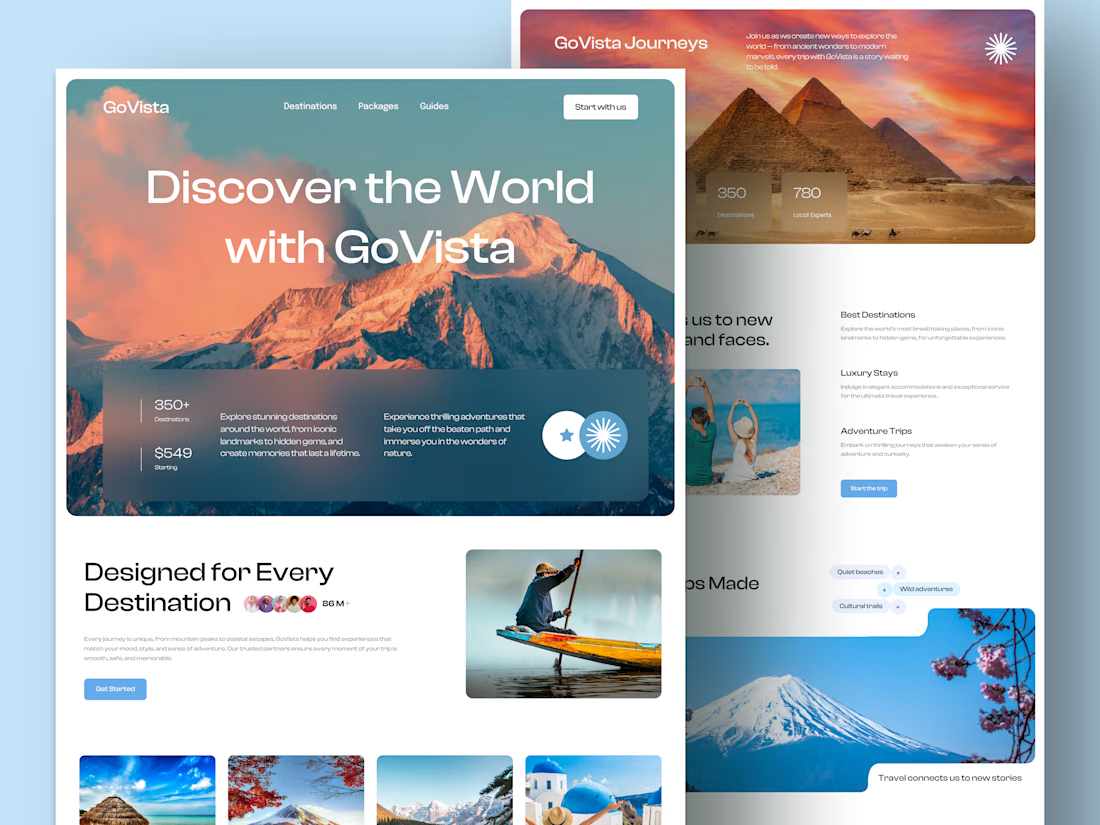
GoVista Journeys - A travel landing page designed to make people dream of their next destination.
A travel company based in Leicester, UK, needed a visually engaging landing page to showcase its destinations and travel experiences while its larger website was being prepared.
The goal was simple: make a strong first impression through beautiful travel imagery, a clean layout, and a design that makes people want to explore more.
Because in travel, the journey can begin long before the booking. ✈️
What catches your attention first on a travel website: the images, the destinations, or the overall design? 👇

I like this very much, very good concept

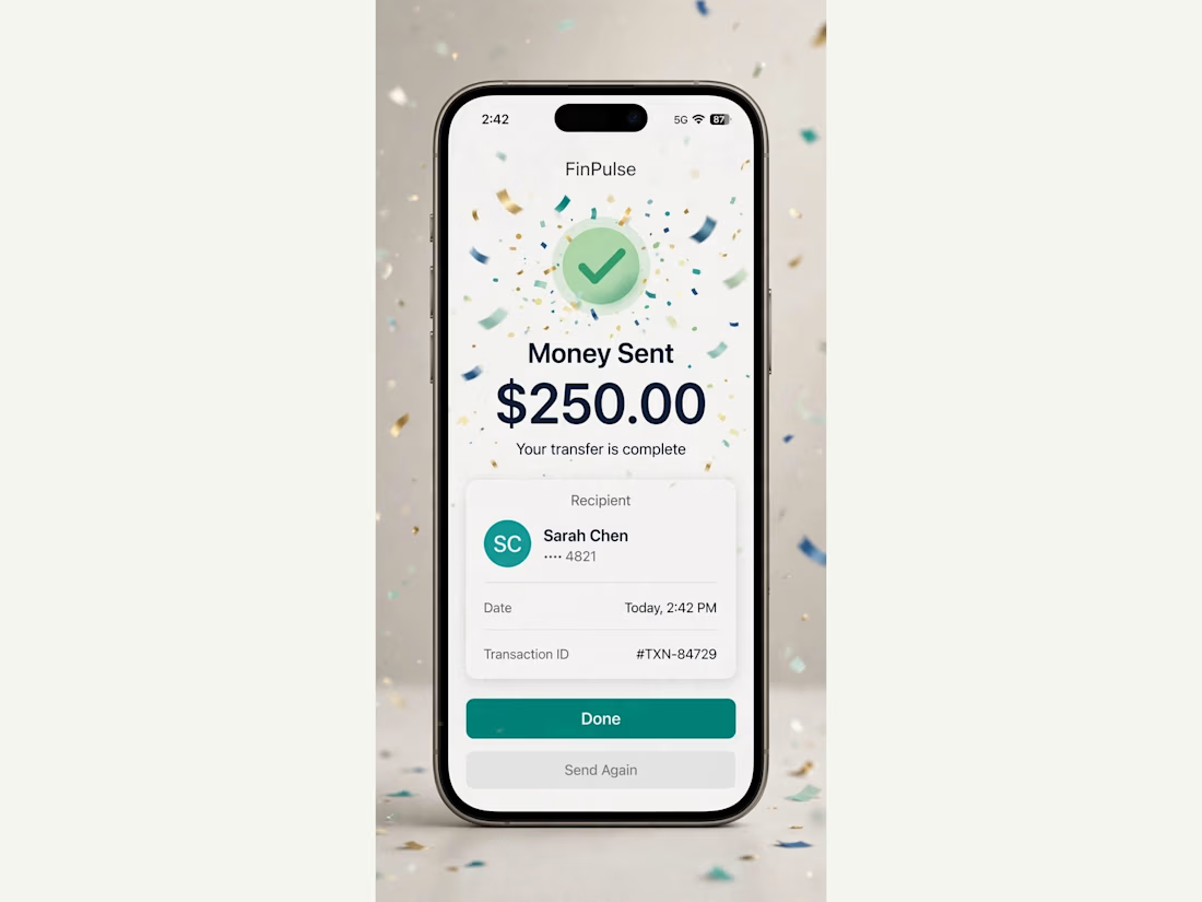
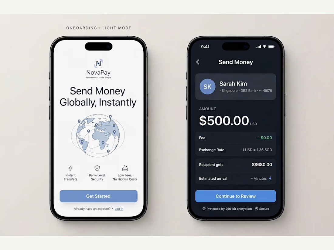
FinPulse — Premium Cross-Border Remittance App
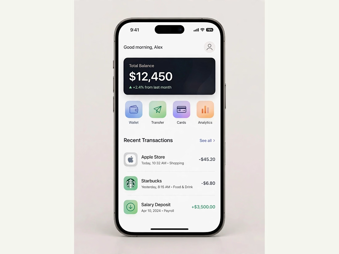
Designed a trustworthy FinTech mobile app for global money transfers.
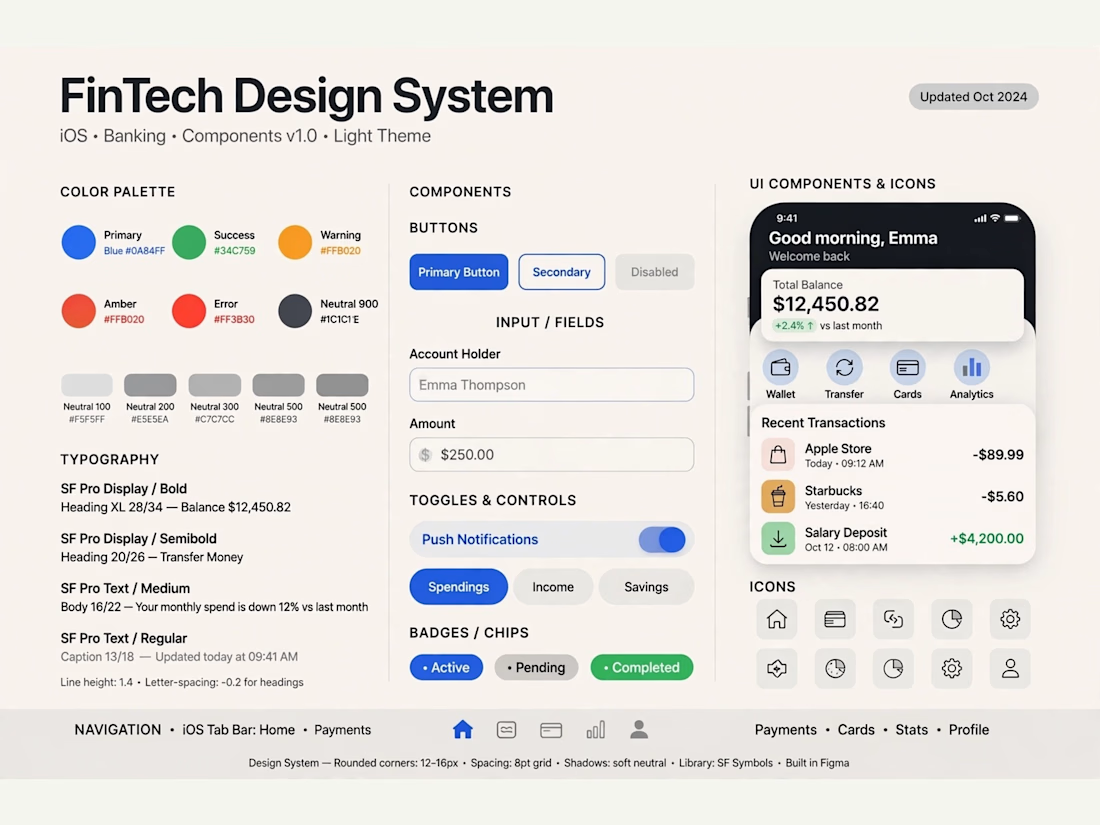
Process: Started with user flow & wireframes for 3-tap transfer, then built a scalable design system in Figma with 100+ components.
Outcome: Final UI focuses on clarity and trust — from onboarding to Home Dashboard ($12,450 balance), Send Money, and Money Sent success state. Built for conversion and speed.
Tools: Figma, iOS Design System, SF Pro
Tags: Mobile App, FinTech, UI/UX, Product Design



Really solid FinTech mobile design. Clean, trustworthy, and the user flow sounds well thought out. Great outcome on the final UI!