The network for creativity
Join 1.25M professional creatives like you
Connect with clients, get discovered, and run your business 100% commission-free
Creatives on Contra have earned over $150M and we are just getting started

The network for creativity
Join 1.25M professional creatives like you
Connect with clients, get discovered, and run your business 100% commission-free
Creatives on Contra have earned over $150M and we are just getting started



Related posts


Great job with the visual direction. 👏

A logo is one thing. Giving it a whole personality is another. 👀
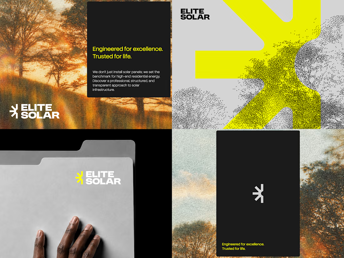
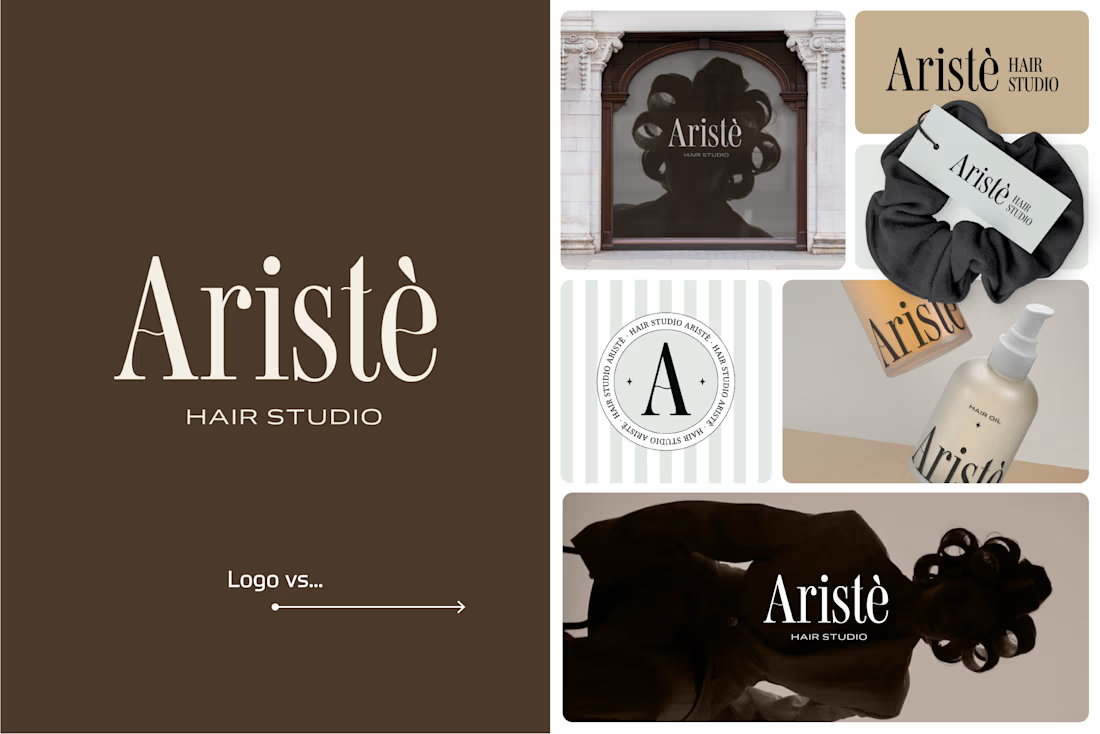
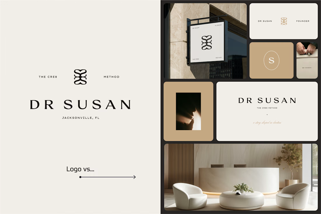
I picked a few of my branding projects to show what happens beyond the logo.
First, the logo on its own. Then, the full visual identity: colours, typography, graphic elements, patterns, packaging, and all the little details that make each brand feel like itself.
Because I don't want a logo to just look good sitting on a presentation slide. I want to see what it can become when it gets out into the real world.
Every project has a different story, personality, and visual direction. And that's probably my favourite part of brand design: figuring out how to turn one initial idea into a whole visual language.
Swipe through and meet the logos, then their bigger personalities. ;)
A logo is the starting point. The fun really begins after that.
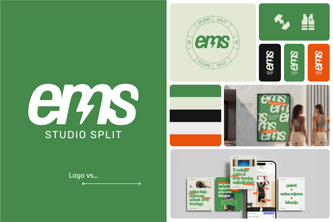
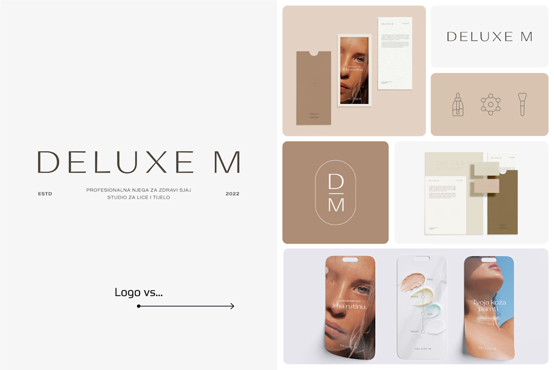

Clever use of the lightning bolt in the EMS logo!

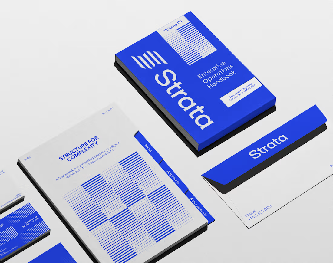
In geology, strata are layers laid down over time, each one holding the rest. That’s exactly what an enterprise platform should feel like.
I designed the brand identity for Strata, a SaaS platform that connects fragmented systems, data, workflows and teams. The name already carried the idea, so the identity makes it visible: “Every layer, working as one.”
Logo: Five stacked layers forming a subtle S, solid like rock and arranged for motion.
Principle: “Complexity, organized into movement” turns a dense product story into something calm.
Palette: Strata Blue #2447F9, near-black #02040C and white. Flat colour only, so every layer stays distinct.
Layout: Modular grids and architectural spacing that build pages the way strata build ground, in order.
Imagery: Portraits washed in Strata Blue, with light streaming through, putting people at the centre of the system.
A good name sets up the brand. The identity has to prove it.
If your SaaS or B2B platform needs a brand as solid as its infrastructure, let’s talk.
#BrandIdentity #SaaSBranding #TechBranding #LogoDesign