The network for creativity
Join 1.25M professional creatives like you
Connect with clients, get discovered, and run your business 100% commission-free
Creatives on Contra have earned over $150M and we are just getting started
Back to feedPost

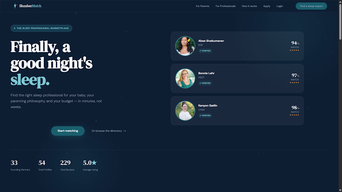
Another Webflow marketplace successfully delivered. 🚀
I just wrapped up https://www.slumbermatch.ai — a launch-ready two-sided marketplace that connects parents with vetted sleep professionals.
Built with Webflow, Memberstack, Airtable, Zapier, Whalesync, Typeform, Calendly, and Finsweet, the platform includes:
• A CMS-powered expert directory with advanced filtering
• Dynamic profile pages with booking and inquiry features
• A secure partner dashboard for professionals
• Automated workflows that sync and publish approved records seamlessly
The result: a scalable MVP that helps parents find trusted experts while giving professionals an easy way to manage their presence online.
From HTML mockups to a fully functional product in just a few weeks. Excited to help more founders bring ambitious ideas to life.
#Webflow #NoCode #Marketplace #Memberstack #Airtable #Zapier #StartupBuild


The network for creativity
Join 1.25M professional creatives like you
Connect with clients, get discovered, and run your business 100% commission-free
Creatives on Contra have earned over $150M and we are just getting started











Related posts

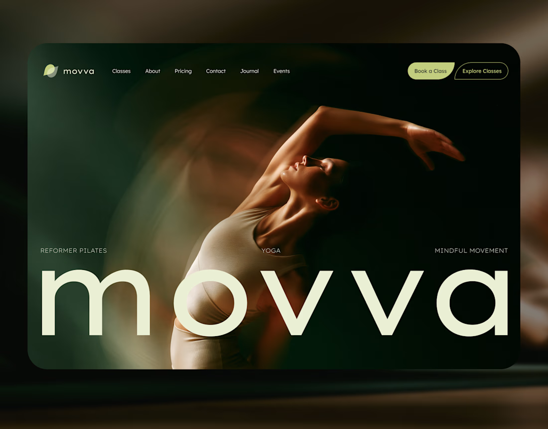
MOVVA is now featured on Contra 🤍
I’m especially happy about this because working on this template was a creative outlet for me.
I wanted to build something useful for a business: a website that covers what a studio needs when it opens, from an easy-to-use schedule to clearly structured class information, with a solid foundation for SEO.
At the same time, I wanted it to feel beautiful. To bring a sense of movement, lightness, and the joy of taking a class into the design. To capture that friendly atmosphere that makes you want to walk into a studio and give it a try.
Thank you, Contra team!


Huge congrats on getting featured! 🤍 MOVVA looks stunning - love the mindful movement vibe and that hero image. Super useful concept for studios. Well deserved feature!


SES AI is a battery technology company accelerating the energy transition through AI-powered material discovery, battery development, manufacturing, and management.
SES AI approached us with a website redesign driven by its new “All-in on AI” strategy. As AI became central to the company’s work across safety, manufacturing, and science, the existing website still focused primarily on its battery-hardware side. We redesigned the experience to clearly communicate the three AI pillars, while making the website simpler, more direct, and easier to navigate.


This looks insane. The robotic arm with the battery cell is such a strong visual. Love how clean you kept it despite it being AI heavy.
A clean and modern food delivery app concept designed with a focus on simple navigation, clear layouts, and a smooth user experience.
Designed in Figma.
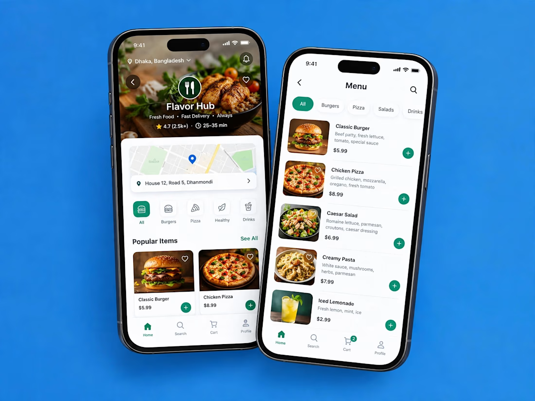

Love how clean and intuitive this feels, the navigation looks super smooth and the layout is really well balanced