The network for creativity
Join 1.25M professional creatives like you
Connect with clients, get discovered, and run your business 100% commission-free
Creatives on Contra have earned over $150M and we are just getting started
Back to feedPost

Too many CTAs can make a Kajabi sales page harder to convert.
“Buy Now.”
“Learn More.”
“Join the Waitlist.”
“Book a Call.”
When all of them are competing for attention above the fold, visitors have to figure out what you want them to do instead of simply taking the next step.
A better approach:
One page → one primary action.
Everything else should support that action or stay secondary.
Good conversion-focused design isn’t about adding more buttons. It’s about removing unnecessary decisions and making the next step obvious.


Exactly. I also keep one primary CTA label consistent from the hero through the page, then use secondary links only for objections like FAQs or curriculum. On Kajabi, the offer page and checkout should continue the same promise so the handoff feels intentional. Do you usually test sticky mobile CTAs separately?
The network for creativity
Join 1.25M professional creatives like you
Connect with clients, get discovered, and run your business 100% commission-free
Creatives on Contra have earned over $150M and we are just getting started



Trending
retrofuturism
Share your favorite designs from the past exploring the distant future. Or your own take on the aesthetic 🚀
halftone
Dots. Texture. Grain. Let's see your designs using the halftone technique.

Midjourney
Creatives are showing off what they're making with Midjourney.
colorgrade
Video editors sound off: How do you enhance the mood of your video in color grading?
Related posts


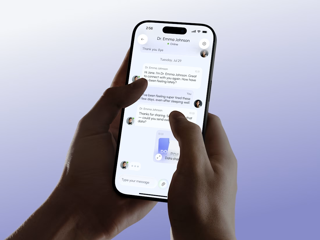
Clean concept. The app feels simple without making it look too clinical.

Are you a first-time founder and can’t seem to find a moment to post on LinkedIn?
Get yourself a Figma system filled with ready-to-use posts and placeholder content.
Change the look to your liking, adjust the text and you’re good to go.
Your potential clients won’t know about you if you’re not out there.
No time to set it up yourself?
I also do custom LinkedIn systems. Built around your branding, your tone of voice & content you can actually use.

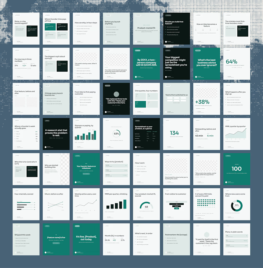

The idea is practical and very relevant for founders. I like how the system turns content creation into something repeatable instead of starting from a blank canvas every time.


So crisp, clear, and beautifully done!