The network for creativity
Join 1.25M professional creatives like you
Connect with clients, get discovered, and run your business 100% commission-free
Creatives on Contra have earned over $150M and we are just getting started
Back to feedPost


INCLUDE: Luxury wellness brand site with video-first marketing. HLS adaptive bitrate streaming via CloudFront CDN for zero-buffer playback across all devices and connection speeds. Accessible video player with poster frames, mute/unmute controls, and mobile-safe autoplay.
Hybrid architecture: Webflow handles the editorial frontend with pixel-perfect design freedom, Shopify handles transactions and checkout. No traditional theme constraints. Full GDPR compliance with European consent management.
Core Web Vitals passed: LCP 1.7s, CLS 0, FCP 1.0s, TTFB 0.4s. Lighthouse SEO 100. Webflow, Shopify, HLS.js, CloudFront, AWS. Delivered at Yumeda Studio.


The network for creativity
Join 1.25M professional creatives like you
Connect with clients, get discovered, and run your business 100% commission-free
Creatives on Contra have earned over $150M and we are just getting started

Related posts

A high-impact Webflow experience for an industrial site-selection platform.


Industrial site selection on Webflow lives or dies on map and filter clarity. High impact usually means dense data still scans on mobile.


Your product page shouldn’t make customers work this hard to buy.
For pet apparel, one of the biggest conversion killers isn’t always the product.
It’s uncertainty about fit.
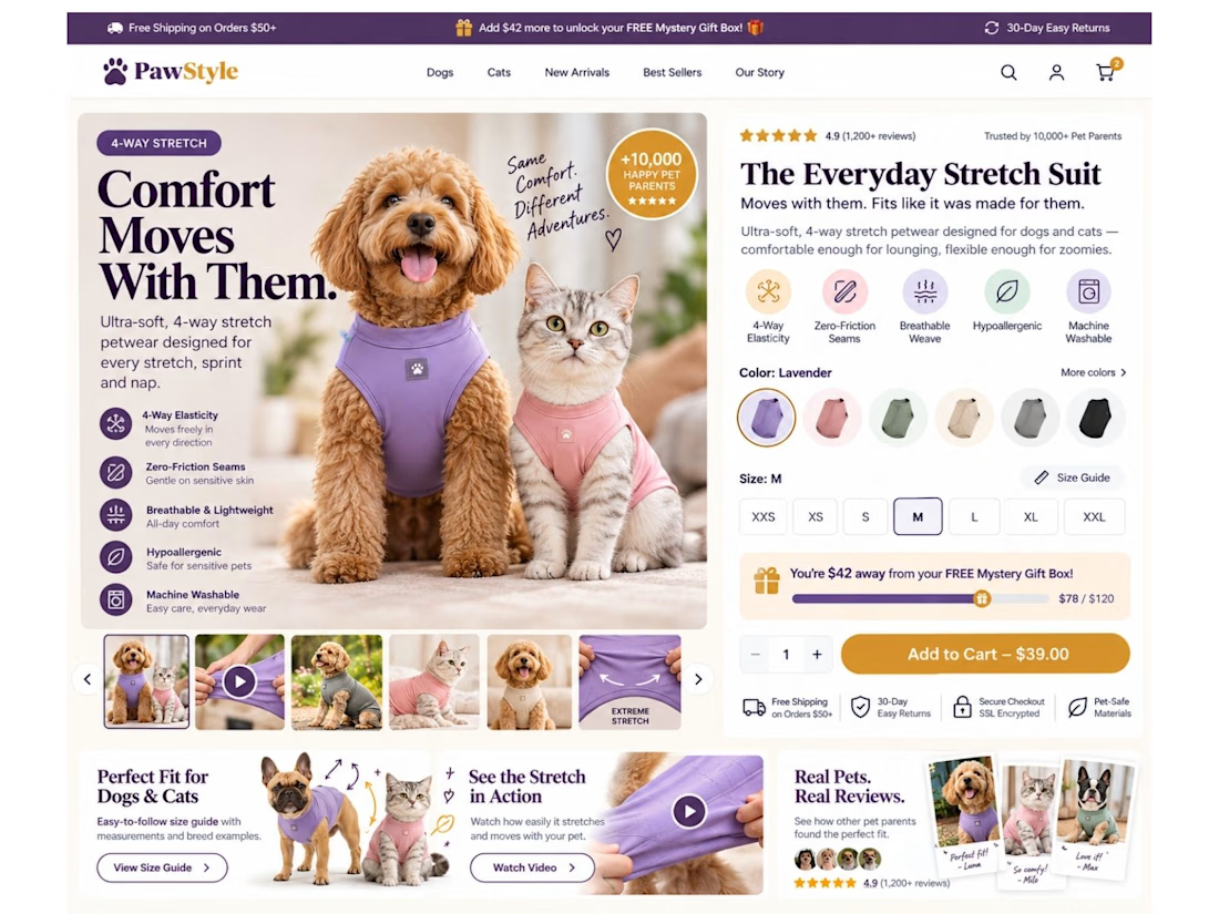
So I designed this Shopify product page concept around one goal: remove hesitation before the Add to Cart.
Instead of a basic product page, I built the buying experience around:
🐾 Dog + cat sizing support
📏 Easy-access interactive size guide
🧵 4-way stretch & product benefit callouts
🎥 Stretch demonstration video
⭐ Pet-specific reviews & UGC
🎁 Free gift progress tracker to increase AOV
🎨 Color + size selection above the fold
🛒 Clear, high-visibility Add to Cart
📱 Mobile-first sticky purchase experience
📩 Back-in-stock flow for unavailable sizes
The idea is simple:
Don’t just show the product. Answer the questions stopping someone from buying it.
“Will it fit my dog?”
“Will it stretch?”
“Which size should I choose?”
“Can I trust the quality?”
“What are other pet owners saying?”
Good eCommerce design should answer those questions before the customer has to ask them.
That’s how I approach Shopify design: UI/UX + CRO + buyer psychology, not just making pages look good.
What’s the #1 thing that makes you hesitate before buying clothing online—for yourself or your pet? 👇



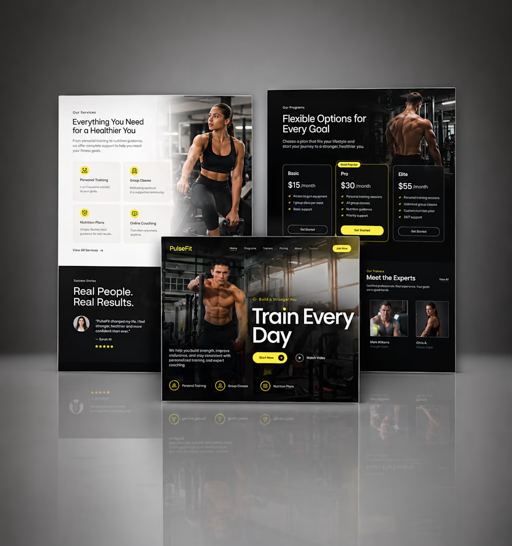
Kajabi Gym & Fitness Landing Page Design
The client needed a focused landing page for their gym and fitness offering that could present the program clearly and encourage visitors to take the next step.
I designed the landing page in Kajabi with a strong visual hierarchy, clear sections for the fitness program, benefits, social proof, and calls to action. The layout was also structured to work smoothly across desktop and mobile.
The result was a clean, focused fitness landing page that makes the offer easier to understand and gives visitors a clear path toward getting started.
#KajabiFitness #KajabiFitnessCoach #KajabiFitnessWebsite #KajabiFitnessLandingPage #FitnessCoachWebsite #FitnessCoachingWebsite #OnlineFitnessCoach #PersonalTrainerWebsite #FitnessLandingPage #GymLandingPage #FitnessProgram #OnlineFitnessProgram #PersonalTraining #WeightLossCoach #FitnessFunnel #FitnessSalesPage #GymWebsite #FitnessWebsiteDesign #FitnessWebDesign


Great work, Hesty. I like how you focused on clear hierarchy, social proof, and strong CTAs instead of just making the page look good. That combination of UX + conversion thinking is what makes a landing page effective.





