The network for creativity
Join 1.25M professional creatives like you
Connect with clients, get discovered, and run your business 100% commission-free
Creatives on Contra have earned over $150M and we are just getting started
Back to feedPost

A layover companion — dark, cinematic, fully interactive. Here's what's live:
The clock ticks in real time (your local time)
Countdown to boarding ticks down every few seconds, and the progress bar slides with it
Click any flight on the departures board to switch your destination
Mood pills toggle — tap what you want to do
Ambience bars animate continuously, click the track to adjust each layer
Bottom strip shows gate close time, terminal, currency, wifi


The network for creativity
Join 1.25M professional creatives like you
Connect with clients, get discovered, and run your business 100% commission-free
Creatives on Contra have earned over $150M and we are just getting started





Related posts

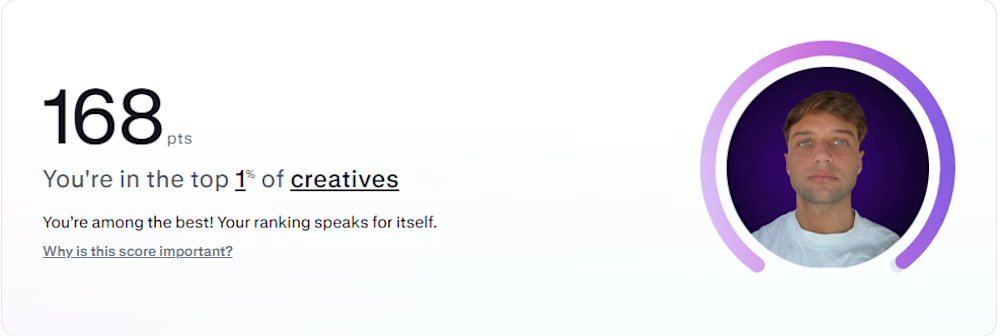

Congrats on top 1% Franco! Amazing achievement 👏
Quick question if you don't mind - I'm new on Contra (UGC + 3D product animation niche). My PTS is low right now. What was the 1 thing that helped you the most to increase your score from 0 to 100+?
Would love to learn from your journey!

Swiss-inspired web design exploration. Which one would you go with?
11 voted
37%
19 voted
63%
30 votes
Closed

expanded for user convinience

Website redesign complete 🚀
Can’t wait to share the full site. Until then, here’s my personal favorite interaction from the project.
Industry: Data / Crypto


Really clean design.