The network for creativity
Join 1.25M professional creatives like you
Connect with clients, get discovered, and run your business 100% commission-free
Creatives on Contra have earned over $150M and we are just getting started
Back to feedPost

Skincare with nature + science and a slow-release formula that makes your routine addictive.
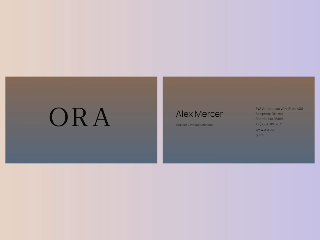
I designed the brand identity for ORA, a premium biotech skincare brand.
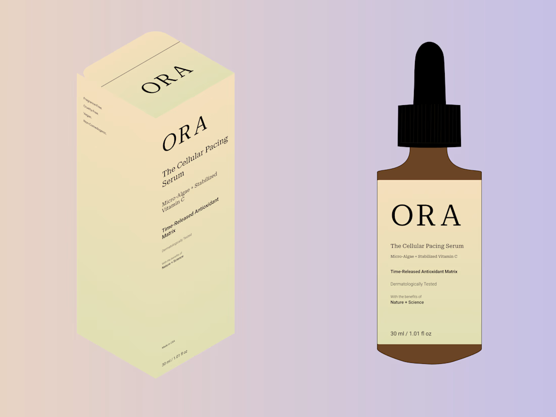
ORA uses a slow-release formula that delivers micro-doses to skin layers over time to protect skin dealing with redness, irritation, or barrier damage caused by harsh chemicals. I represented this standout concept directly in the wordmark, using wide letter spacing to effectively symbolize the slow release.
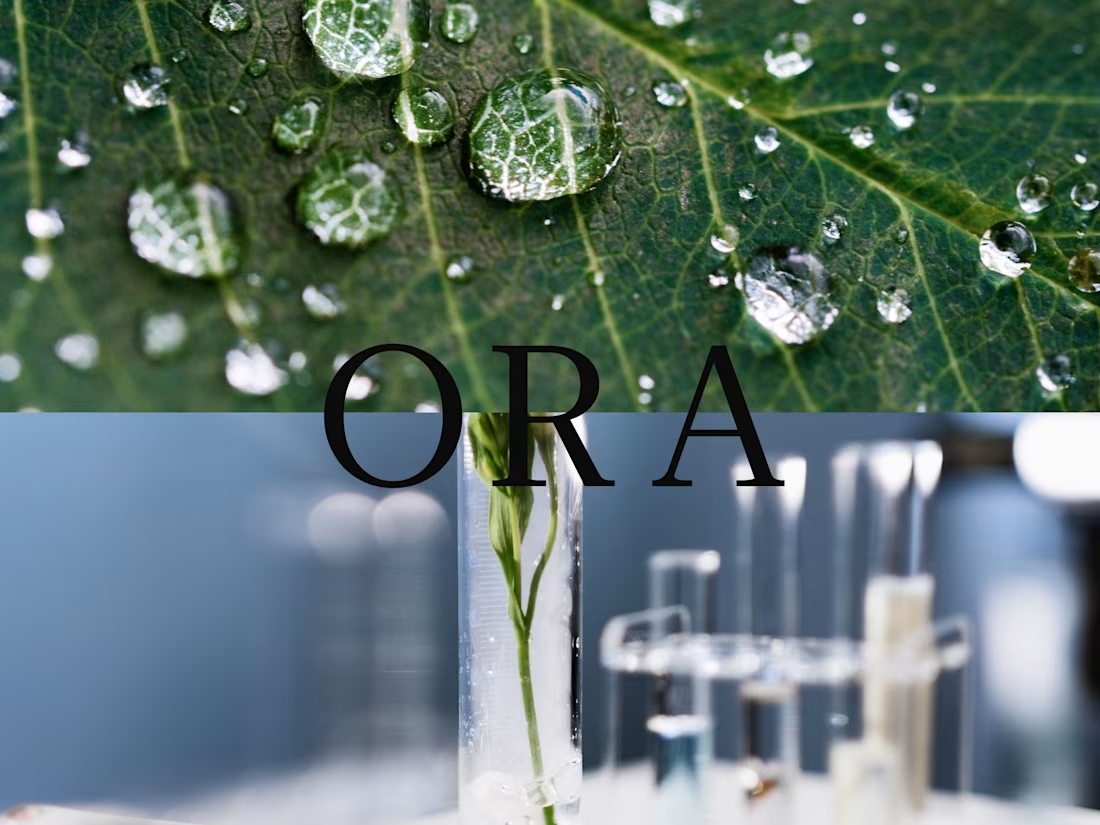
Because ORA bridges the gap between nature and science, the visual identity uses seamless gradients to tell the whole story.
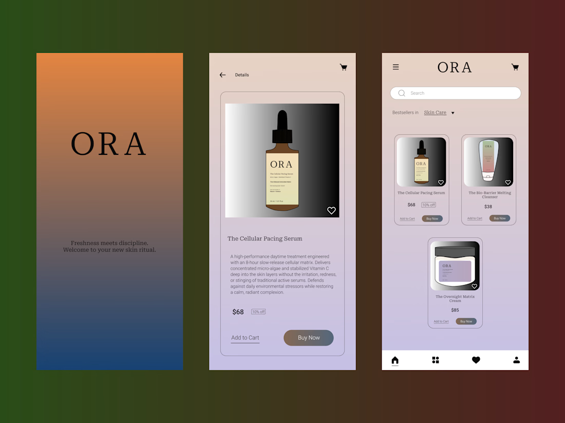
I expanded this into a full brand identity by designing the packaging, UI, retail, and social touchpoints.
Sharing some brand assets here, but the full case study is live on my profile.
The network for creativity
Join 1.25M professional creatives like you
Connect with clients, get discovered, and run your business 100% commission-free
Creatives on Contra have earned over $150M and we are just getting started



Related posts

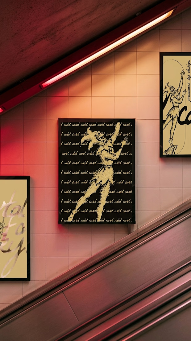
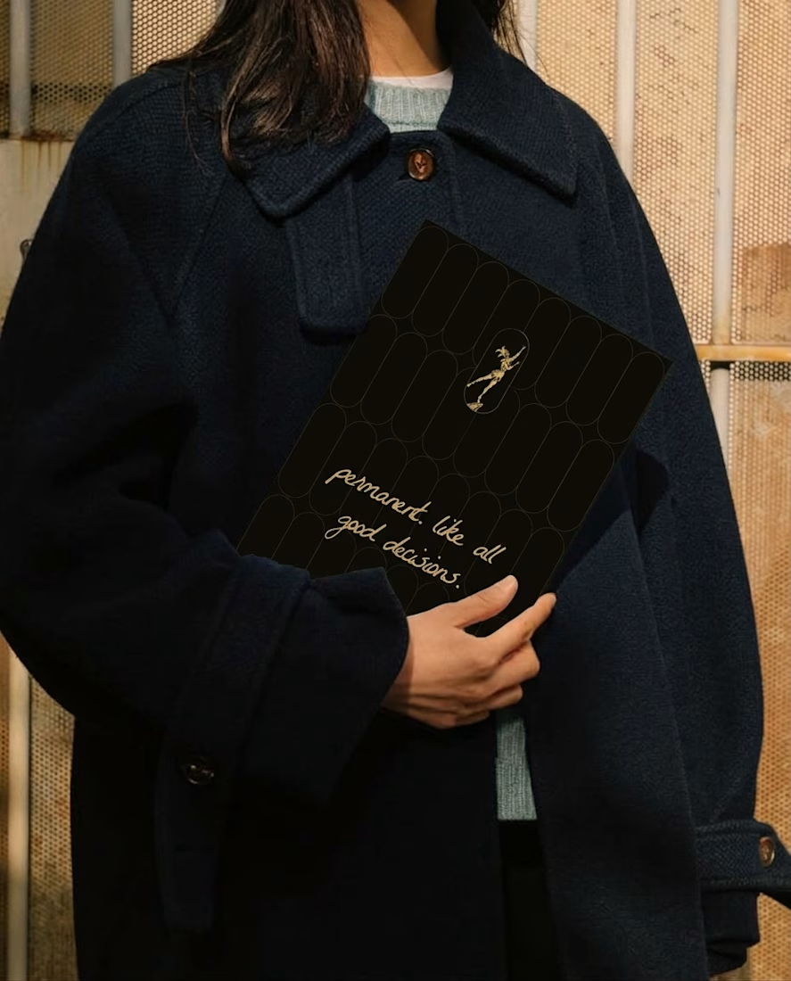
can gold stay precious if you use it everywhere?
my rule for wild card tattoo club: gold is foil, never paint. ink, chalk and one drop of oxblood do the rest.

Umami Color & Finishing is an established color-grading studio in LA. Its work and reputation had outgrown its old site, and the studio was ready for one at the level of its work.
I designed and built it around the work itself: every project filterable by type and colorist, and every view with its own link, so the team can send a lead exactly what fits.
Case study
Live site: umamicolor.com


this is amazing work

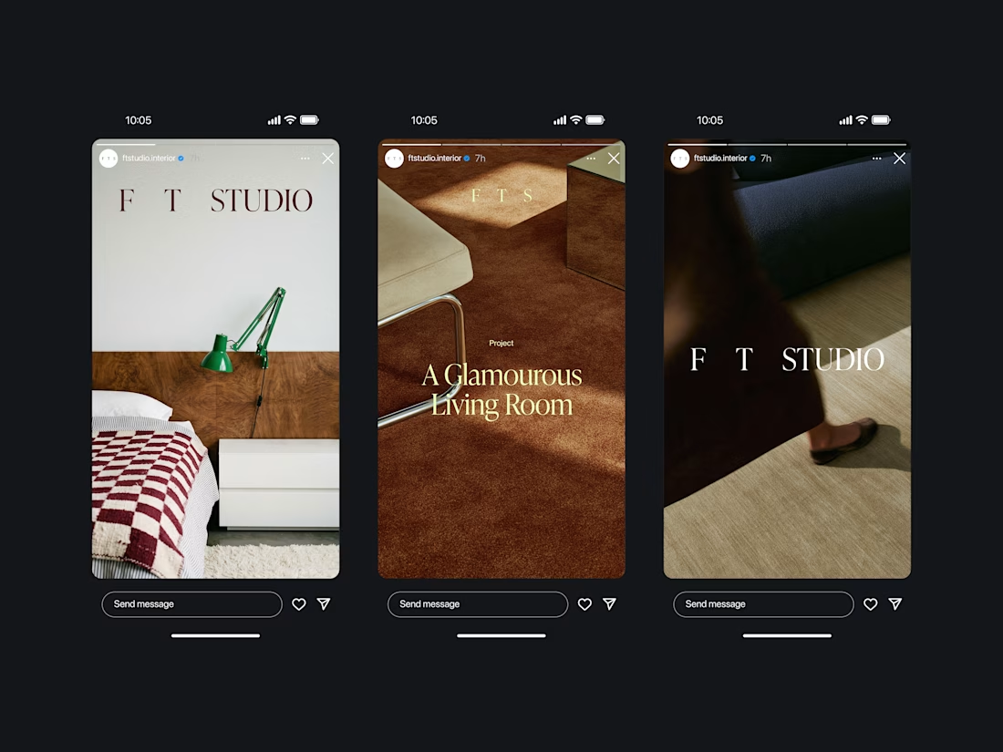
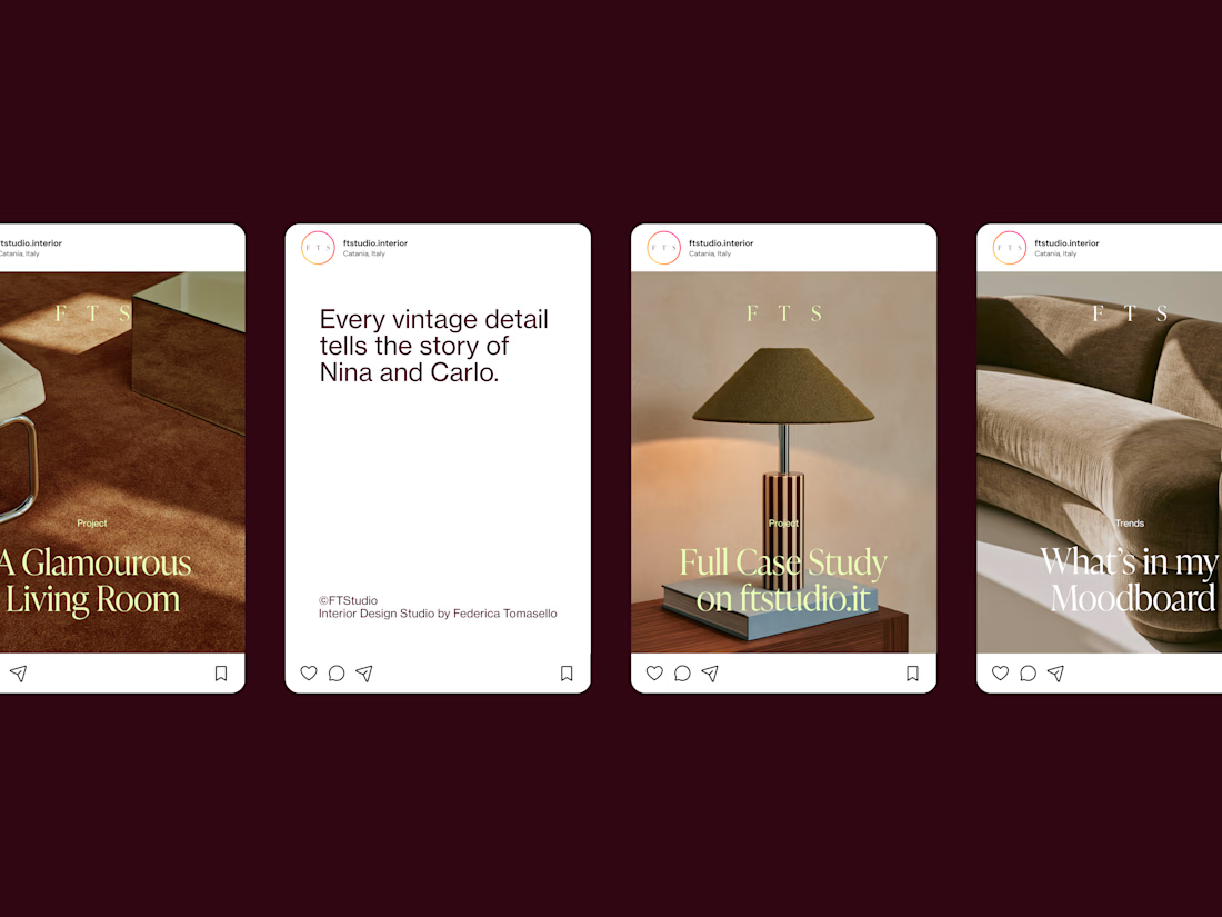
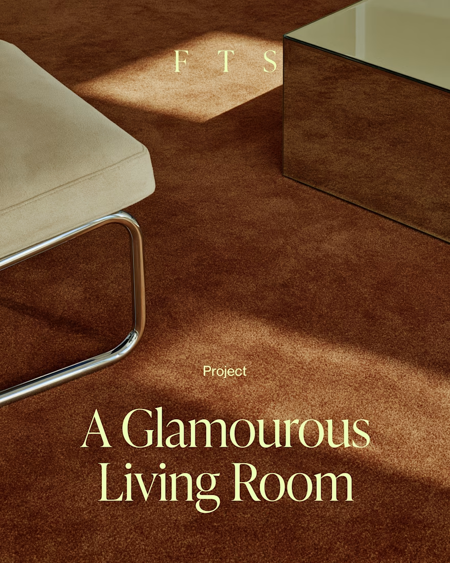
Social Media Posts for FT Studio, Interior Design Studio by Federica Tomasello.
Having a social media presence, these days, is no longer something up for debate. You have to be present; you have to introduce yourself to the world.
I enjoy designing social templates for my clients, as long as they speak exactly their language and communicate who they are: who they are in real life and what changes their work can bring to other people's lives.
You have to be specific, not because the niche matters, but because each of us, and the work each of us does, is the result of our personal experiences, our social interactions, our families, our studies, our passions. And that can only be unique.
If you're interested in how the project developed, take a look at the full case study: FT Studio, Interior Design Studio Brand Identity
Thank you,
alessia.


I love them!! They look so good.