The network for creativity
Join 1.25M professional creatives like you
Connect with clients, get discovered, and run your business 100% commission-free
Creatives on Contra have earned over $150M and we are just getting started
Back to feedPost

Proud to submit the Off Grid Adventure Vans website for the #squarespacechallenge!
I designed and developed a responsive Squarespace website focused on showcasing custom camper van conversions with clean navigation, engaging visuals, mobile optimization, and an intuitive user experience. It was a great project that balanced storytelling, performance, and ease of content management.
Live: https://www.ogavans.com/
#squarespacechallenge

ogavans.com
Off Grid Adventure Vans
Elegant campervan conversions designed and built for every adventure. Live out your Vanlife dreams knowing our experienced team has your back every step of the way .
The network for creativity
Join 1.25M professional creatives like you
Connect with clients, get discovered, and run your business 100% commission-free
Creatives on Contra have earned over $150M and we are just getting started











Related posts

Project Title:
Dunkin’ Product Web Concept
Project Description:
A playful web design concept created to explore bold product visuals, strong composition, and interactive brand presentation. The goal was to turn a simple product idea into a more engaging digital experience while keeping the layout clean, clear, and visually memorable.
This concept reflects how I approach web design in general — understanding the brand, building a strong visual direction, and creating an experience that works around the product, service, or idea being presented.
Role: Web Designer / Creative Developer
Focus: Visual Direction, Layout, Product Presentation, Web Interaction


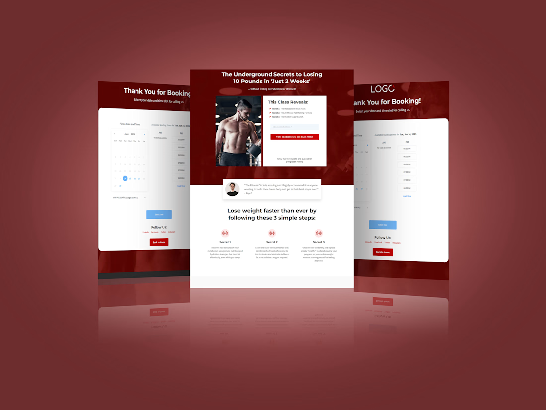
A landing page that does one job: get the email, then get the booking.
I designed a lead funnel for a fitness class, built as a landing page with a booking page right behind it. Here's what each part does:
Proof comes right after the promise. A client testimonial sits directly under the hero, so doubt gets answered before the visitor scrolls.
Scarcity is stated plainly. "Only 100 live spots" gives people a reason to act today without a fake countdown timer.
The thank-you page does real work. Instead of a dead end, the visitor picks a date and time slot right away, while their interest is highest.
The red and white palette keeps the energy high, and the red button is the only one that stands out.


sentences
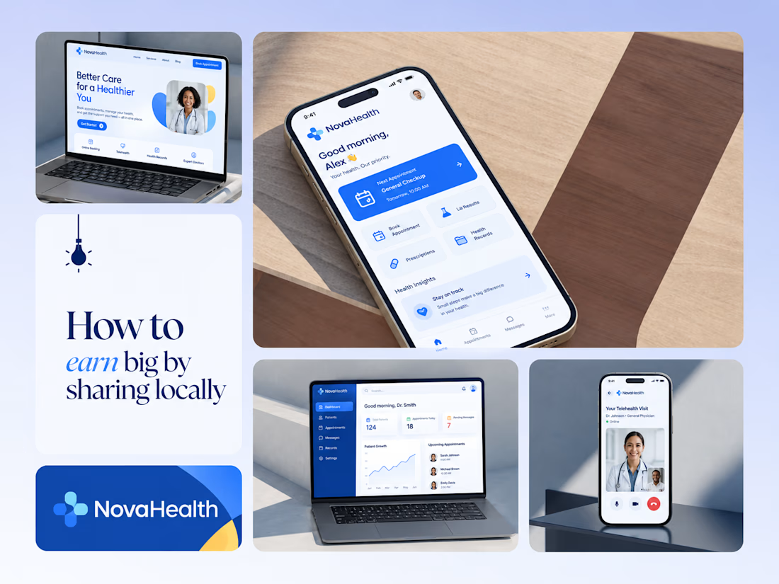
One brand, three screens: patient, doctor, and the video call between them.
NovaHealth is a healthcare brand and product system I designed from logo to apps. Healthcare software tends to feel either cold and clinical or too cluttered to open. I wanted something calm for a worried patient and quick for a doctor between appointments.
The logo breaks the classic medical cross into soft, rounded blocks in two blues, so it reads as “health” without feeling sterile.
The patient app opens with one thing: a solid blue card showing your next appointment. It’s the only fully saturated block on the screen, so nothing competes with it.
The doctor dashboard is built for a glance. Total patients, today’s appointments, and pending messages come first, in the same blue and rounded style as the patient app.
The telehealth screen has almost no UI. The doctor’s face fills the screen, with just three controls: mic, camera, and a red end-call button, the only red in the whole system.
One rule ties it together: blue means action, white space means calm, and yellow is a small spark of warmth.
Which screen should I break down next? 👇


Great medical brand design specially the phone app UI and top left laptop dashboard 🔥🔥🔥
great job Joshua ❤️🎉