The network for creativity
Join 1.25M professional creatives like you
Connect with clients, get discovered, and run your business 100% commission-free
Creatives on Contra have earned over $150M and we are just getting started


The network for creativity
Join 1.25M professional creatives like you
Connect with clients, get discovered, and run your business 100% commission-free
Creatives on Contra have earned over $150M and we are just getting started





Related posts

09 XL — From a Portrait to a Visual Story.
This one started with a simple black-and-white portrait, but I wanted to give it a little more personality. I began experimenting with contrast, grain, and shadows to build a raw, almost cinematic atmosphere.
Then came the fun part — playing around with typography, adding the black strip across the eyes, and using minimal details like 09 and XL to give the composition a subtle editorial feel.
Once the poster came together, I placed it in a real-world bus stop mockup to see how it would live outside the screen.
A little experimentation, a few happy accidents, and lots of tiny adjustments later — this was the result.


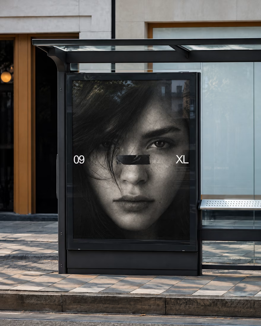
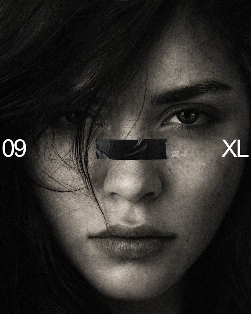

The black bar across the eyes with 09 and XL on the sides turns a simple portrait into a bold poster, and the bus stop mockup shows it works at street scale. Is the grain added in Photoshop or part of the original photo?

Like a lot of designers, I find my portfolio one of the hardest projects. There's no deadline, and it can always get better. Anyway, I think I'm happy with this one for a while.
Take a look:
davidguba.com


portfolio looks sharp


I'm in the US for a couple of weeks and I keep spotting these neon signs. So I designed my own, Desert Rest, as a flat still, then asked ChatGPT to bring it to life with the new GIFs
What still of yours would you bring to life with a GIF? Show me 🙌