The network for creativity
Join 1.25M professional creatives like you
Connect with clients, get discovered, and run your business 100% commission-free
Creatives on Contra have earned over $150M and we are just getting started
Back to feedPost

Most employee benefit platforms fail because of cluttered UIs, rigid perk systems, and confusing admin dashboards.
I avoided that on the Rezy redesign. Here’s how.
🧵(1/5)
Built around scannable, tailored benefits—not complex administrative headaches. Floating tags give employees instant clarity on their perks.
(2/5)
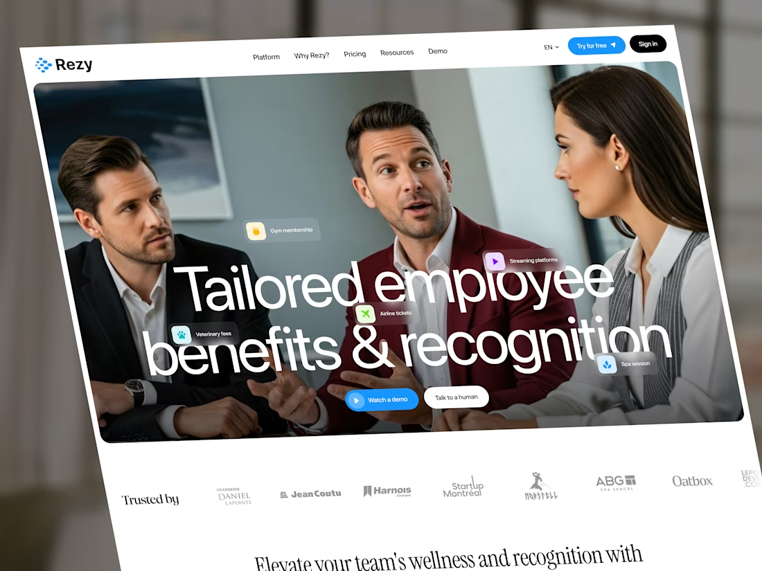
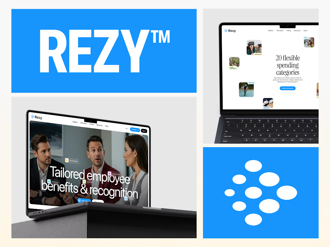
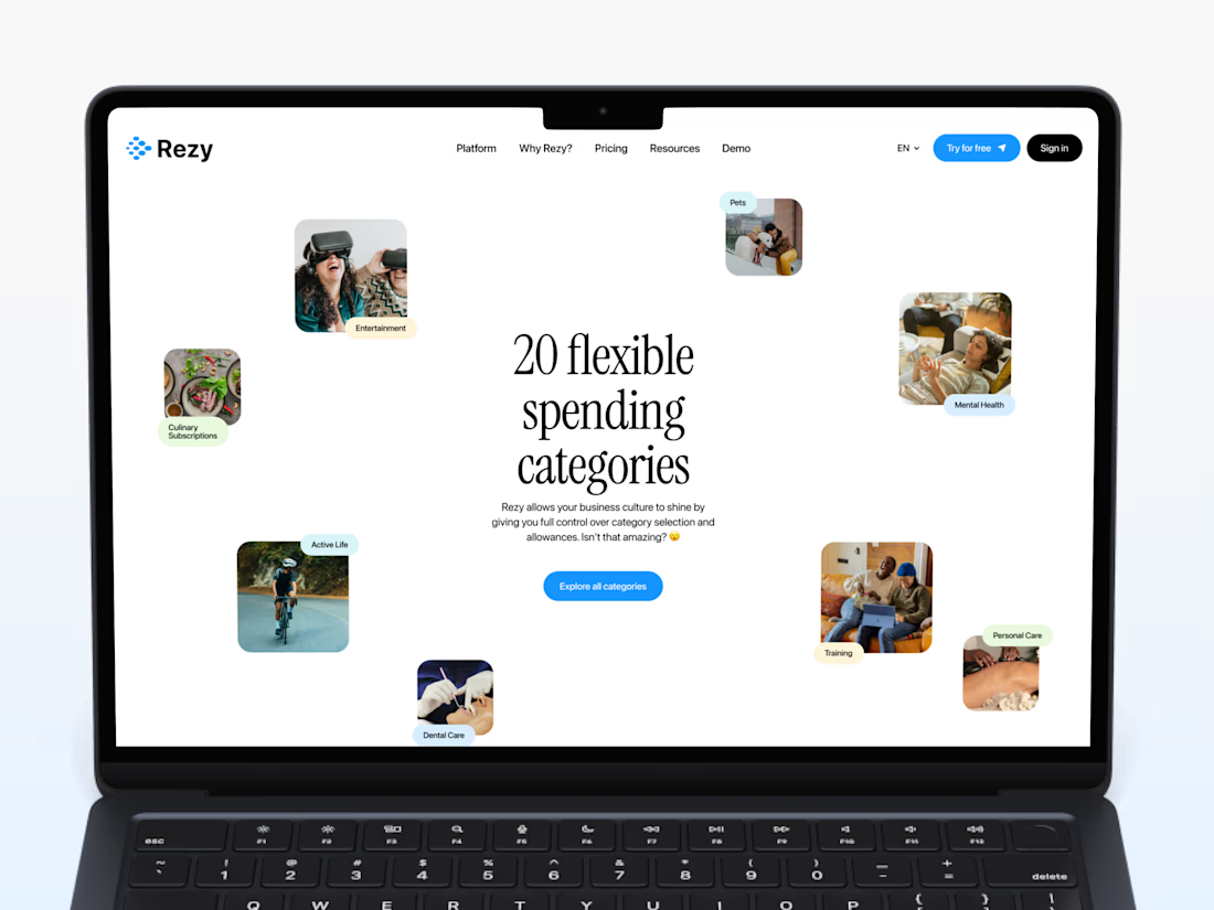
On real devices. Designed with a flexible structure because personalized recognition needs to feel effortless on both desktop and mobile. (3/5)
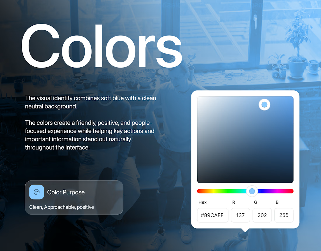
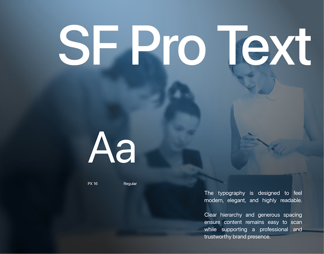
Brand system, applied. From the core web product to perk recognition cards and onboarding touchpoints—one cohesive visual identity. (4/5)
Full case study on Behance: https://behance.net/gallery/254110925/Rezy-HR-Tech-Workplace-Experience-Website
Building a SaaS or HR tech product? DMs open. 📩
The network for creativity
Join 1.25M professional creatives like you
Connect with clients, get discovered, and run your business 100% commission-free
Creatives on Contra have earned over $150M and we are just getting started







Related posts

Website redesign complete 🚀
Can’t wait to share the full site. Until then, here’s my personal favorite interaction from the project.
Industry: Data / Crypto


Really clean design.

This is a website redesign of an old personal project I made, and I just recently concluded it (2 weeks ago) It's one befitting for a small food business, and I just wrapped it up.
Just as I would do for my clients, I conducted a deep study on the website's old look to spot the loopholes and issues holding it back from getting customers.
I found a couple of issues, and it was massive. To sum it up, the previous look:
- lacked a compelling copy and crucial info
- only emphasized on the flavours of their product
- had no convincing proof
- didn't represent the brand
So, I decided to change that. I conducted keyword and competitor research to:
- see what customers call their products
- understand the industry standard
- find relevant keywords
- discover what works and chances we can take advantage of.
Fast forward to the conclusion of the project, I had taken a poor website into an actual sales machine by:
- adding a compelling copy that talked about the flavour and value they bring
- redesigning the UI while keeping it navigational for a better user experience
- enhanced the hero section to include value + flavour + attention-worthy design.
- integrating the keywords and other SEO setups
- made the website responsive across all screens.
- optimized the homepage to flow with the conversion funnel
- adding FAQs, testimonials and customer count to build trust and authenticity
- made the site represent the brand in every way.
A website redesign isn't only about changing the UI; it's about enhancing and re-optimizing a website to bring in and convert more leads into paying customers. Looking at this one, I got it well done.


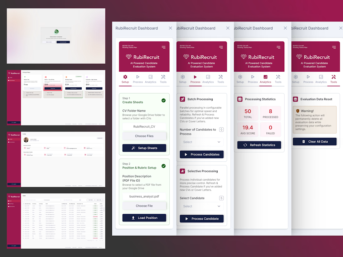
AI-Powered Candidate Evaluation System
Sole designer on RubiRecruit, an AI-driven recruitment platform. I redesigned the Chrome extension recruiters use to evaluate candidates and built two brand-new portals from scratch.
Full Case Study : https://imalshakandamby.github.io/project-rubi.html
Problem:
The original 8-step extension flow mixed manual and AI-automated steps with no distinction between them, gave no progress feedback, and overused the brand color so nothing signaled priority. An Admin Portal and User Portal didn't exist yet.
Solution:
I restructured the flow into 4 clear steps with explicit guidance, built the Admin and User Portals from the ground up on one reusable design system, and unified color, components, and navigation across all 3 surfaces.
Impact:
Evaluation time cut by half, zero ambiguity between user and system actions, and two fully functioning portals delivered on a reusable foundation built to expand, not rebuild.