The network for creativity
Join 1.25M professional creatives like you
Connect with clients, get discovered, and run your business 100% commission-free
Creatives on Contra have earned over $150M and we are just getting started
Back to feedPost

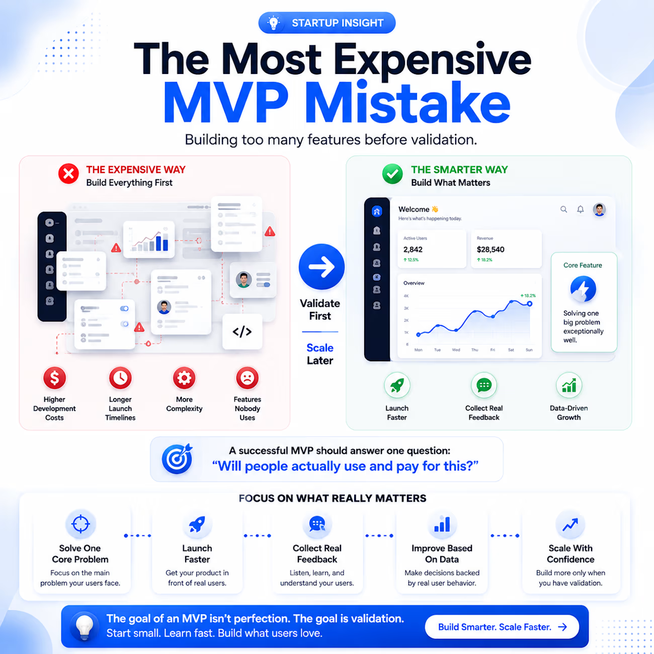
Most founders make the same mistake when building an MVP.
They try to build everything.
More features.
More screens.
More complexity.
But an MVP isn't supposed to be a complete product.
It's supposed to answer one question:
👉 Will people actually use and pay for this?
The most successful products usually start with a simple solution to a specific problem.
Instead of building 20 features, focus on:
✅ Solving one core problem
✅ Launching faster
✅ Getting real user feedback
✅ Making decisions based on data
✅ Scaling only after validation
The goal of an MVP isn't perfection.
The goal is learning.
Every extra feature adds:
• More development time
• Higher costs
• Increased maintenance
• Greater risk
The fastest-growing startups aren't always the ones that build the most.
They're the ones that validate the fastest.
As a Full-Stack Developer & Digital Consultant, I've seen simple MVPs outperform feature-heavy products because they focused on solving the right problem first.
If you're planning a SaaS platform, dashboard, mobile app, or AI-powered solution, start with validation before expansion.
What's the biggest MVP mistake you've seen startups make?
👇 Share your thoughts below.

The network for creativity
Join 1.25M professional creatives like you
Connect with clients, get discovered, and run your business 100% commission-free
Creatives on Contra have earned over $150M and we are just getting started





Related posts

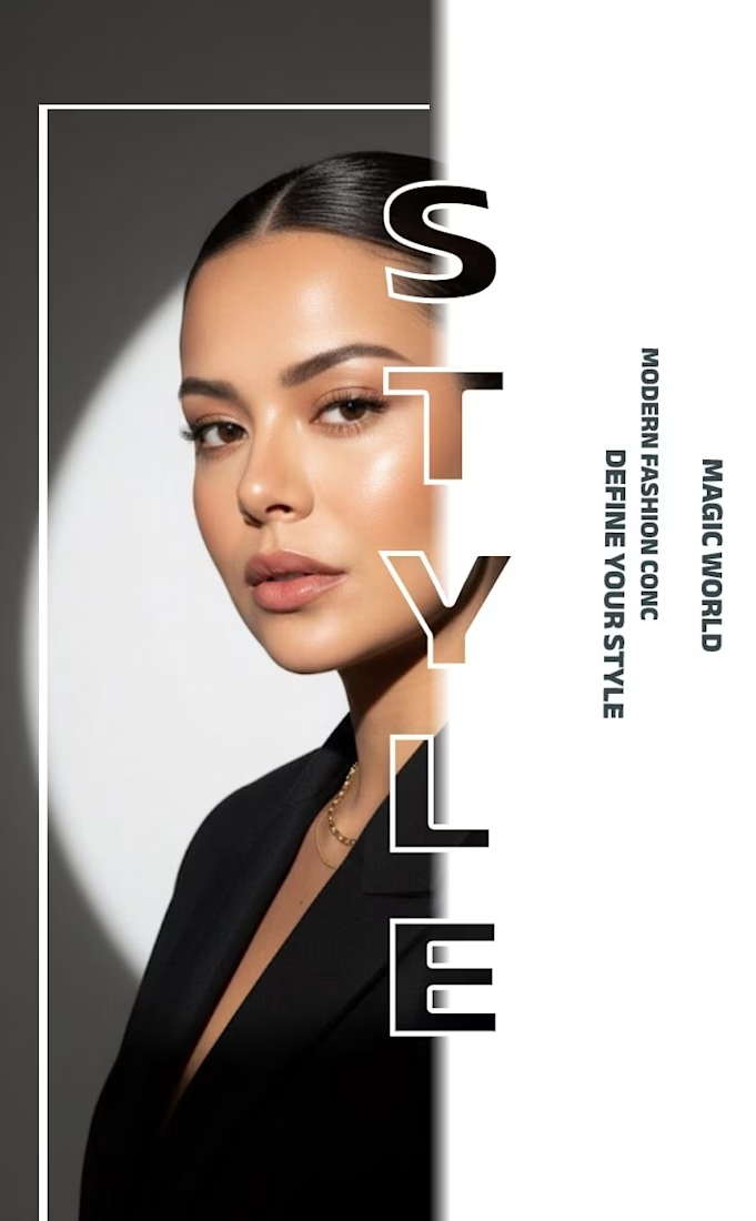
✨ Modern Fashion Poster Design - STYLE ✨
Designed a clean, high-fashion poster concept focusing on bold typography and minimalist aesthetics.
Concept: Modern Fashion | Define Your Style
Tool: Canva / Photoshop
Style: Luxury, Minimal, Editorial
Open to feedback and freelance work!
#GraphicDesign #PosterDesign #FashionDesign #Canva #ContraCommunity

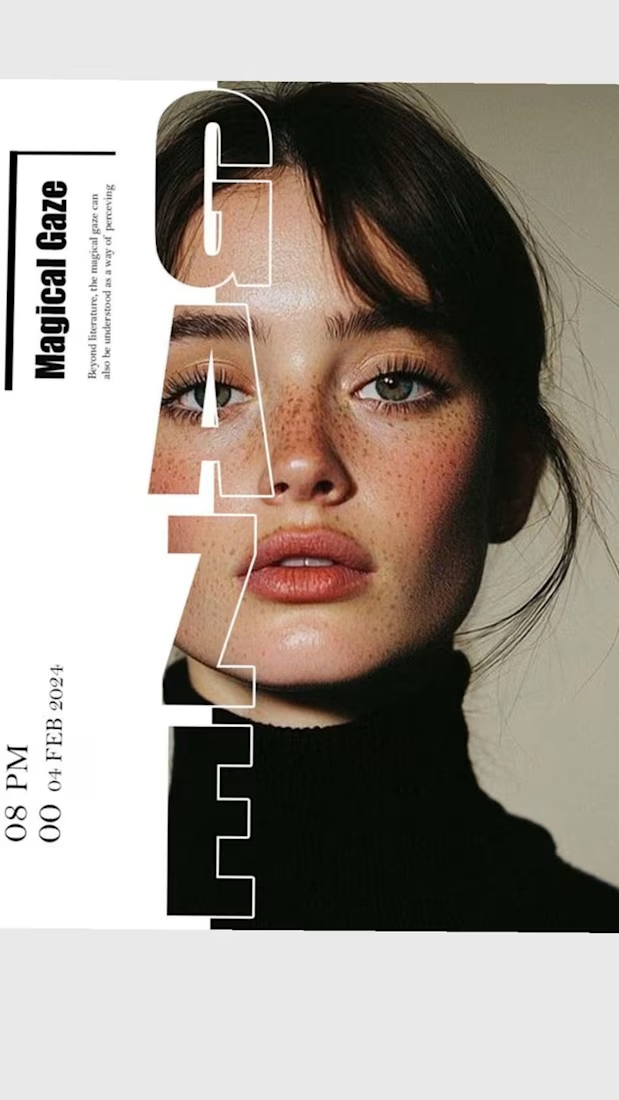

The way you let the bold type dominate the empty space really drives the luxury feel.

Hey everyone! 👋
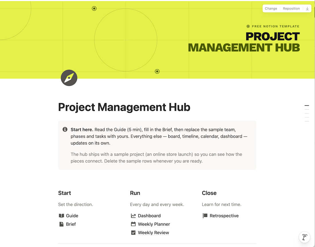
I built a Project Management Hub in Notion to run projects from brief to retrospective in one calm, minimalist workspace. It's for sale on Gumroad, but I'm sharing it for free with the Contra community.
It includes a guide, project brief, dashboard, weekly planner and review, plus 7 linked databases (tasks, phases, team, budget, risks and more). A sample project shows how everything connects.
It's for your personal use only, so please keep it within the Contra network.
Hope it helps! Let me know what you think 🙌


Love this!!

New hotel branding done : Alma del Mar 🌊☀️
A 12-room Mediterranean boutique hotel identity built around slower hospitality, personal details and a visual direction I called Kokkuri Retro — warm, rich and nostalgic, but never too loud.
From editorial pieces and guest amenities to room details and spatial touchpoints, I wanted every element to feel like part of the same world.
Where time softens.


Like the art direction


