The network for creativity
Join 1.25M professional creatives like you
Connect with clients, get discovered, and run your business 100% commission-free
Creatives on Contra have earned over $150M and we are just getting started
Back to feedPost

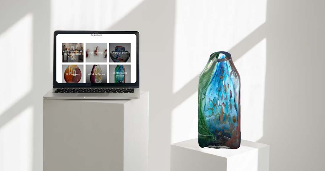
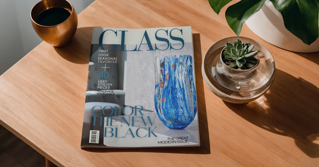
Website refresh and catalog design for glass artist Randi Solin

The network for creativity
Join 1.25M professional creatives like you
Connect with clients, get discovered, and run your business 100% commission-free
Creatives on Contra have earned over $150M and we are just getting started





Related posts

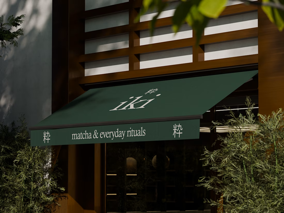
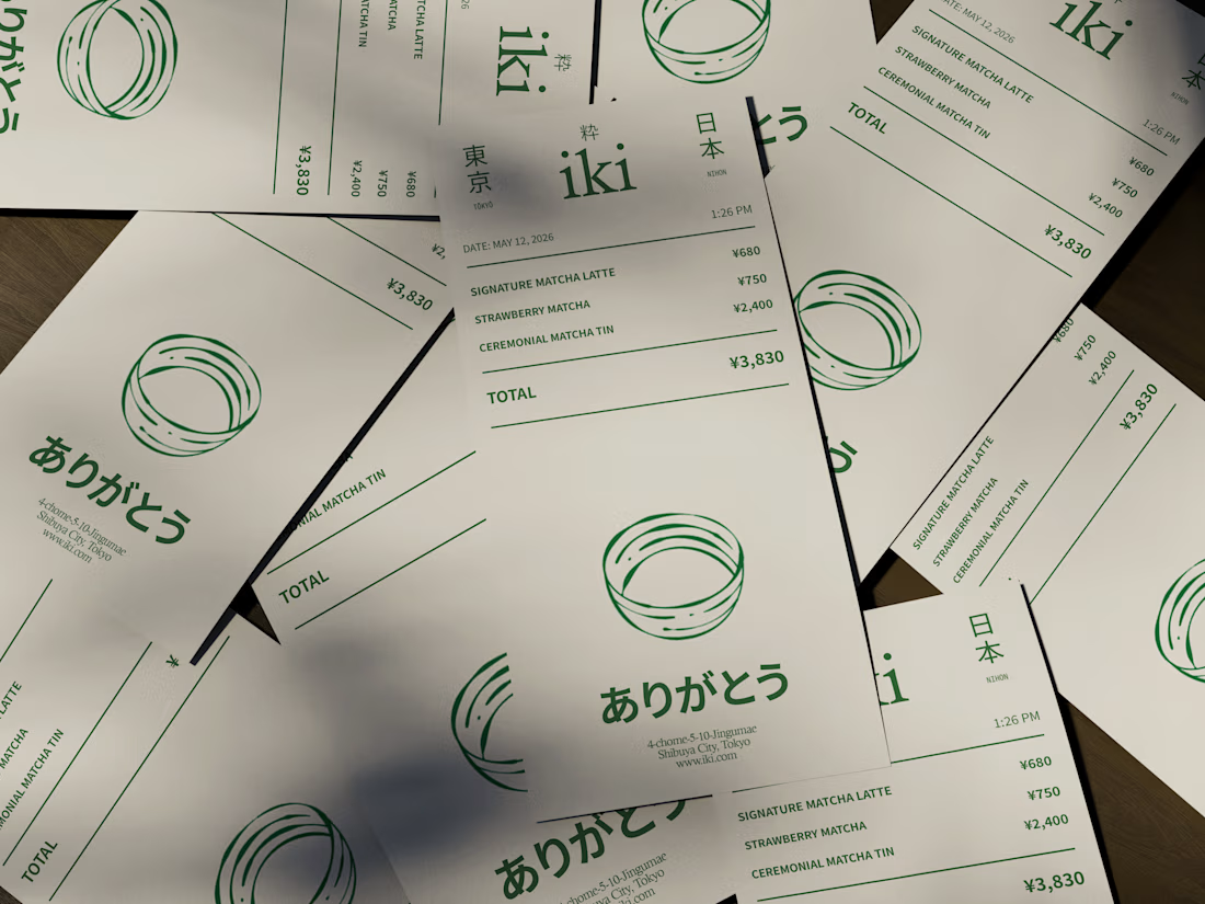
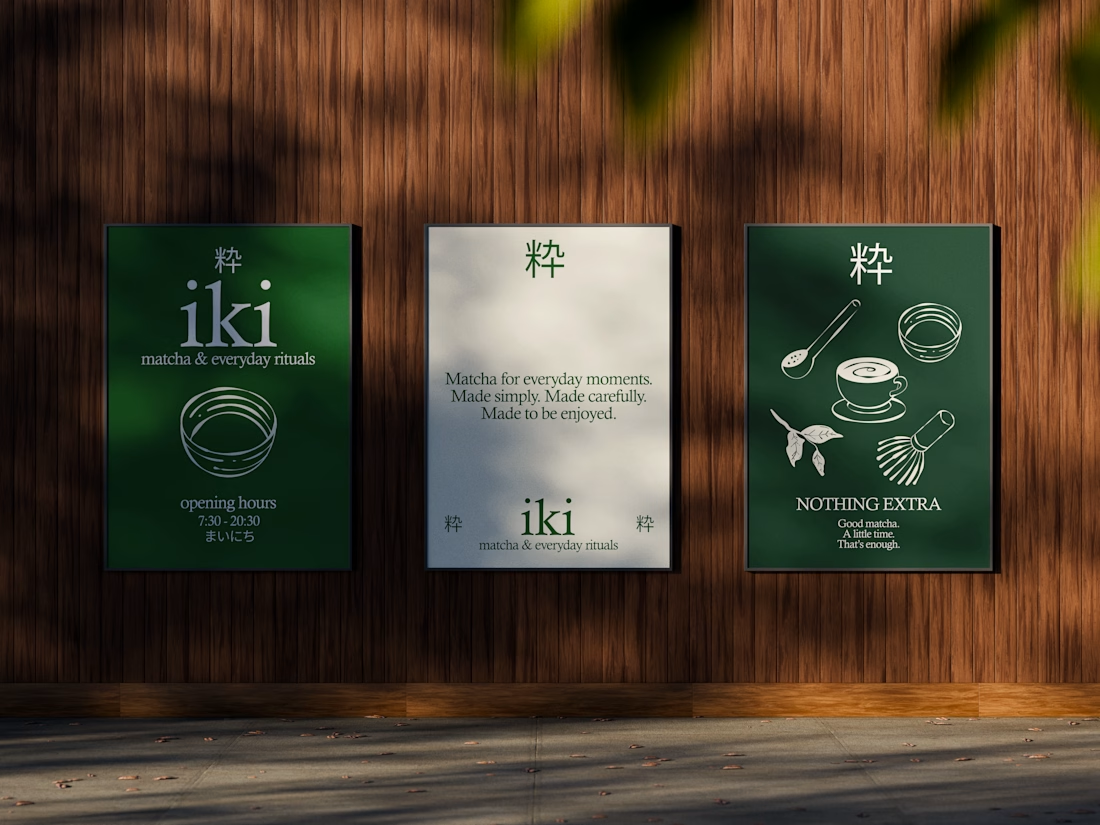
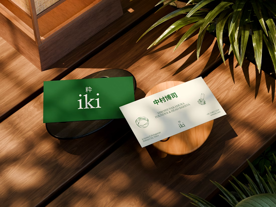
some visuals from iki, a matcha shop i’m currently working on 🍵
one of the most interesting parts of this project has been figuring out how to turn an abstract concept into something people can actually see and feel.
from the typography to the illustrations and overall visual language, every element is an opportunity to give the brand more personality and make it feel like its own world.
still exploring, but i’m really enjoying where this is going.


Great 🔥


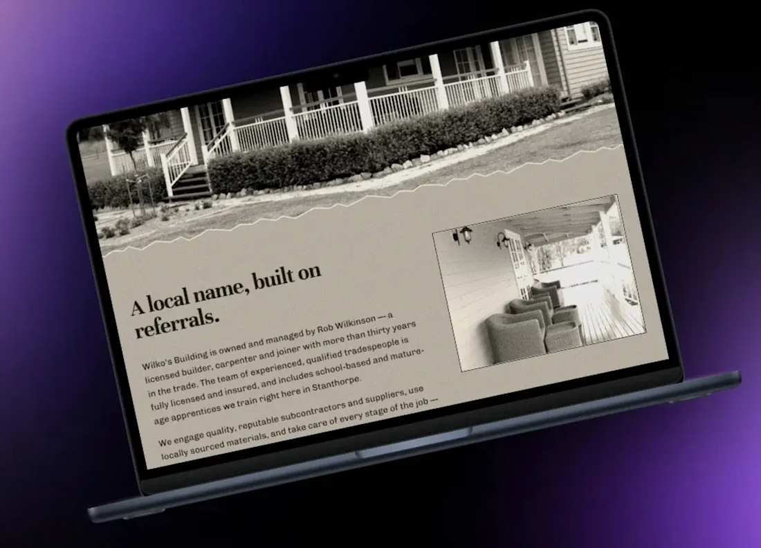
I built this website redesign concept for Wilko’s Building, a local building business.
Their existing site had been around for quite a while and was starting to feel dated, especially on mobile. I wanted to see what a cleaner, more modern version could look like while still keeping the business feeling established and straightforward.
The main focus was improving the mobile layout, making the content easier to scan, and giving the site a more polished structure without overcomplicating it.
I kept the build lightweight and responsive, with clearer sections for services, business information and contact details so customers can quickly find what they need.
This was a concept project rather than commissioned client work, but it’s a good example of how I approach redesigning older small-business websites: keep the useful information, improve the presentation, and make the experience much better on modern devices.