The network for creativity
Join 1.25M professional creatives like you
Connect with clients, get discovered, and run your business 100% commission-free
Creatives on Contra have earned over $150M and we are just getting started
Back to feedPost

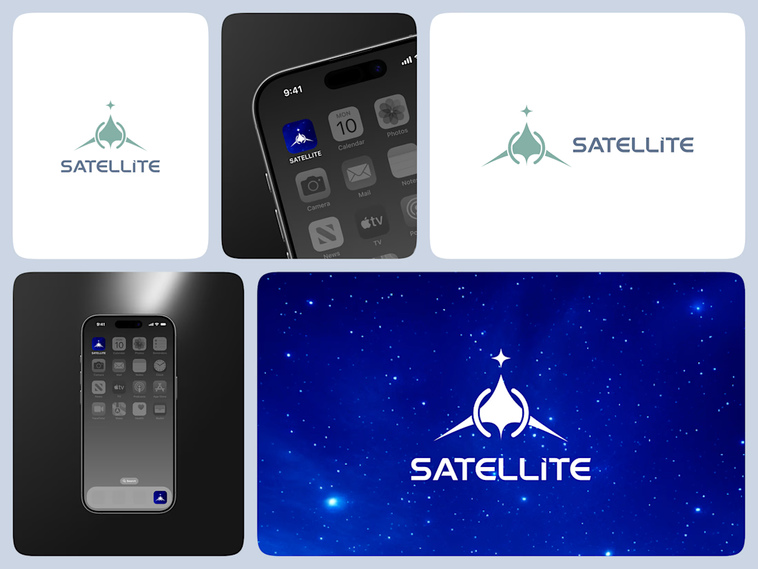
✦ SATELLITE — Connecting the World Through Design
SATELLITE is a logo concept I designed for a satellite company that represents connection, communication, and innovation beyond boundaries.
The idea behind the mark was to visualize movement and orbit — how technology brings people closer, no matter the distance. Each curve and shape in the design symbolizes precision and global reach, while the clean typography builds a sense of trust and modernity.
The goal was to create a logo that feels dynamic yet balanced, technical yet human — just like the satellites that inspire it.
For me, this project is a reminder that design, like communication, isn’t just about signals — it’s about connection.


The network for creativity
Join 1.25M professional creatives like you
Connect with clients, get discovered, and run your business 100% commission-free
Creatives on Contra have earned over $150M and we are just getting started

Challenges
View all


