The network for creativity
Join 1.25M professional creatives like you
Connect with clients, get discovered, and run your business 100% commission-free
Creatives on Contra have earned over $150M and we are just getting started
Back to feedPost

Events Marketing Consulting (Latin America + Europe)
Panama-based events organization, bilingual (English + Spanish).
In 2026, sponsors don’t say yes because an event needs money. They say yes when the sponsorship gives them access and involvement. In a 90-day consulting program, I helped restructure how they promoted congresses, sold sponsorships, and grew memberships for association clients.
What we worked on
Sponsorship approach + packages
Proposals that made sponsorship easier to approve
Event promotion plan (before / during / after)
Membership messaging
Team training (English + Spanish)
Deliverables
Sponsorship package structure + proposal framework, event promotion plan by phase, membership messaging direction, internal guidance the team could reuse.



The network for creativity
Join 1.25M professional creatives like you
Connect with clients, get discovered, and run your business 100% commission-free
Creatives on Contra have earned over $150M and we are just getting started
Challenges
View all


Related posts

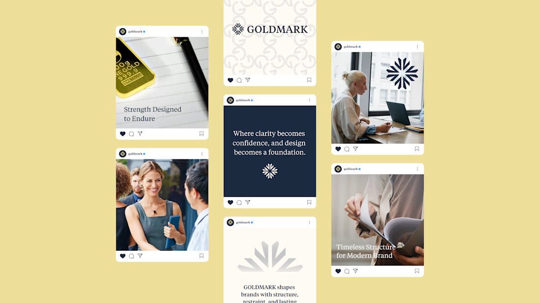
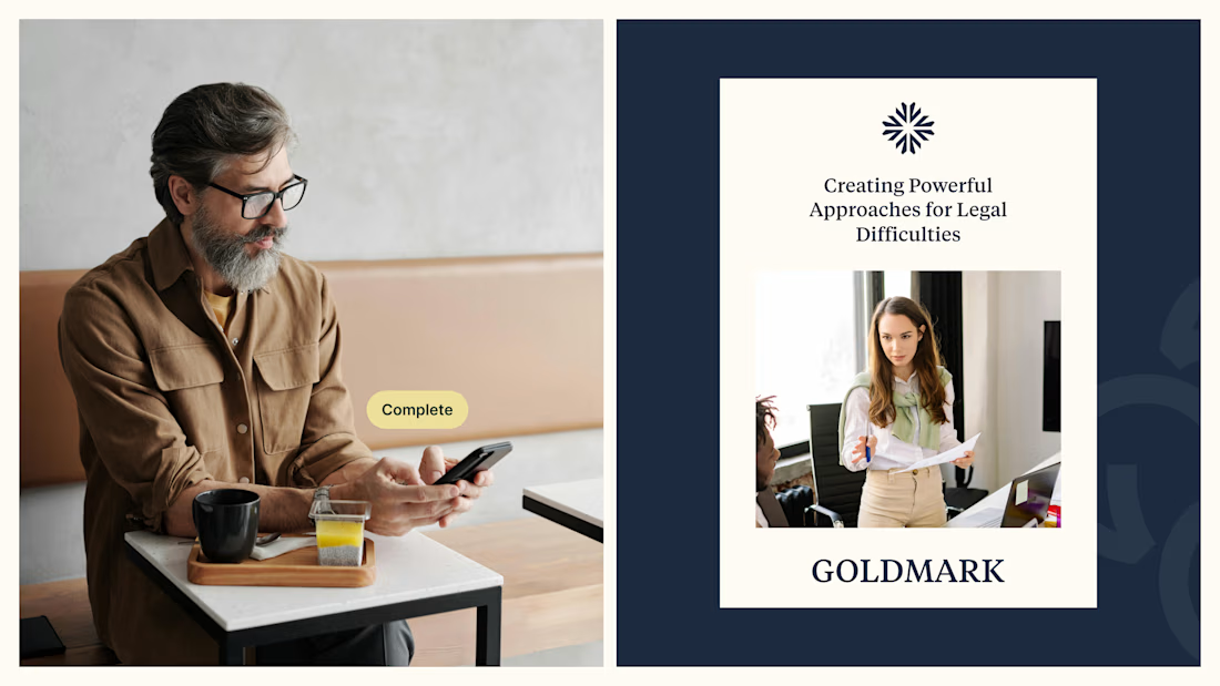
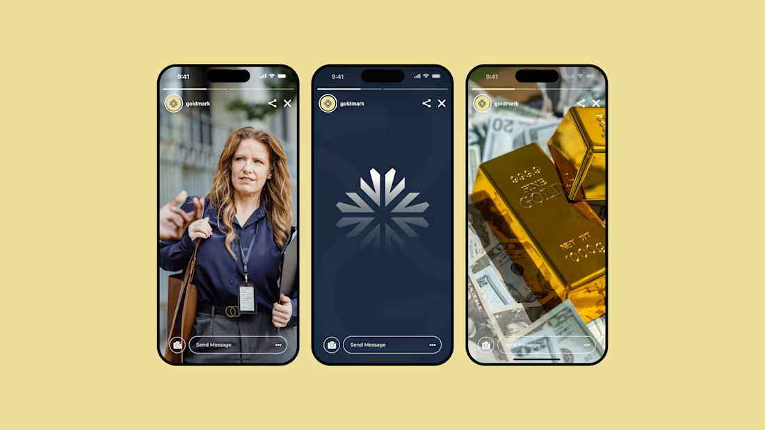
GOLDMARK - A refined identity for modern legal expertise. ✦
A complete branding exploration focused on building a visual language that feels premium, trustworthy, timeless, and confident.
The identity combines a distinctive symbol, elegant typography, and a deep navy + warm gold palette to create a sophisticated presence across digital and print applications.
Services: Brand Identity • Logo Design • Art Direction • Visual System
#BrandIdentity #BrandDesign #LogoDesign #VisualIdentity #Branding #GraphicDesign #ContraPortfolio

Everyone wants their brand to look "premium" but almost nobody can define what that actually means.
In crowded industries like digital marketing, premium is the absence of noise. Every unnecessary element is removed until what's left earns trust on sight and can be immediately recognized.
Designing Nyxora meant understanding that trade-off and building for legacy.
The identity needed to feel current enough to compete with the top agencies out there, but grounded enough that a client would hand over a real budget without hesitation.
The result is an identity built on purpose, one designed to earn trust before it earns attention.
Case study: https://rb.gy/hy6hs1




Nice

Nocturne is a self-initiated fragrance house I built from the ground up, treated with the same process I'd bring to any client: strategy first, then design.
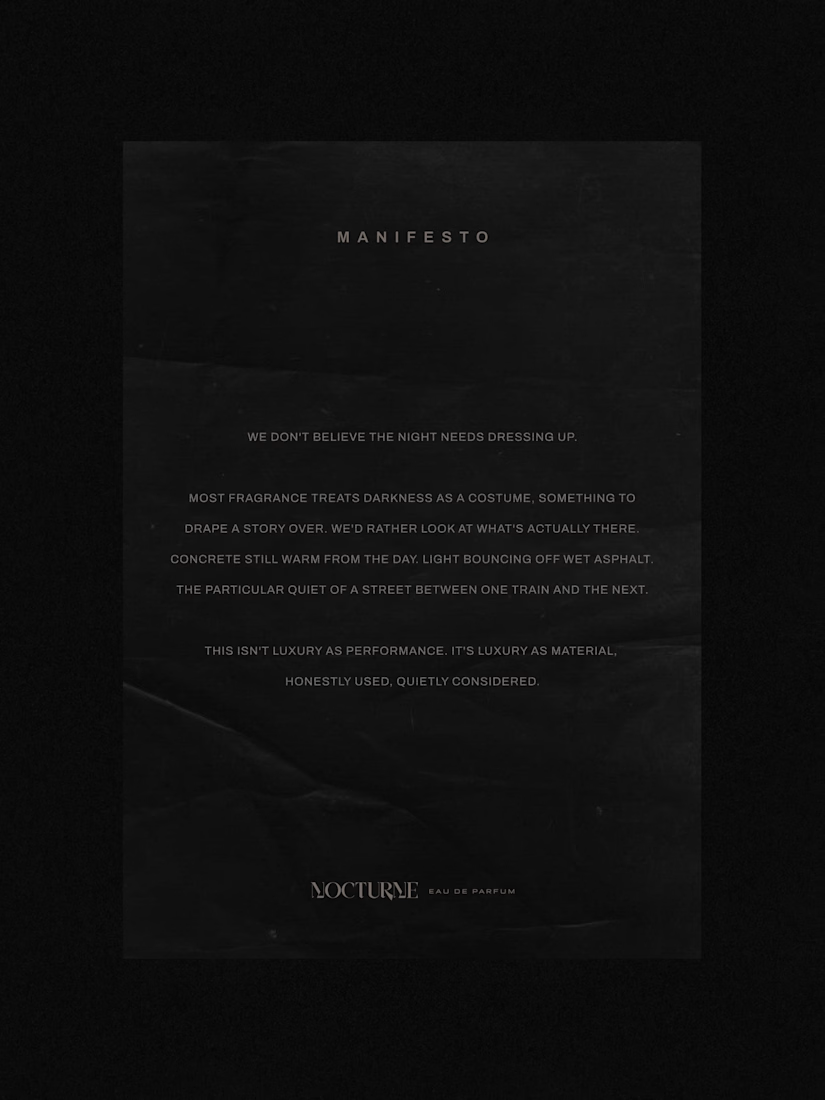
The brief was familiar: a fragrance inspired by the city after dark. Most fragrance branding solves that with common approaches such as moonlight, mystery, or gold foil details. I wanted to solve it with something more specific: what does after dark actually look like in an urban environment? Concrete, streetlight, wet pavement, the quiet stretch between one train and the next.
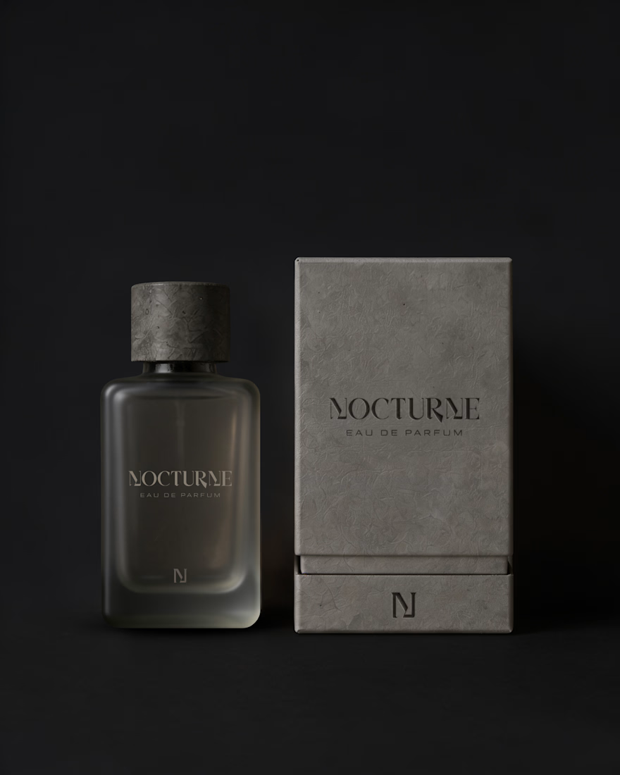
That question shaped everything downstream. An archetype chosen deliberately against category convention, Creator and Explorer rather than the more expected Lover or Magician. A material-first approach to the bottle and packaging. Sandblasted glass, a textured concrete-like cap, no gold, no ornament. And a running checklist I held every decision against throughout the project.
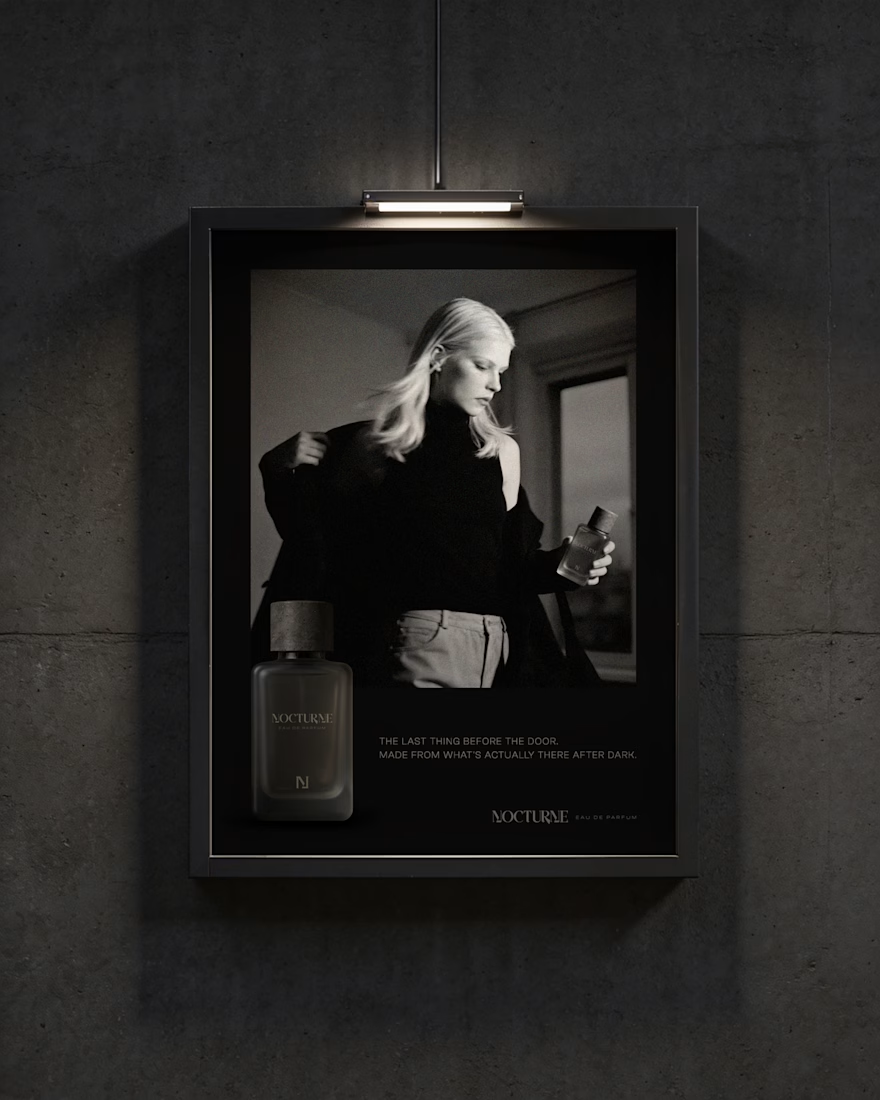
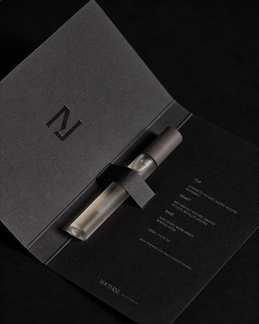
The case study covers the strategy behind Nocturne, not just the finished system: positioning, personality, the reasoning behind each material and typography choice, and how those decisions translated into the bottle, packaging, and campaign work.
I'd love to hear what you think, especially if you enjoy seeing the thinking behind a visual identity as much as the final result.


Good Work!