The network for creativity
Join 1.25M professional creatives like you
Connect with clients, get discovered, and run your business 100% commission-free
Creatives on Contra have earned over $150M and we are just getting started
Back to feedPost

Just shipped canvas mode on LayerDock, the website feedback tool I’m building with my co-founder.
If you build sites for clients, you know the drill. The client says “it looks weird on my phone” and you spend the next hour guessing which phone, which section and what weird means.
Now the site shows up on iPhone, iPad, laptop and desktop all at once, side by side. Your client clicks the exact spot that’s bothering them on whichever screen and leaves a comment right there. You see the device, the element and the note in one place.
I designed this one to feel like Figma comments but on a live site. Would love to hear what you think, especially if you deal with client feedback every week.
Try it at layerdock.io
The network for creativity
Join 1.25M professional creatives like you
Connect with clients, get discovered, and run your business 100% commission-free
Creatives on Contra have earned over $150M and we are just getting started

Challenges
View all


Related posts

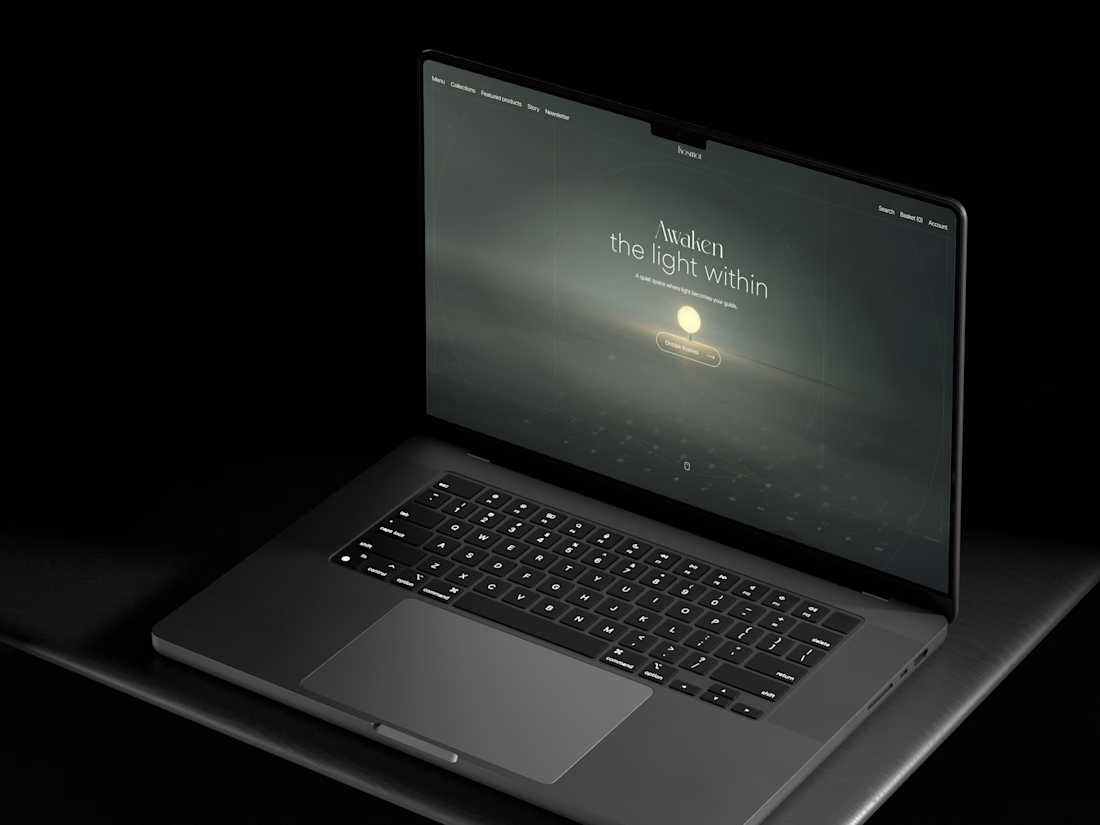
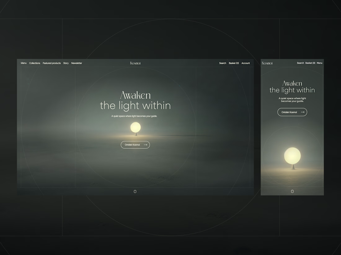
Not every hero section needs a lot of copy.
For this project, the client wanted a more unconventional e-commerce feel for a brand focused on meditation materials, so I let the visuals do most of the talking.
Sometimes less really does more, what do you think? 🤔

Lovely

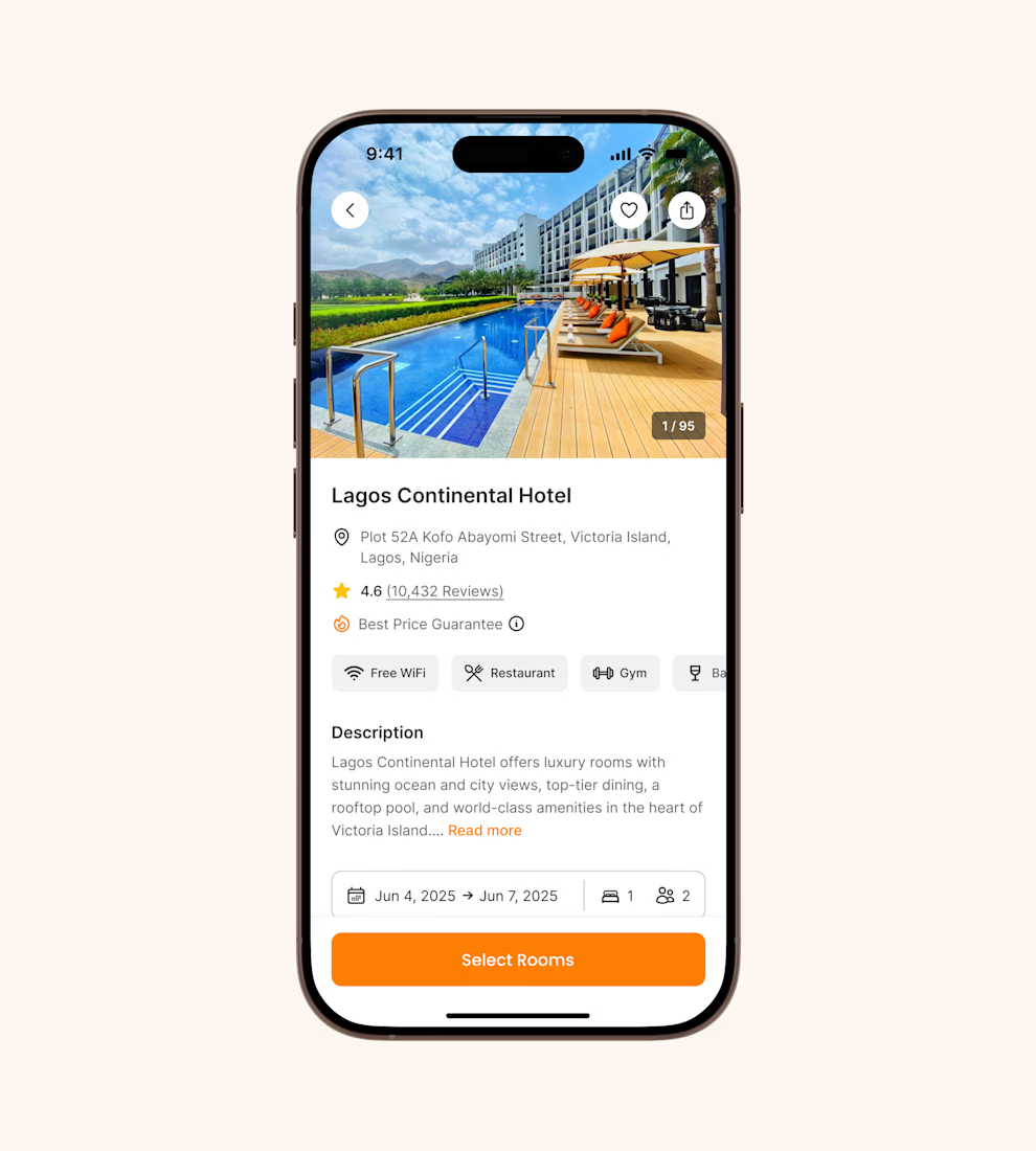
Hotel details screen for a booking app I’ve been designing.
Focused on clear information hierarchy, visual comfort, and helping users make quick booking decisions.
Excited to start sharing my work here 🚀


It's basic design but it's great❤️

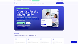
What do you think about my dentist booking app? Any feedback is welcome :)
Website and booking: https://calmio-dental-care.lovable.app
Reception app: https://calmio-dental-care.lovable.app/admin (username admin, password admin)
@Lovable #lovablechallenge
calmio-dental-care.lovable.app
Calmio Dental — A dentist for the whole family
Modern family dental care at two Bratislava clinics, bookable online in 2 minutes.

what changed the most out of everything? I always wonder if it's the layout or just finally telling people clearly what to do next