The network for creativity
Join 1.25M professional creatives like you
Connect with clients, get discovered, and run your business 100% commission-free
Creatives on Contra have earned over $150M and we are just getting started
Back to feedPost

Case Study: From "Coding Hell" to a Premium Custom Shopify Store ✨
🚨 The Problem: A handmade furniture business owner tried using AI to generate code for their Shopify store. The result? A broken layout and a frustrated founder with zero coding experience who couldn't update their own site.
💡 The Solution: I stepped in to clean up the backend and rebuild the frontend architecture so it looked fully custom but was incredibly easy to manage.
Key Deliverables:
✔️ Erased the broken code and rebuilt the homepage using native Shopify sections.
✔️ Established a premium, rustic visual identity with custom typography.
✔️ Built a dynamic quote header and a conversion-focused footer email capture.
✔️ The Best Part: I mapped every single custom feature into the Shopify Theme Editor. The client now has complete freedom to manage text, fonts, and images entirely code-free.
Beautiful UI meets perfect usability. Drop a 🪵 in the comments if you love a rustic aesthetic, or send me a DM if your Shopify store needs a cleanup!
#ShopifyExpert #ShopifyDesign #FrontendDevelopment #EcommerceWebsite #FurnitureBrand
Option 3: Short & Punchy (Best for X / Twitter or a quick update)
AI generated code broke this handmade furniture brand’s Shopify layout, leaving the non-technical founder stuck in "coding hell." 🛑💻
I stepped in to clean up the mess. I rebuilt the homepage using native sections, added custom typography, a dynamic quote header, and a sleek email capture.
The biggest win? Moving the entire architecture into the Shopify Theme Editor so the client can manage their premium, rustic storefront 100% code-free. No more touching Liquid files! 🛠✨
#Shopify #UIUX #WebDev #Ecommerce


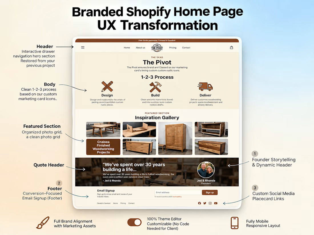

Making the store maintainable for its owner is an important outcome.
The network for creativity
Join 1.25M professional creatives like you
Connect with clients, get discovered, and run your business 100% commission-free
Creatives on Contra have earned over $150M and we are just getting started







Related posts


Apple Watch → Dynamic Island → Widget → Desktop Card → Mobile.
Same concept, different screens. Exploring how one UI adapts across devices.


Good work🔥👏👏


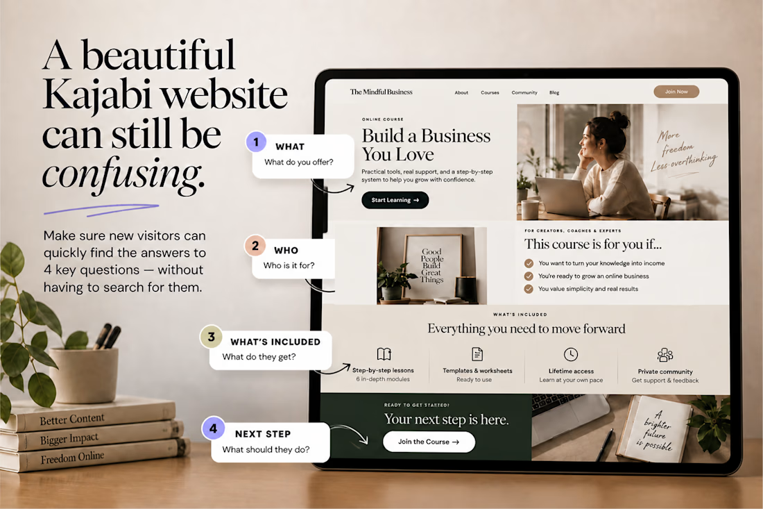
A beautiful Kajabi website can still be confusing.
One simple test:
👉 Can a new visitor understand what you offer, who it’s for, what they get, and what to do next without having to figure it out? If not, the problem may not be your design.
It may be your information hierarchy. Good UX doesn’t just make a Kajabi website look polished. It makes the right information impossible to miss.


Nice work, love it

Hey Contra, I disappeared for a bit. Not because I stopped caring about design, I just needed a breather 🫂
I continued to work, but couldn't bring myself to post something here. Burnout caught up with me, and honestly that “you’re not good enough” voice doesn’t make a comeback any easier. Funny how you can work hard for years and impostor syndrome still shows up like it pays rent.
But I’m back, easing into it this time. I’ve also been posting some design content on my Insta along the way.
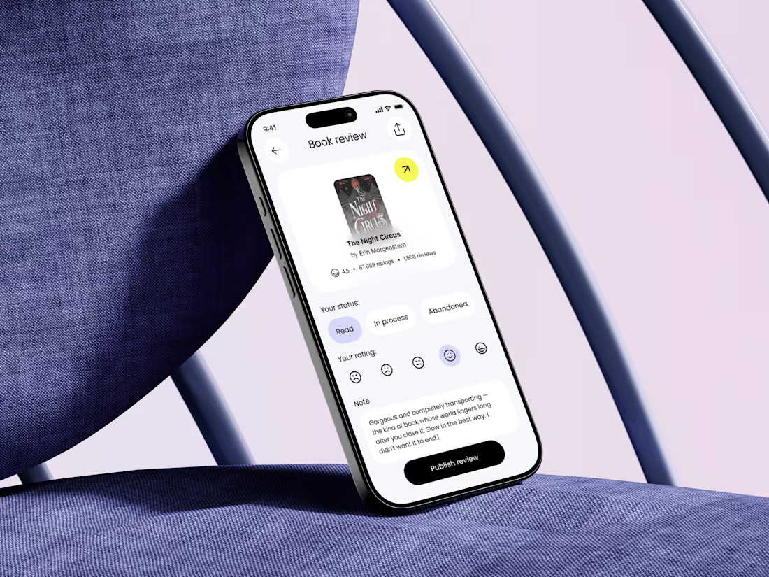
If you’ve been in that spot too: you’re not behind. Anyway, good to be here again🎉 For now you can take a look at one of the key screens of my new project that I can't wait to finish and show y'all!


Nice to see you here again 🎉 I'm waiting for the project updates 🤗