The network for creativity
Join 1.25M professional creatives like you
Connect with clients, get discovered, and run your business 100% commission-free
Creatives on Contra have earned over $150M and we are just getting started
Back to feedPost


The network for creativity
Join 1.25M professional creatives like you
Connect with clients, get discovered, and run your business 100% commission-free
Creatives on Contra have earned over $150M and we are just getting started



Related posts

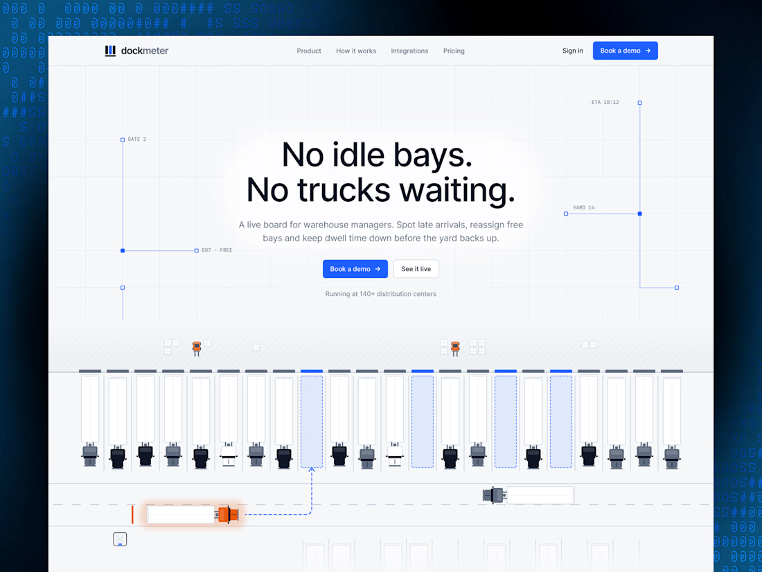

"No idle bays. No trucks waiting." is a headline a warehouse manager gets in two seconds, and the live bay diagram under it proves it. Is the diagram animated in Framer or a video?

Really liked how these designs turned out!
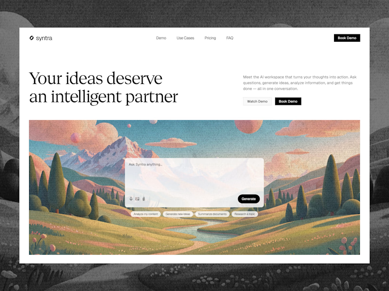
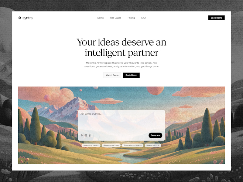
Explored a concept for AI SaaS product, focusing on a clean interface and a simple, intuitive chat experience.
Tried two different layout variation for the hero section.
Which would you like?
13 voted
57%
10 voted
43%
23 votes
Closed

Really clean concept! 👏
I like the second layout more — the headline "Your ideas deserve an intelligent partner" + the chat preview below makes the AI feel real and easy to use immediately. The first one is also clean, but this one sells the product faster.
I also design SaaS...

Which hero would you choose — 1 or 2?
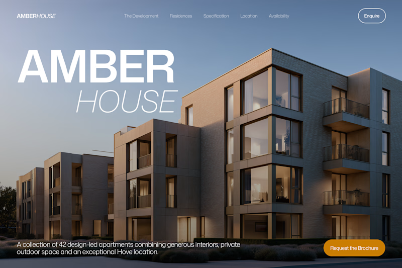
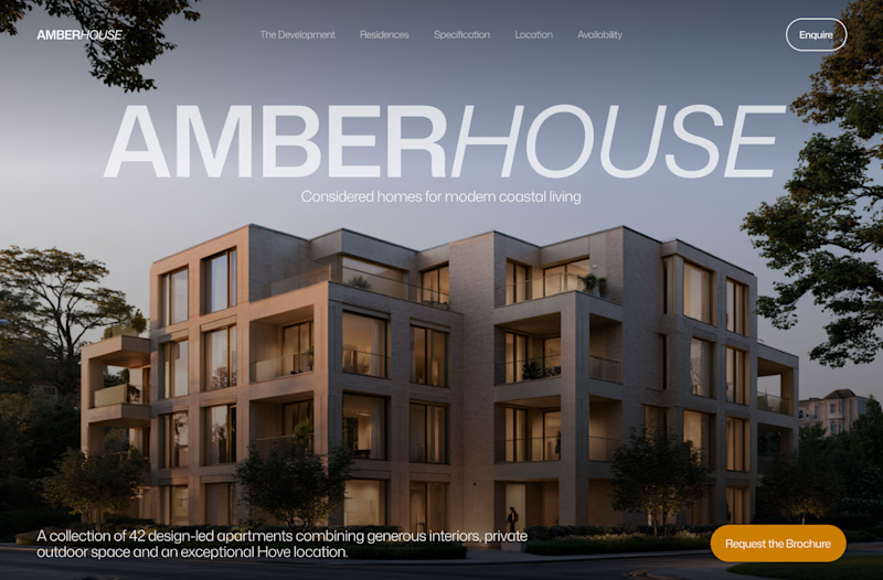
Two directions for Amber House, my real estate website template. The first pairs a closer architectural crop with an asymmetric layout. The second gives the building more breathing room, with a wide view and a centered headline.
Same template, two different first impressions. Which feels stronger to you, and why?
24 voted
59%
17 voted
41%
41 votes
Closed

I will go with Bold & Asymmetric!