The network for creativity
Join 1.25M professional creatives like you
Connect with clients, get discovered, and run your business 100% commission-free
Creatives on Contra have earned over $150M and we are just getting started
Back to feedPost
Your product screenshots are doing too much. 😵💫
I’ve been reviewing a lot of SaaS visuals lately, and most founders try to cram an entire dashboard into one frame. It shows the product, sure… but it doesn’t tell the story.
While building this moodboard, the examples that stood out were Superhuman, Notion, and Remote. Clean. Intentional. Each visual does one job: guide attention to the value.
A product visual isn’t documentation. It’s a narrative device. It should highlight the moment that matters, not the whole system.
If you’re trying to show the whole product, try the opposite. Pick one moment. One action. One promise your product makes. Let the visual breathe.
My Cosmos moodboard link is in the comments if you want to see the examples. ⬇️
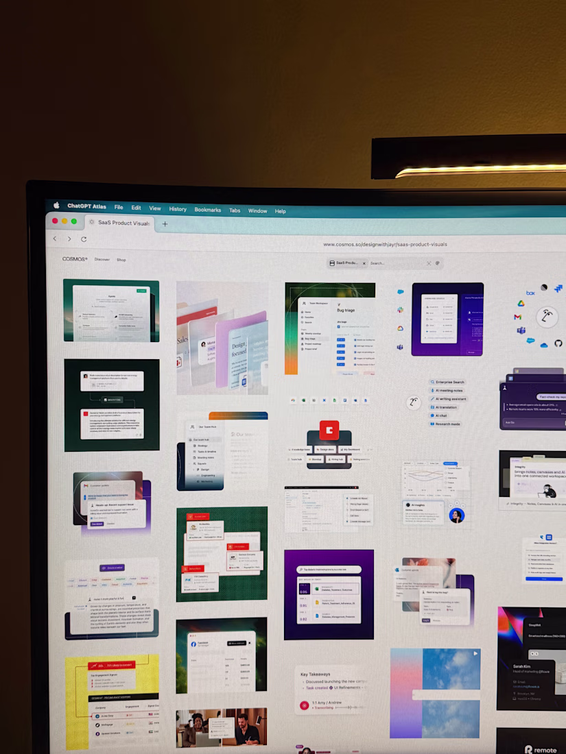
Collected examples from Superhuman, Notion, Remote, Asana, and a few more.
The network for creativity
Join 1.25M professional creatives like you
Connect with clients, get discovered, and run your business 100% commission-free
Creatives on Contra have earned over $150M and we are just getting started
Trending
Claude
Claude has entered the design space. How are you using Claude Design?
Contra University
Learn from expert creatives how to earn more using next-gen AI tools.
creativeaiflow
Creative AI workflows are evolving. What tools do you use, and what are their strengths and weaknesses?
freelancerlife
Freelancer life is wins, pivots, and everything in between. What’s yours right now?