The network for creativity
Join 1.25M professional creatives like you
Connect with clients, get discovered, and run your business 100% commission-free
Creatives on Contra have earned over $150M and we are just getting started
Back to feedPost

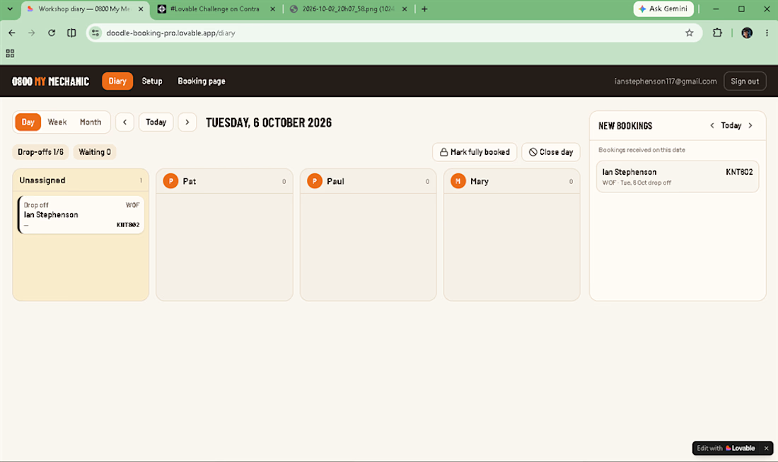
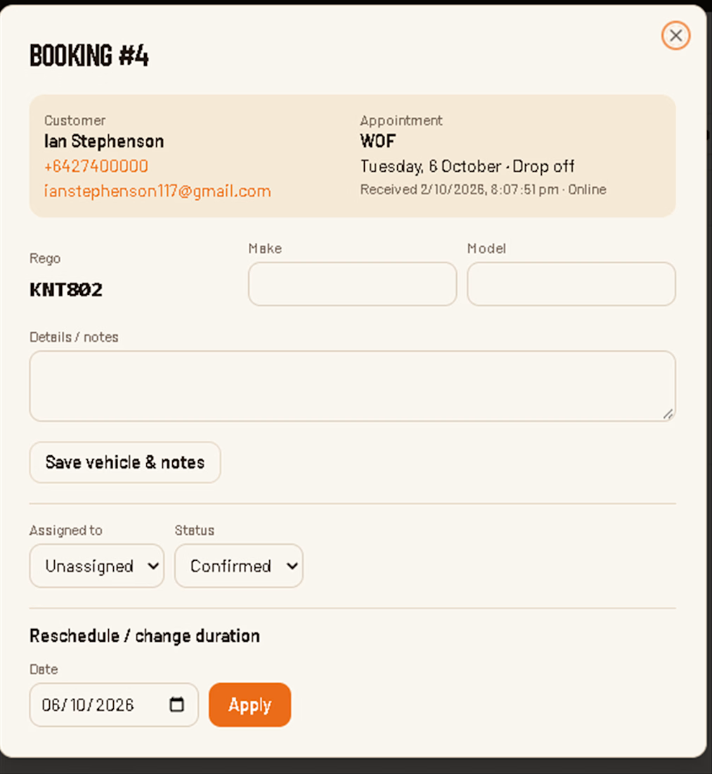
Hmmm we don't know how to submit.
We posted and completed before 8pm NZ.. Fingers crossed. Thank you for the opportunity to show our skills.
The network for creativity
Join 1.25M professional creatives like you
Connect with clients, get discovered, and run your business 100% commission-free
Creatives on Contra have earned over $150M and we are just getting started








Related posts

Title: Nexa Electronics: Premium E-Commerce Website with Interactive 3D Exploded Views
Description:
Nexa Electronics is a demo e-commerce website I designed and built to show my skills in modern web design, front-end development and interactive 3D experiences. This video is a walkthrough of the site.
What’s in the video
The home page, with a cinematic hero section and a 3D device showcase
Browsing by category: Smartphones, Laptops, Audio, Gaming, Smartwatches, Smart Home and Accessories
Product pages with configuration and colour options, a zoom inspection view, pricing, stock status and customer reviews
The interactive 3D exploded view (“Explore Inside in 3D”), where you can take products apart layer by layer to see their internal components
Quick View, the device comparison matrix, the shopping bag and a full checkout flow (shipping details, payment, order review and confirmation)
Customer sign-in and an admin dashboard for managing the store
Website features
Interactive 3D exploded views of products, with labelled internal parts and an explode slider
A mega-menu navigation and fast category browsing
Product configuration (storage and colour variants) with live pricing
Wishlist, compare and shopping bag functionality
Device comparison matrix
A simulated checkout with order confirmation
Customer accounts (sign-in)
An admin dashboard with store stats and inventory and price management
A newsletter signup section
A toggle to turn the 3D experience on or off
A responsive, dark and light themed premium UI
Note: I made this video with the help of AI, and it is just a demo to show my skills. To see my work properly, I recommend visiting the live website here: https://nexaelctronics.netlify.app/
Thanks for watching. I’m open to freelance projects, so get in touch if you’d like something similar built for you.


Great work

New website project 'm working on, super excited to share updates on this soon.

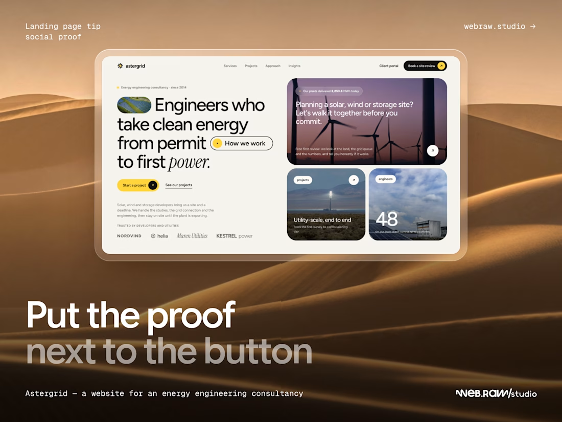
Put the proof next to the button.
People hesitate right before they click: who else trusts this team? If client logos and reviews sit at the very bottom of the page, that answer comes too late. Place a short logo row or one real quote right under the main CTA, and repeat it near the final one. Same proof, better timing.
Example: Astergrid, a website for an energy engineering consultancy: the "trusted by" logos sit on the first screen, a few lines under "Start a project".
webraw.studio/work/astergrid/