The network for creativity
Join 1.25M professional creatives like you
Connect with clients, get discovered, and run your business 100% commission-free
Creatives on Contra have earned over $150M and we are just getting started
Back to feedPost

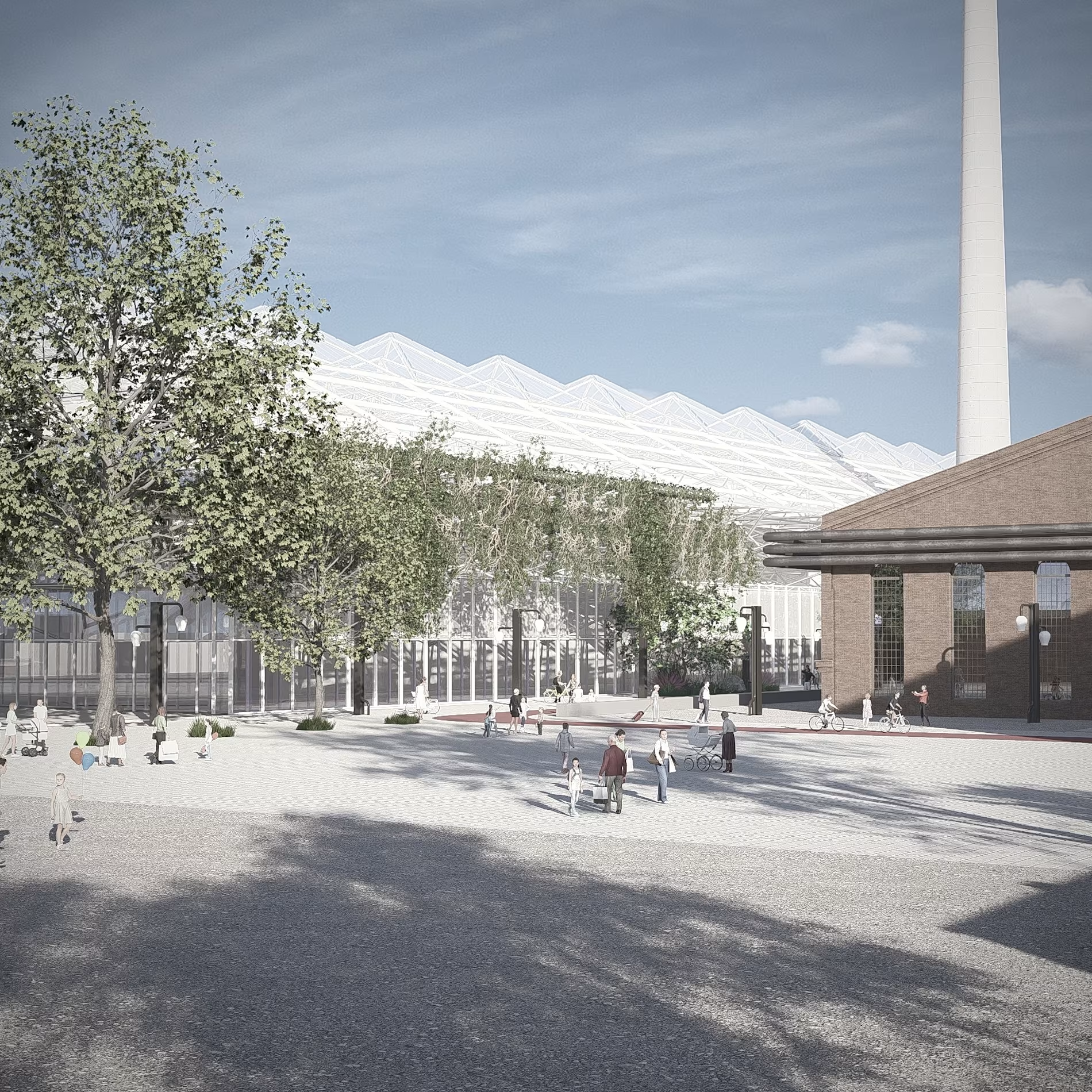
Reimagining Industrial Heritage | Steaua Română Refinery
Giving new life to historical industrial footprints. This project explores the adaptive reuse and urban regeneration of the iconic Steaua Română Refinery site in Câmpina.
Through sensitive architectural interventions, modern structural modules, and visual integration with the surrounding landscape, we aim to bridge the gap between industrial memory and contemporary public space.
✏️ Design & Visuals: s/ca studio
#s/castudio #AdaptiveReuse #IndustrialHeritage #UrbanRegeneration #ArchitectureViz #3DRendering #ArchViz #SteauaRomana #Campina ArchitectureDesign


The network for creativity
Join 1.25M professional creatives like you
Connect with clients, get discovered, and run your business 100% commission-free
Creatives on Contra have earned over $150M and we are just getting started











Related posts

New case study is live.
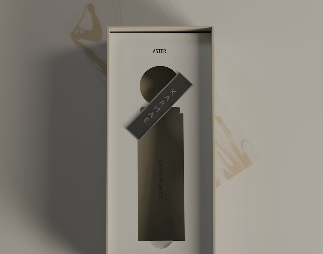
KARMAE is a contemporary fragrance house exploring the relationship between scientific precision and sensory experience. ASTER was developed as the softer side of the brand, combining a restrained visual identity with tactile materials, frosted glass, muted metallics and considered packaging details.
The goal was to create a cohesive brand experience where the identity, product and packaging feel like natural extensions of one another. Alongside the branding and packaging, I also developed the product visuals and final 3D renders in Blender.
A more in-depth look at the concept, design decisions and final applications can be found in the full case study.
Long story short, I really enjoyed bringing this one to life, especially exploring how material contrasts and subtle details could give ASTER its own character while keeping it connected to the wider KARMAE brand.


Beautiful presentation!! and love the product packaging!

New Exploration 🎉
Spatial intelligence for the built world.



The exploration turns nothing but well

New week. New ideas. More room to grow. ✨
One thing I'm learning as a creative is that growth doesn't happen only when you're working on a big project. Sometimes, it's in the small decisions, the things you learn, the ideas you explore, and the courage to keep showing up.
Whether I'm working on architectural visualization, exploring digital design, or learning something new, I want every step to make me better at what I do.
I'm starting this week with an open mind, fresh energy, and a reminder to myself that there's always room to improve.
To everyone building something of their own, keep going. Your progress matters, even when it feels slow. 🤝
What are you working on or hoping to improve this week?
#Design #3DDesign #CreativeProcess


Really like how clearly the idea comes across.